PROJECT
Design System, Uplift & Rebrand
CLIENT
CLIENT
Not on the High Street
ROLES
UX, UI, Design System, Strategy, Process, UX Writing
During my time as Principal Product Designer at Not on the High Street, I was deeply immersed in a business that suffered years of Product Design neglect - resulting in the beloved platform falling dangerously behind its competitors. This case study will highlight some of the critical issues and how I set about driving the business to a better path of Product Design Practice, empowering them to create rapidly and scale.
UNDERSTANDING
UNDERSTANDING
Investigate
My first task at NOTHS was to investigate the business and where it was with regards to design maturity. What type of design teams existed in the past? How did they operate? What stage of design evolution was the platform at and how was it performing? Does the product function and behave as it should? And how can we improve the whole package?
Identify
It became apparent quite quickly that the business had been operating as a marketing outfit primarily, which in a lot of ways served the business well - but as competition advanced in Design and Tech, the lack in those departments became agonisingly exposed. Design teams came and left over many periods and there was no continuity in output or leadership, leaving holes in experience and a lack of consistency in every aspect of the gifting marketplace platform.
Audit
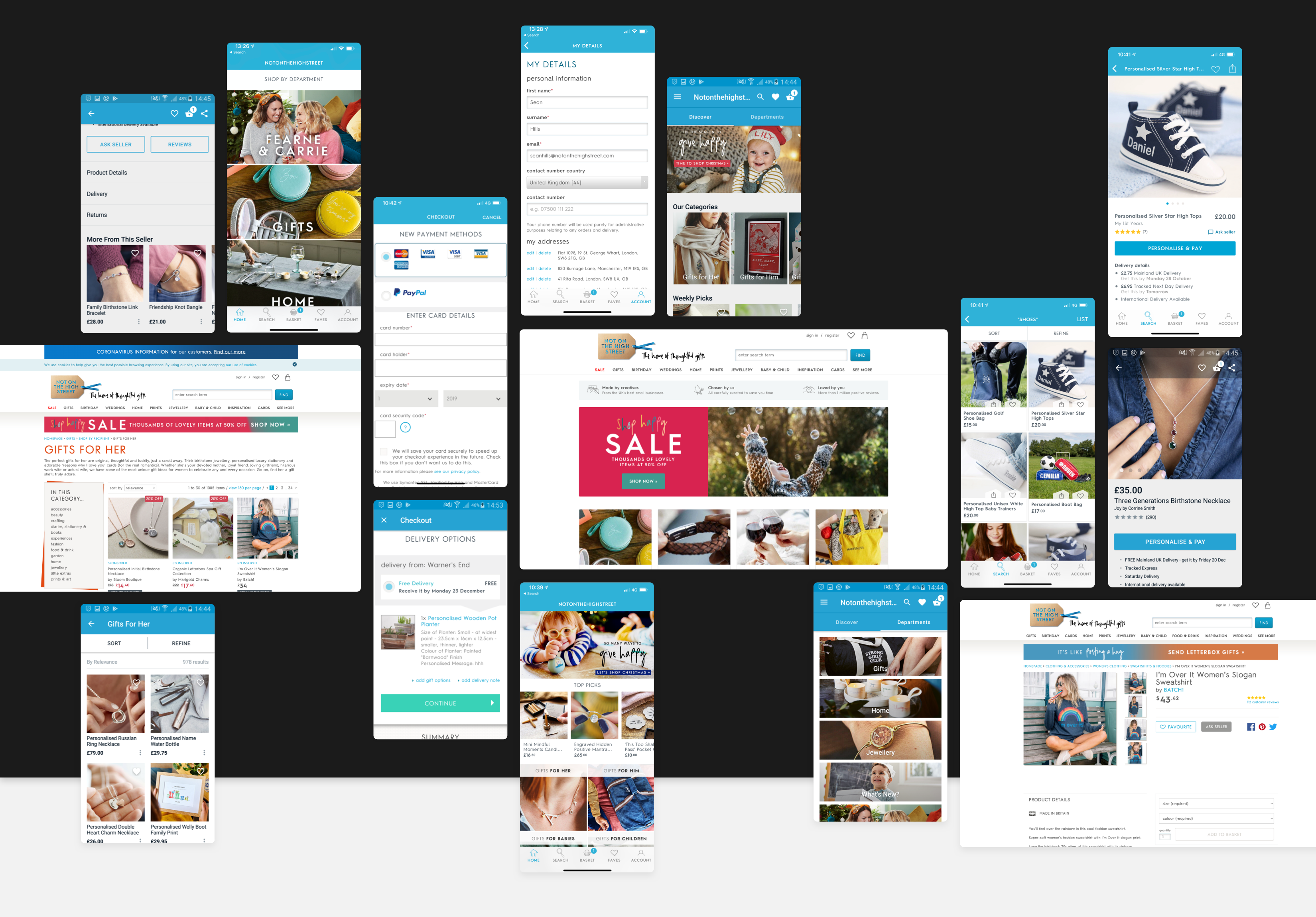
Just like in any design task, big or small, a phase of auditing the product was undertaken to get underneath the hood of the platform and see what exactly was going on and to what scale. This review was carried out across web (all screen sizes) and the iOS/Android apps.
An outline of some of the discoveries:
• Multiple font types and styles that have consistent usage
• Various shades of Primary Blue in existence
• Various icon and illustration styles
• Logo has a large depth and is unreadable on a small scale
• Multiple Button styles that don't adhere to a central system
• Inconsistent Component styles across all screens
• Clunky experience
• Infomation Architecture is confusing
• Spacing is cramped
• Colour contrast and pairings generally fail Accessibility Tests
Findings
The degree of inconsistency and cohesion was startling, especially for a business the size of NOTHS. Different styles, patterns and experiences across both apps and web led to a disjointed brand that couldn't offer consistency or singularity in voice or expression. To add to that, a lack of design guides compounded these issues and forced the creative output into a state of paralysis, reducing any kind of design into a game of guesswork where the answer could only be wrong.
Any plan would have to address these key findings:
1. No consistency
2. Lack of cohesion
3. Chaotic design process
4. Poor communication between teams (Dev, Design, PM's)
5. Out-of-date UI
6. Frustrating experience
7. Stale identity
PROPOSALS
PROPOSALS
With all the information uncovered in trying to understand the business and where it stood from a design level, it was clear that some radical changes were needed to bring order to the platform and how the design department operated.
The Product itself needed modernising aesthetically and some experience-related improvements were required immediately, not to mention some kind of loving attention to the brand overall. The list of 7 requirements could be broken down into 3 proposed phases of improvements.
PHASE 1
Design System
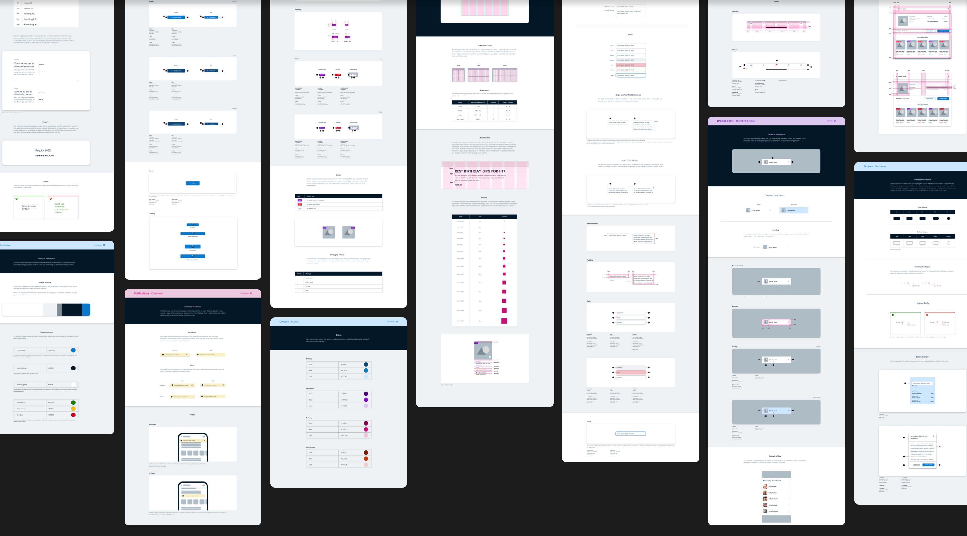
Creating a Design System would gather all the scattered assets under one source of truth, bringing cohesion and aiding in the consistency of output. Having reusable assets will also allow the team to create and scale at speed - as long as there is as much effort in maintaining the System as there is in creating it, of course. Process is also built into a healthy DS - how designers, take from and feed into, how developers gain access and interpret patterns to their own Library and so on. All of this requires more collaboration and communication between the whole Product Team.
Issues potentially resolved:
✓ No consistency
✓ Lack of cohesion
✓ Chaotic design process
✓ Poor communication between teams
PHASE 2
Uplift
Uplift
As we were creating a Design System, it would make sense to update the UI at the same time from an effort perspective - this would also aid in rejuvenating the out-of-date aesthetic that existed. We could also make singular, informed choices about where to improve the User Experience across the App and Website in this phase. By choosing single improvement points in each portion of our user journey, we could minimise the risk of changing too much in one go. Allowing us to clearly identify how those edits have impacted our product, for the better or the worse.
Issues potentially resolved:
✓ Out-of-date UI
✓ Frustrating experience
PHASE 3
Rebrand
The brand itself had a clear identity, albeit twee with a narrow but loyal, engaged audience. There was an opportunity to make operational changes to the brand, such as updating the colour palette to something more attuned to the digital age with accessibility in mind, as well as freshening the logo and typography used throughout, to breathe life and appeal to a modern audience - as well as exciting our existing audience. There was an opportunity to look at how products were photographed and how new Partners with exciting product ranges could envigorate our offering to our customers.
Issues potentially resolved:
✓ Stale identity
PHASE 1
PHASE 1
DESIGN SYSTEM
DESIGN SYSTEM
The Design System was created from the ground up with scalability and change in mind. We knew a rebrand was happening down the line and what was created in this phase would eventually be updated again.
Knowing the apps and the web were far apart from one another in terms of UI, experience and identity, it was important that we looked to create a platform-agnostic approach to how we design for the product. This would eradicate existing inconsistencies and help tie the platform together, where previously it was going in different directions. This was something that had to be sold to the Product Team, as it does go against some principles around Native Design.
What makes up a Design System
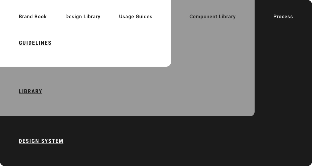
A large part of my job was to educate the Product Team and wider business about not only what a Design System is but also why we needed one. A Design System is more than just a Design Library in a Sketch or Figma file, it's a whole ecosystem used by the whole Product Team - it can even be used by wider teams to gather information about how we work and operate as a Product team, or how Marketing Teams could use Assets created for them without deviating from brand constrictions or breaking parts of the digital experience.
An Atomic Structure (of sorts)
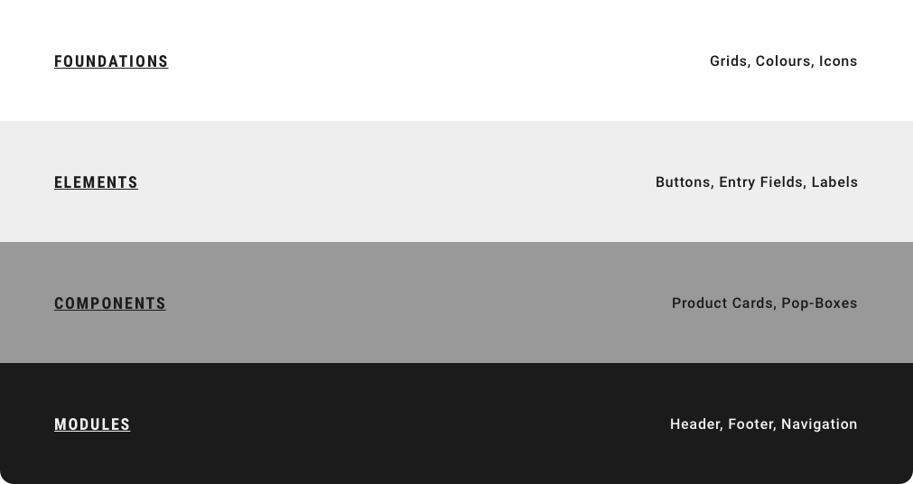
We based our Library structure on the well-known Atomic Design Methodology - with some amends.
The language used in the Atomic System has never sat well with me. Terms like Atoms, Molecules and Organisms aren't naturally used in the Product world and don't feel reflective of the nature of what we do. I worked with our Designers and Developers to create a naming convention that felt more natural and in line with our industry and the terminologies we use in-house.
Grid System
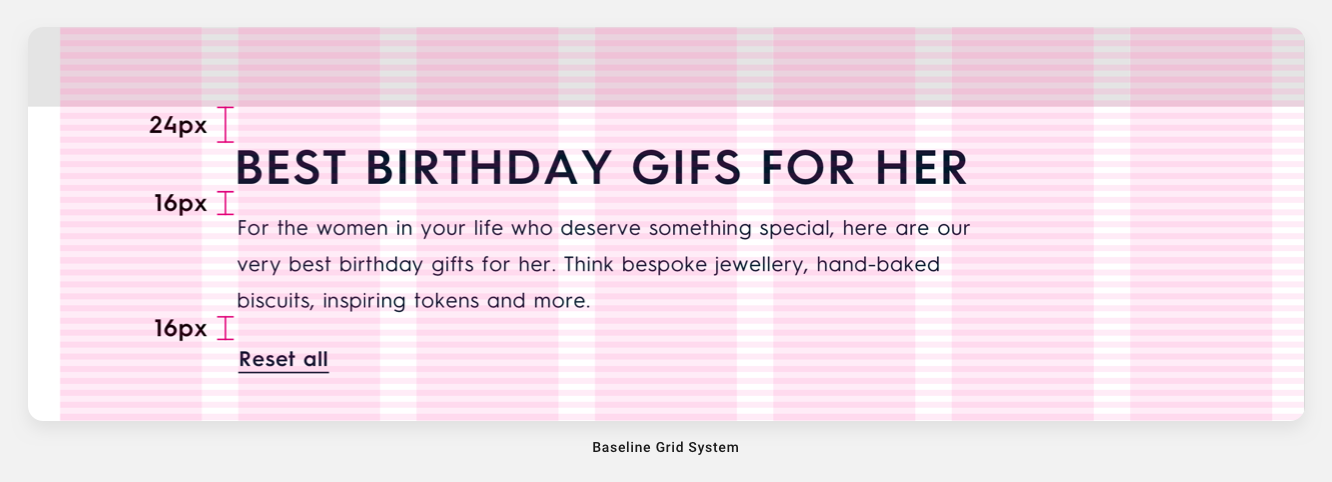
The original Grid System was a mess with disconnect grids being used throughout the Product on random pages without reason. I created a Fluid Grid System that worked from mobile to large desktop and converted the naming to be tied to the size of the screens rather than the device itself. This created harmony across the Product and reinforced the agnostic approach intended by not thinking of screens by device, but thinking about the product as a whole.

Baseline Grid
Part of the decision-making around the Grid System was which Baseline Grid to set. Web and iOS have no constraints around Baseline Grids but Material Design has one set to 4dp. Rather than have one set of rules set for Android devices and another for Web and iOS, I thought it would be best to set the same rules to reinforce consistency across all screen sizes, so a Baseline Grid was set to 4dp across all screens.
Typography
The font Not on the High Street uses is a custom one called NOTHS Sans No3. It came in two weights. During my audit, I noticed there was an out-of-date cut of this font in designs and live across the Platform. Part of this process involved teasing out where the obsolete font was in use and replacing it with the correct cut of the company's font.

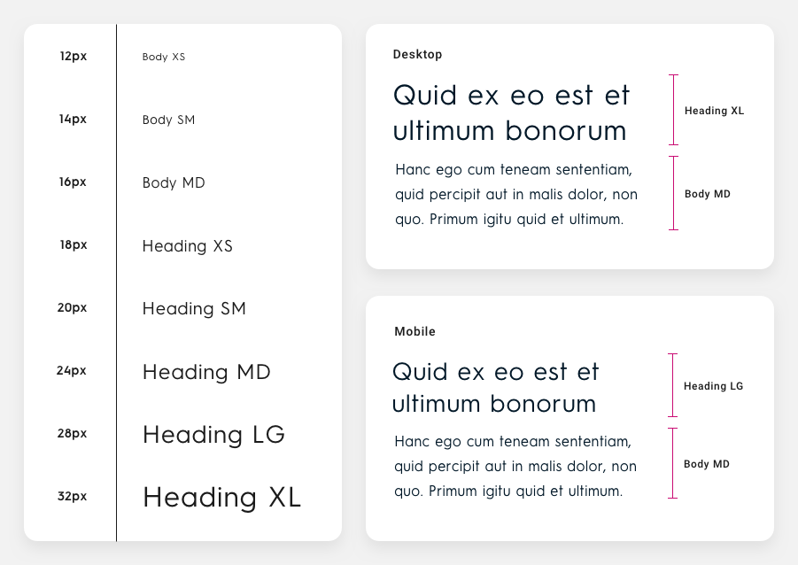
SIngle Typographic Scale
During the process of creating a Typographic Scale, I played with the idea of multiple scales set to match certain screen sizes. I found that this created a large Library of Type sizes and would become a bit of a barrier to simplicity. Instead, I opted for a Single Typographic Scale that could be implemented across all screen sizes. Where a screen would require a drop or increase in type size, the type would use the size up or down in the scale. This approach required nuance from the Designer and good communication with the Development team but once up and running, we found it to be simple to use.
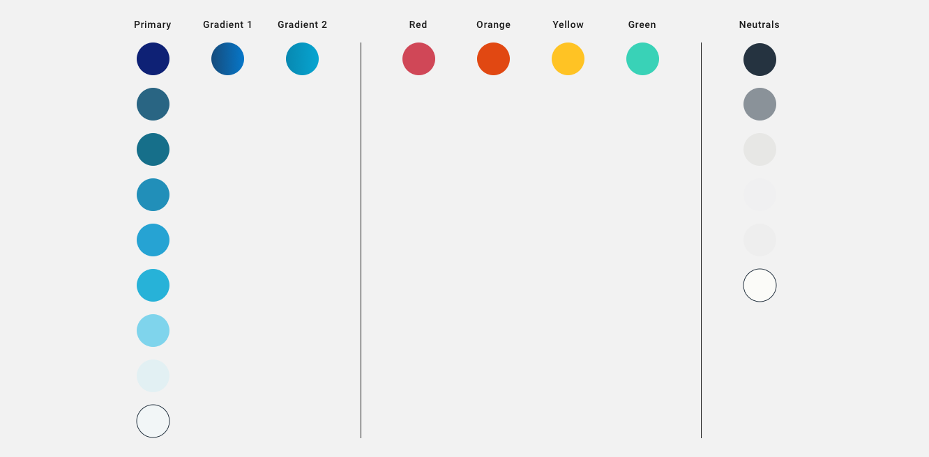
Original Colour System
The colours in use I found whilst conducting the audit shocked me. I'm not sure if I've ever seen such abuse of colour management in my career. I found there to be no cohesive grouping of colours or reason behind the colour shadings - especially with regards to the Primary colour set, which consisted of 9 shades of blue, some of which were so similar they were almost indistinguishable. I also found two random Gradient Styles and a set of functional colours - all of which would struggle to pass Colour Contract Accessibility tests. That was a really fun day.
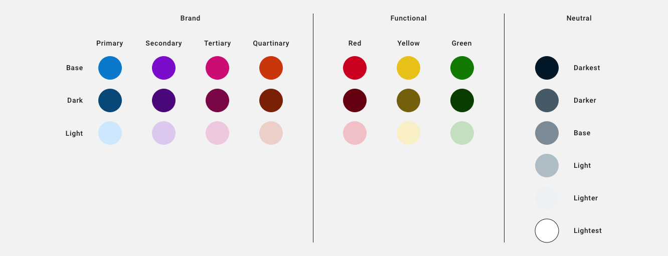
Refined Colour System
From what I witnessed in the Original Colour System, I knew I had to simplify and diversify the colour options. I created 3 pillars; Brand, Functional and Neutral which contained sub-sections of colours. Brand contained 4 colours, organised from Primary to Quartinary. To maintain brand continuity I kept blue as the Primary colour, picking a Base Shade that best represented NOTHS whilst playing well with Colour Contrast Tests. Functional was simplified to Red, Yellow and Green, and Neutral had a selection of shades to work with. The colour naming of this system had to consider the future rebranding, so I opted for semantic naming, which deviated in the Functional Pillar - some scenarios would see these colours used for warnings or notifications, which we do, but we also use Red for things like Sales, so it made sense to break the semantic norms in that case. Creating a structure like this would allow for a seamless transition when we rebrand - as long as the rebrand adheres to the structure laid out.
Iconography
Iconography, like every other asset used at NOTHS, was a confused jumble. I found a mixture of loose hand-rendered styles and simple graphical styles used together, and in some cases overlapping. We didn't have the time or resources to create our own bespoke icons and with a rebrand happening down the line it didn't make sense to do - so we opted to use Materials Icon set in the short term to tie everything together across the platform.
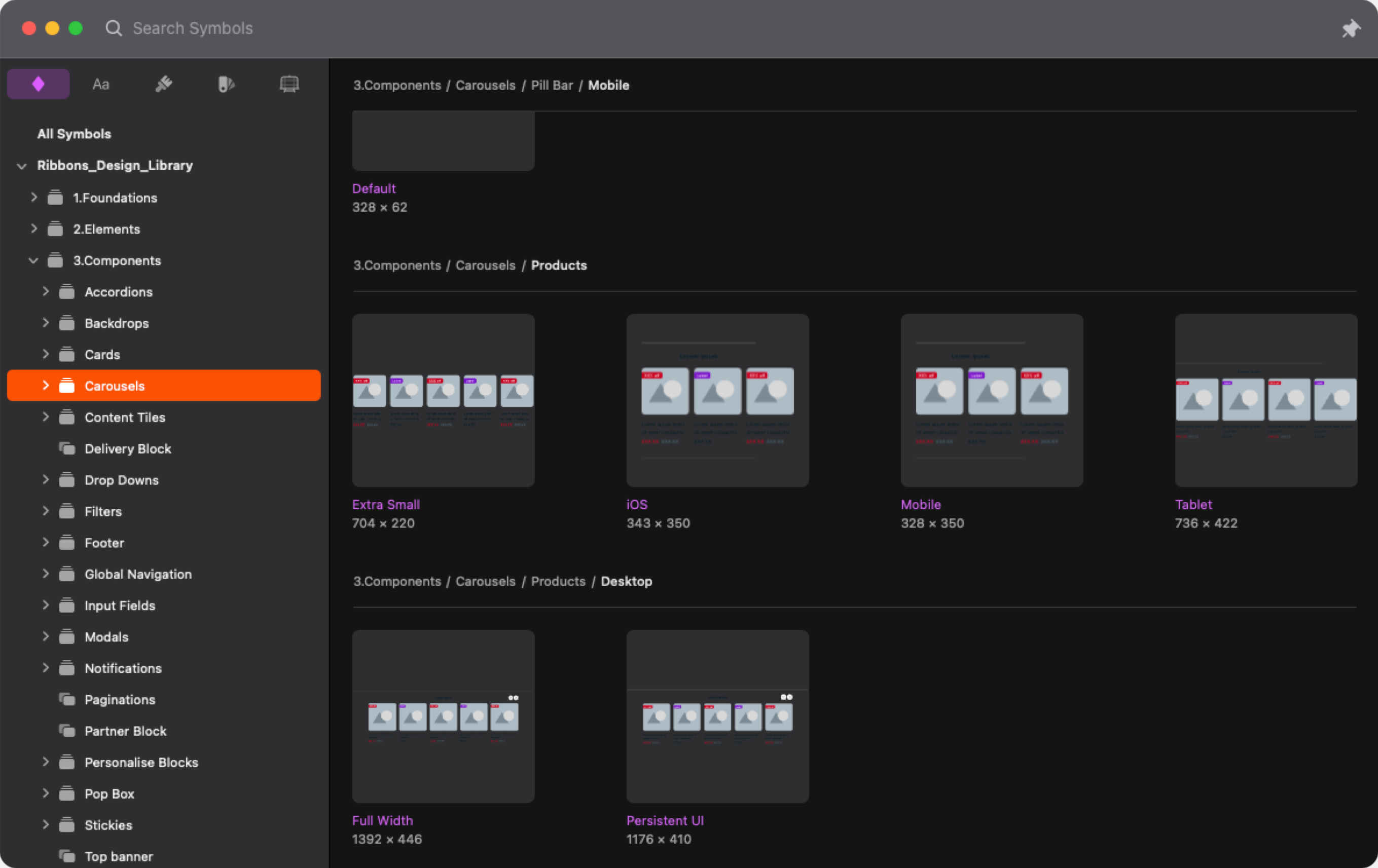
The Design Library
NOTHS Design Library is created in Sketch. Each asset has been built with flexibility of use and scalability in mind. Tidy layering and thoughtful naming are key to a Library that is easy to use for Designers of all levels. Components should be expandable across screens where possible, with editable fields and fenced colour variables being baked into Override settings, reducing the chance of any rogue assets sneaking into designs. Just like building a Consumer Product, where our customers are the users, the Design Library is built where the Designers are the users - and any approach to good UX should be applied in kind.
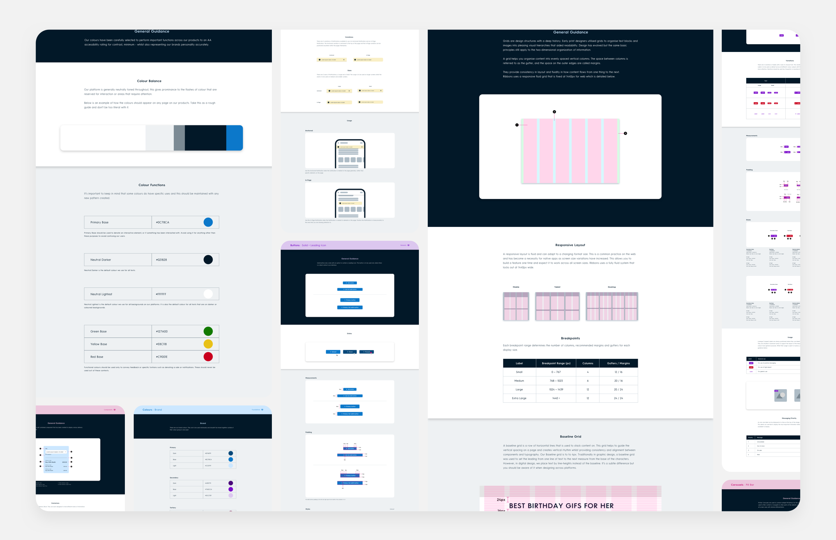
The Design Guides
Design Guides are critical to any Design System. Even if you don't have a Design System, Guides would still be paramount and non-negotiable to any self-respecting business. They are central to the process and champion to consistency and cohesion. The guides created existed in Zeplin - a collaboration tool for Designers, Developers and PMs. Using Zeplin for our Guides was a stop-gap, so we could get a functioning set of guidance up and running quickly and aid our Product Team in creating accurate builds. The future plan is to create an internal-facing website, that houses our guides and code all in one place. This internal site would eventually become outward facing and serve as a proud asset to champion NOTHS' commitment to Design and Development excellence.
The Design Process
Processes are fluid and interchangeable parts of any system. Flexibility should be at the centre of any process, to allow for changes in teams, businesses and technology. A design process created for a large team within a deep, structured organisation won't necessarily work for a leaner team set within a modestly sized company - even if that process is heralded as the industry bar. The design process set at NOTHS was created to suit the team at a particular time, and with regular rituals could evolve to suit the ever-changing needs and requirements of the Product team as a whole.

DESIGN SYSTEM MAINTENANCE PROCESS
The original Design Process didn't have anything wrong with it but as it didn't have a Design System it didn't allow any routes to update existing assets or create new ones, along with supporting guides. NOTHS has a very small design department, therefore isn't in a position to create a Design System Team to update and maintain the Design System. These tasks had to be decentralised and built into the general Design Process for all designers to follow.
1
The Brief
Briefs can come from all kinds of places, wherever they come from, the brief needs to be ticketed. These tickets are to be constructed clearly and directly with all the necessary information included to be carried out as effectively as possible.
2
Design Development
When a Designer picks up the tickets, they move into a Design Development phase. We use the Double Diamond Process at NOTHs which was created by the Design Council. The process consists of 4 key stages, Discover, Define, Develop and Deliver.
3
Test
Once a Library Asset has been created or edited, it will need to go through a phase of testing. This phase determines whether the asset created will go on to become part of the active Library or not.
4
Design Library Inclusion
If the Asset created gathers positive results from testing it will need to be included in the Library. This means the asset will have to be constructed in such a way that it responds to different screen sizes where possible and is layered in such a way that Overrides are easy to follow and easy for other Designers to use in future.
5
Guides Creation
The thankless task of the process but also one of the most important. Creating guides for any new or edited asset will serve as a central source of truth for the whole Product Team to see and refer to when using in future designs, in development and during any QA.
The thankless task of the process but also one of the most important. Creating guides for any new or edited asset will serve as a central source of truth for the whole Product Team to see and refer to when using in future designs, in development and during any QA.
6
Ready to Develop
In some cases development would have already been undertaken for testing, so the need for handover at this point isn't always necessary. In other scenarios, a handover is needed, and with the support of Guides, the team are in a healthy position to execute an accurate representation of the designs.
PHASE 2
PHASE 2
UPLIFT
UPLIFT
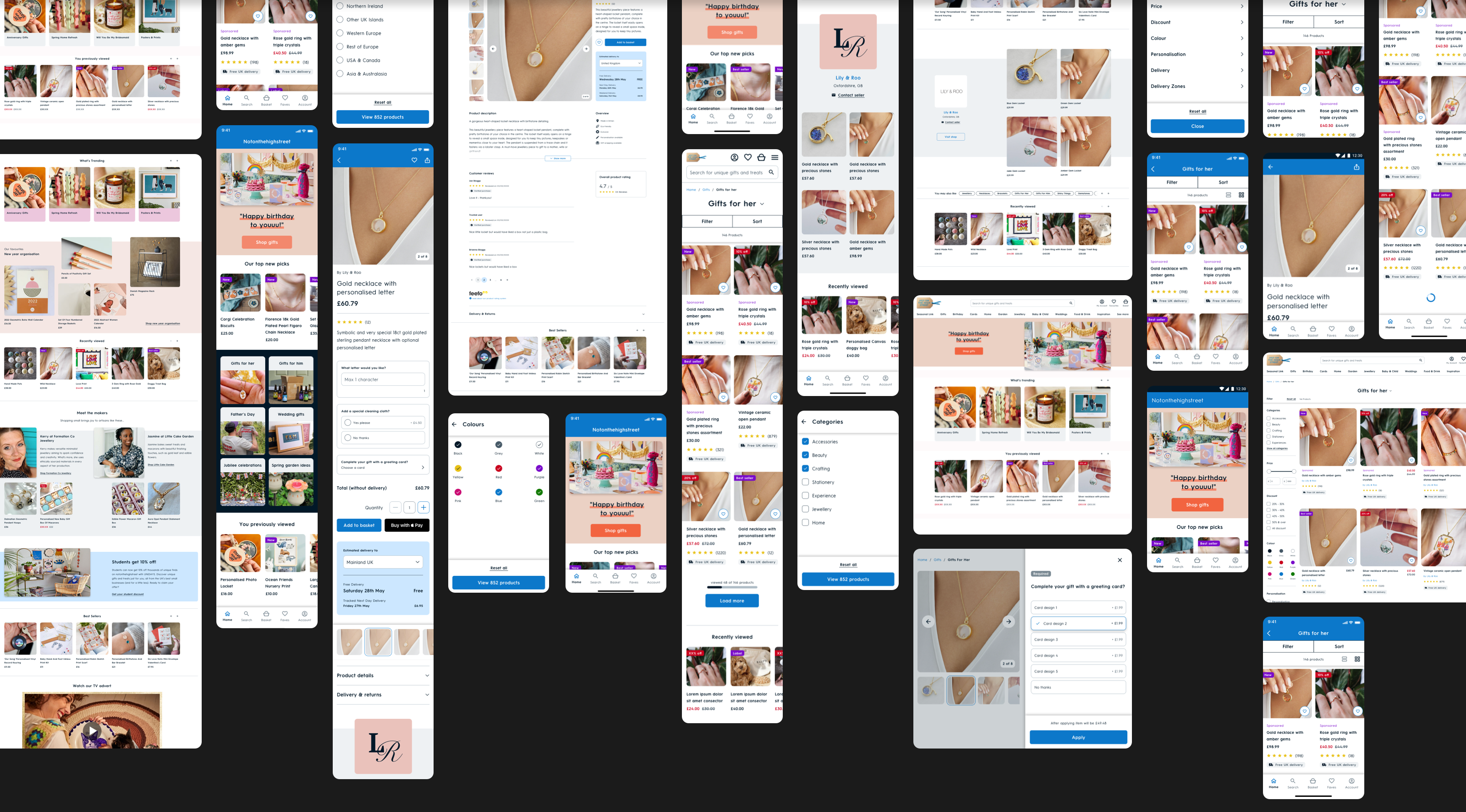
The uplift wasn't just a visual improvement brief, there was also a UX improvement slant to it too. We worked closely with the Product managers to identify which pages of the Product to uplift first. We chose the PLP and PDP to be first due to the high level of traffic they both receive, followed by the Homepage.
Our UX Research Team helped pinpoint which areas on each page caused our users the most grief - we went through that information with the Product team and chose what part of each journey to improve from a UX perspective.
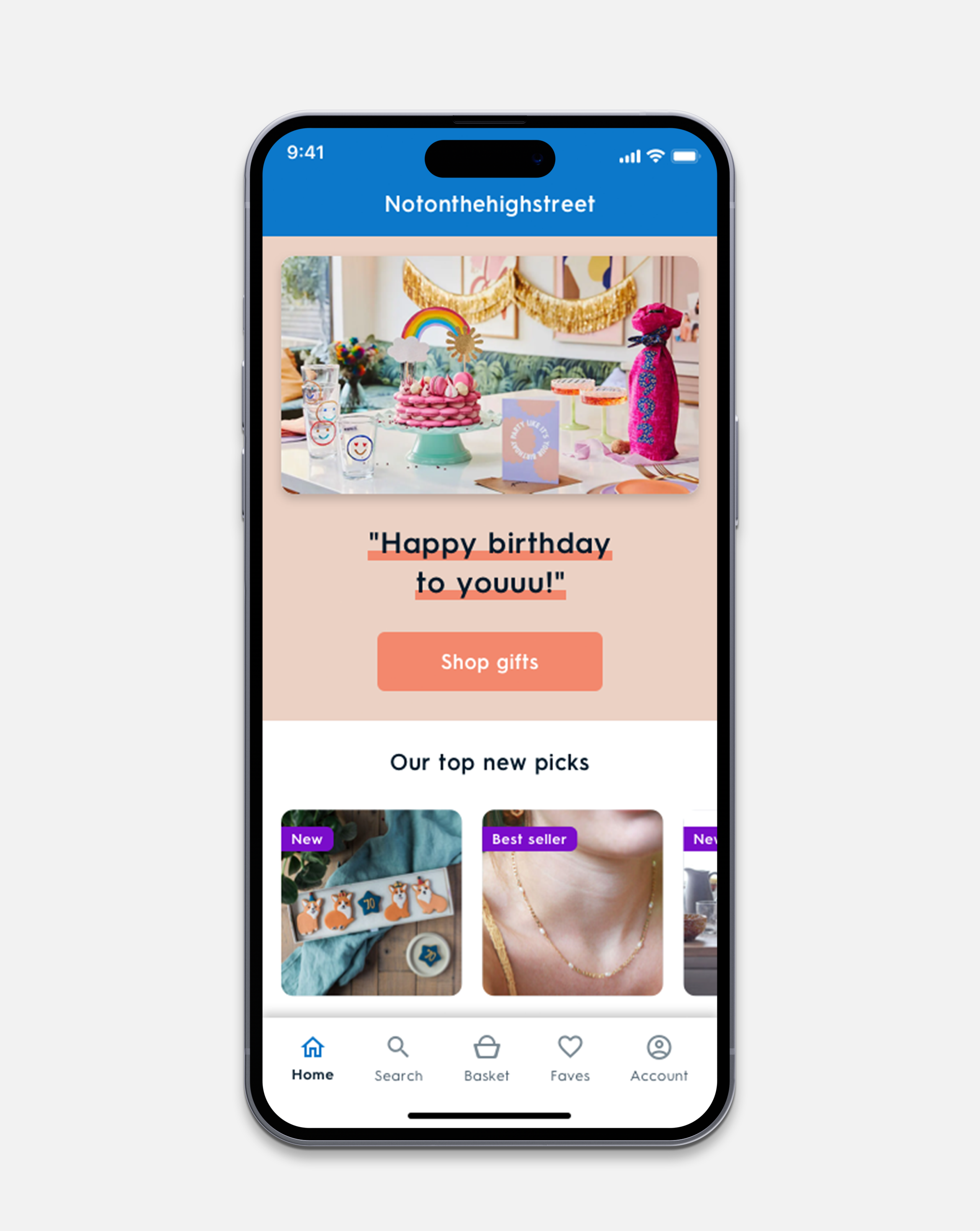
HOMEPAGE
Improve the UI and create enough differences between the components to break up the monotony that currently exists. Create a guide to help the Marketing Team use the new components without breaking brand guidelines.
ROLE
Supervisor
COLLABORATORS
Product Designer, Design Director, Product Manager. Tech Team, Marketing Team
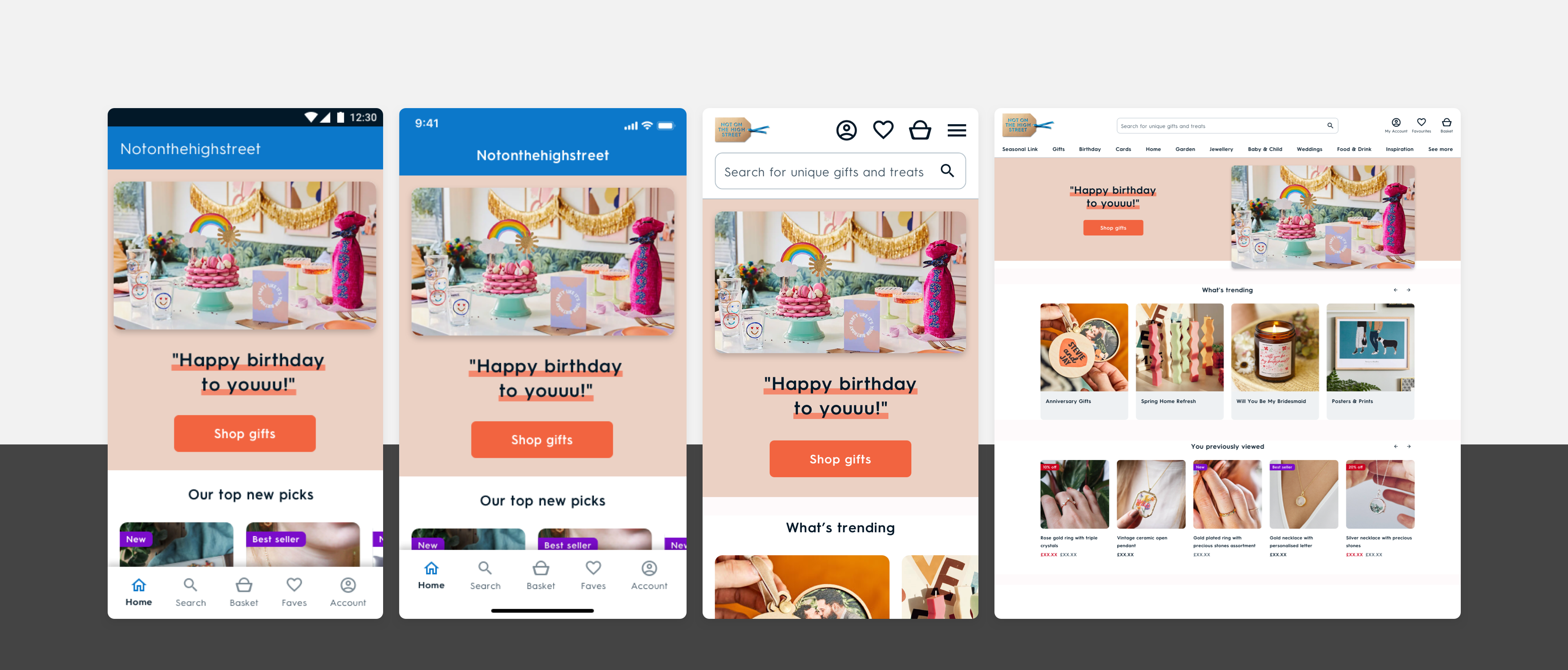
RESULTS
RESULTS
Flat trending positive
Website UX/UI updates - Home Solutions
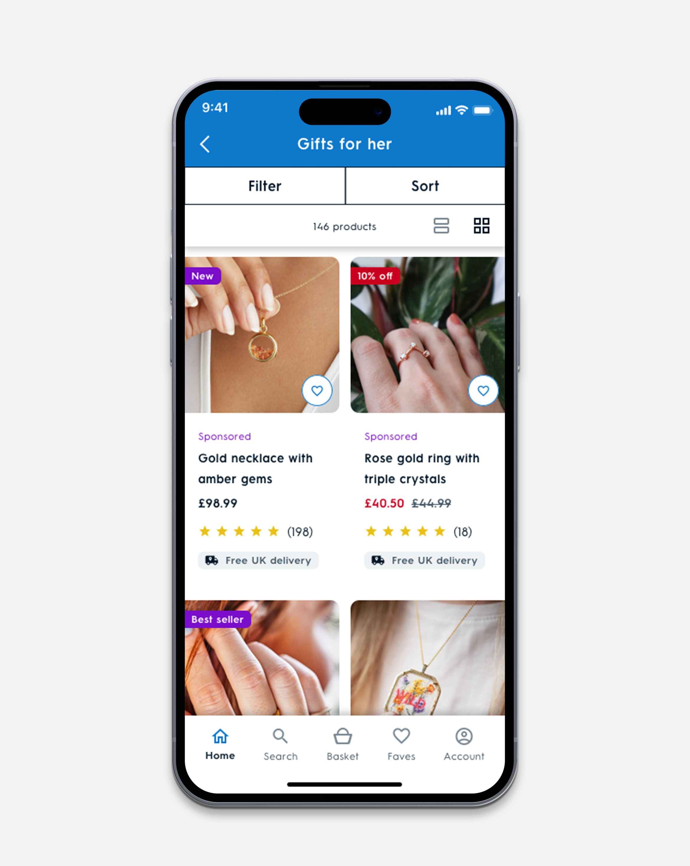
PLP
PLP
Unify the experience and allow for information to be digested easily. Help our users find what they want by improving our sort and filter across all platforms.
• Total visual overhaul of the page
• Redesign of Filter / Sort
• Update Search functionality
ROLE
Principal Product Designer
COLLABORATORS
UX Researcher, Design Director. Product Manager, Tech Team
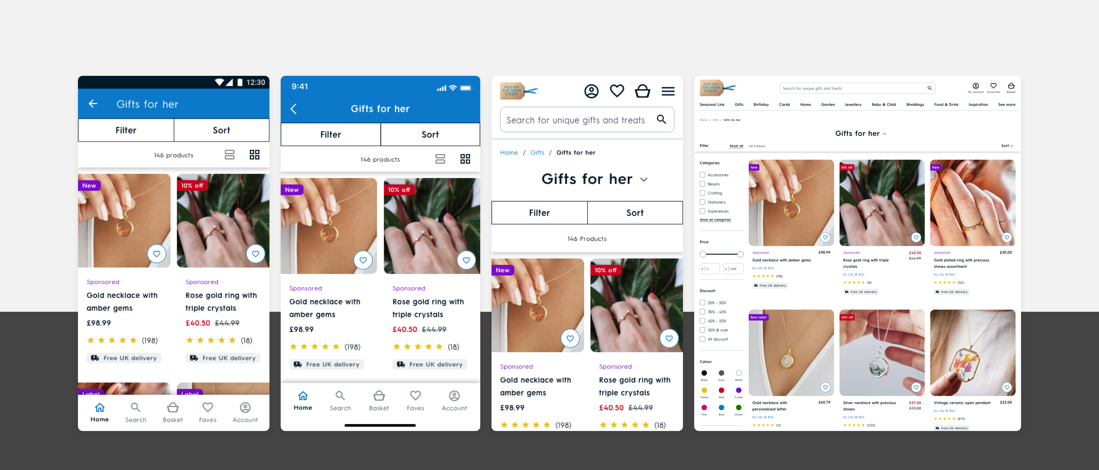
RESULTS
RESULTS
+1.47% CVR
+1.47% CVR
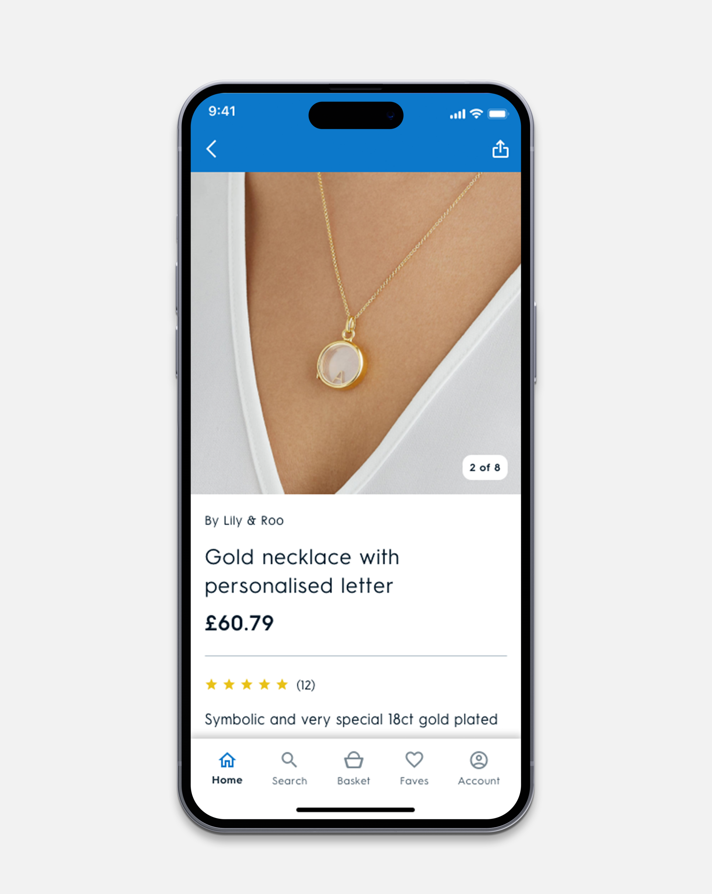
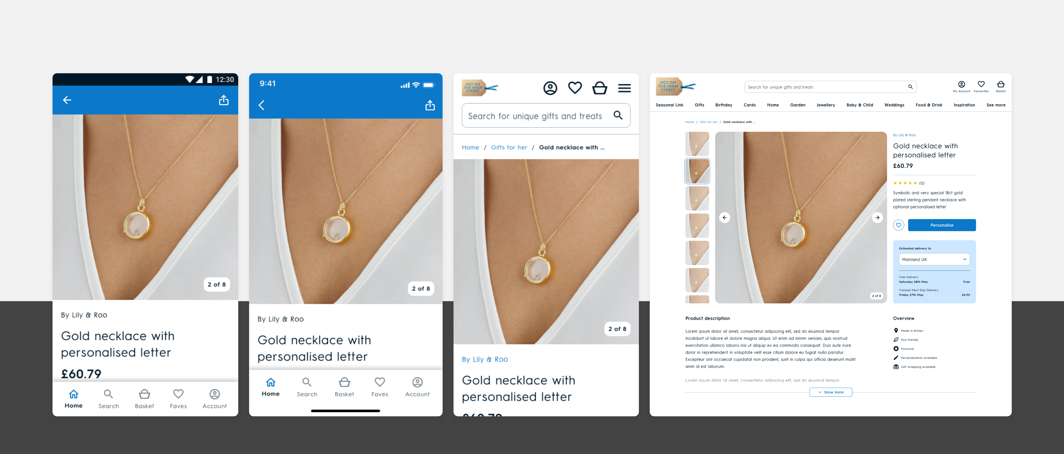
PDP
PDP
Unify the experience and organise the hierarchy of information. Make the personalise experience easier and more enjoyable to use.
• Total visual overhaul of the page
• IA re-org
• Redesign Personalisation
ROLE
Principal Product Designer
COLLABORATORS
UX Designer, UX Researcher, Design Director, Product Manager, Tech Team
RESULTS
RESULTS
+4.32% CRV
+4.32% CRV
PHASE 3
PHASE 3
REBRAND
REBRAND
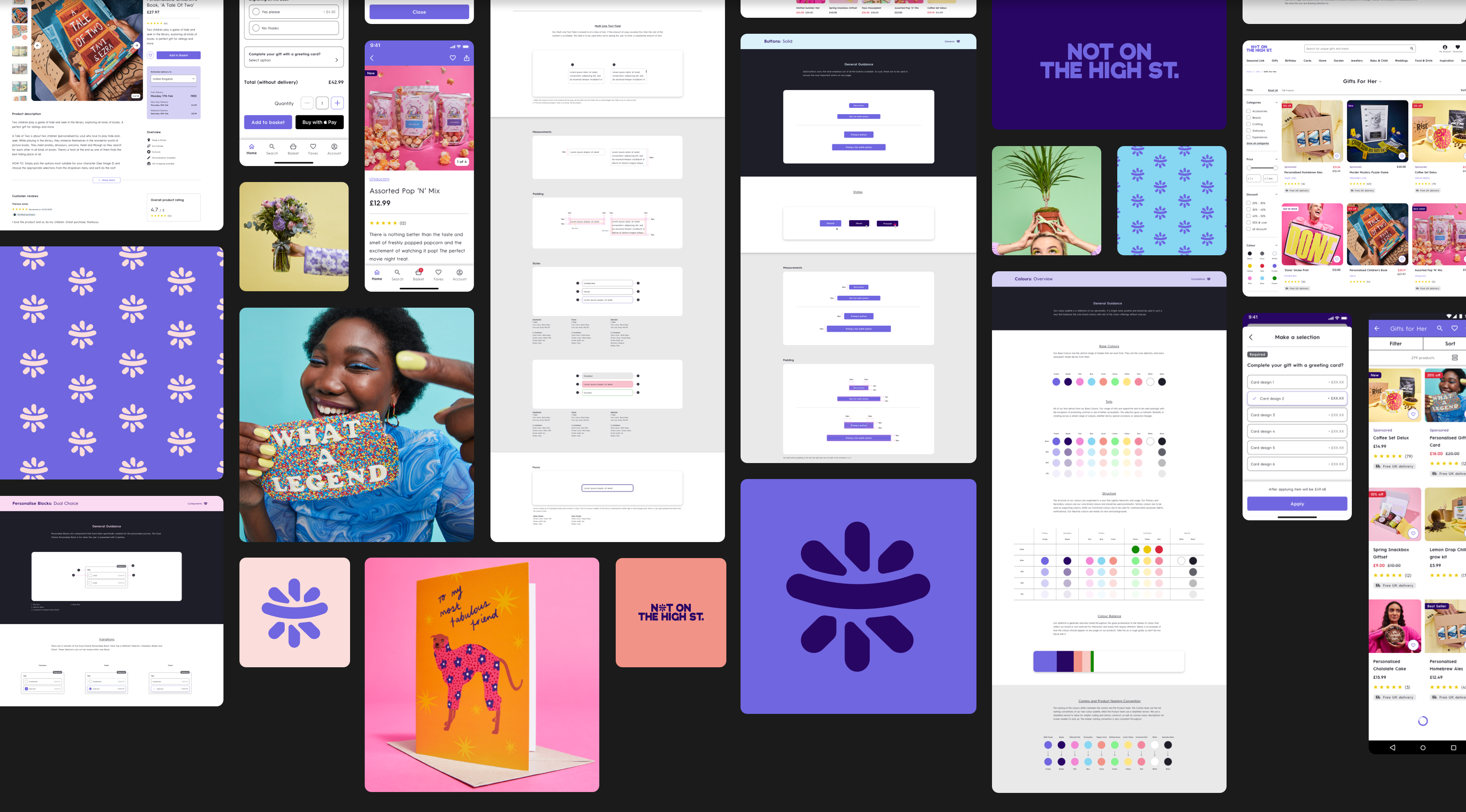
Whilst I didn't agree with the majority of the strategic or execution decisions regarding the rebrand, I still had a role as Principal Product Designer to ensure that the decisions taken by the business were at least presented in as best shape they could be. The agency supplied the in-house team with a small document outlining a shell of the brand direction and I was part of a small in-house team that helped align a direction more tangible for output, not to mention updating the Design Library and Guides to match the new brand direction.
Word Mark
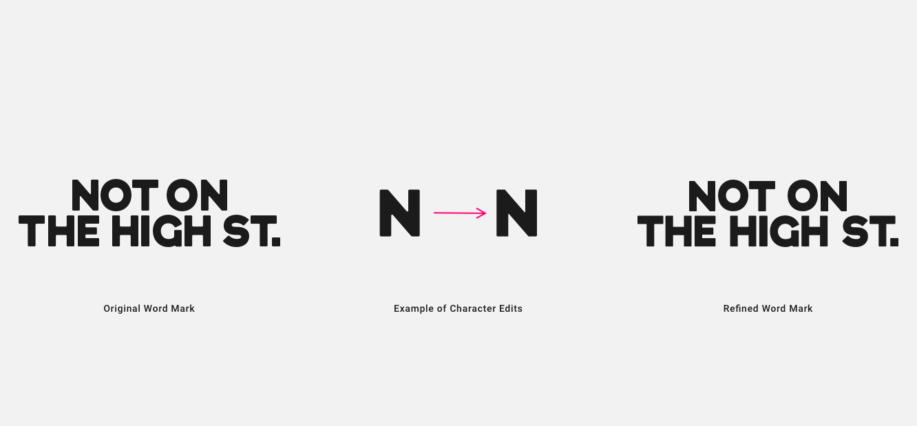
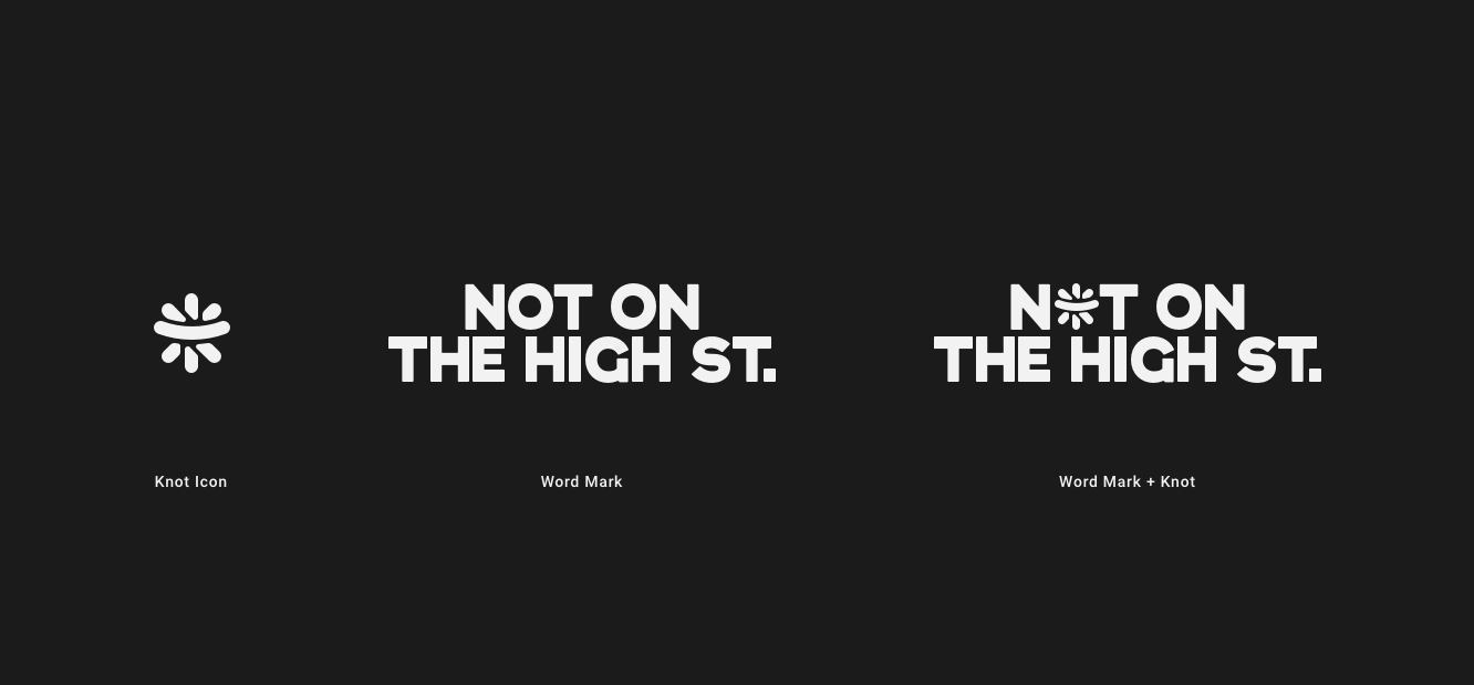
The Word Mark supplied was a basic unedited font typed out. By the time the mark reached me, it was too far down the road with regard to approval, so I couldn't make any significant updates to make it unique or ownable. I still wanted to make a cut of the mark to at least set it apart from the typed-out font that came my way. Edges were refined, curves were lessened, and in some areas, edges were hardened to make the mark legible in smaller scale. Kerning was tightened throughout.
Knot Icon
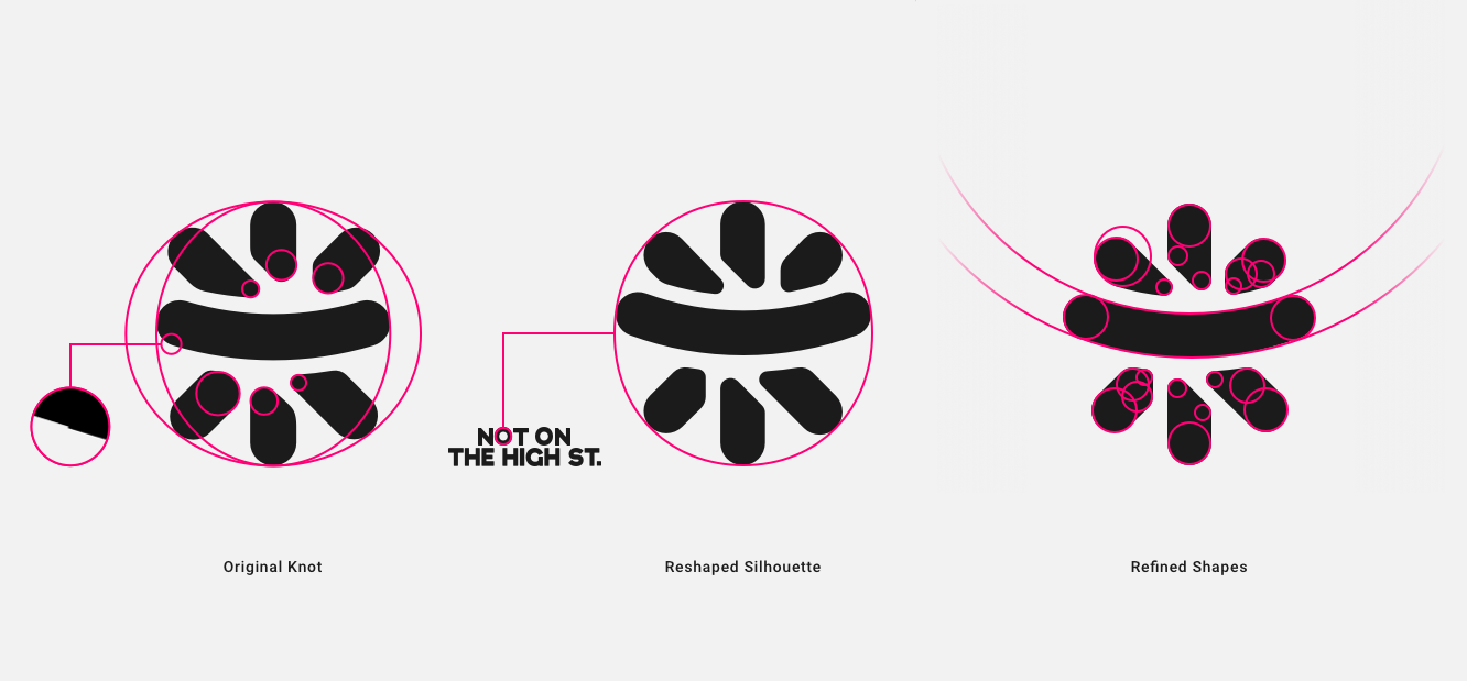
The Word Mark had a supporting asset called the 'Knot' which is inspired by a knot sometimes found on the top of a gift. The icon received from the agency needed some refining. The shapes had mishitting vertexes throughout and imperfect circular edges leaving the icon feeling a little unfinished. The overall silhouette had two containing shapes making it feel rectangular overall.
To improve the icon I took the shape of the 'O' in the wordmark and used that to construct the overall silhouette as well as using perfect circles to create the edges of the shape within.
Colours
The structure of the colours was already laid out from the creation of the Design System. Ideally, the rebrand would have taken that into account and created within that framework to allow a smooth transition and minimise a mammoth cross-team effort. Unfortunately, that didn't happen.

Pseudo-Semantic Colour System
The original Colour System created for the Design System followed a Pseudo-Semantic path, with a simple structure that offers enough variability to build from.

Agencies Colour System
What we received was a flat system with 4 primary colours (2 of which are neutrals), 5 secondaries and 4 functionals, all with no shades and most of which fail AA Accessibility Tests when paired together. Chuck in some questionable naming conventions...I'm looking at you, '2022 Purple' (year of writing: 2023). Oh, the irony of trying to be relevant and releasing something dated on launch.
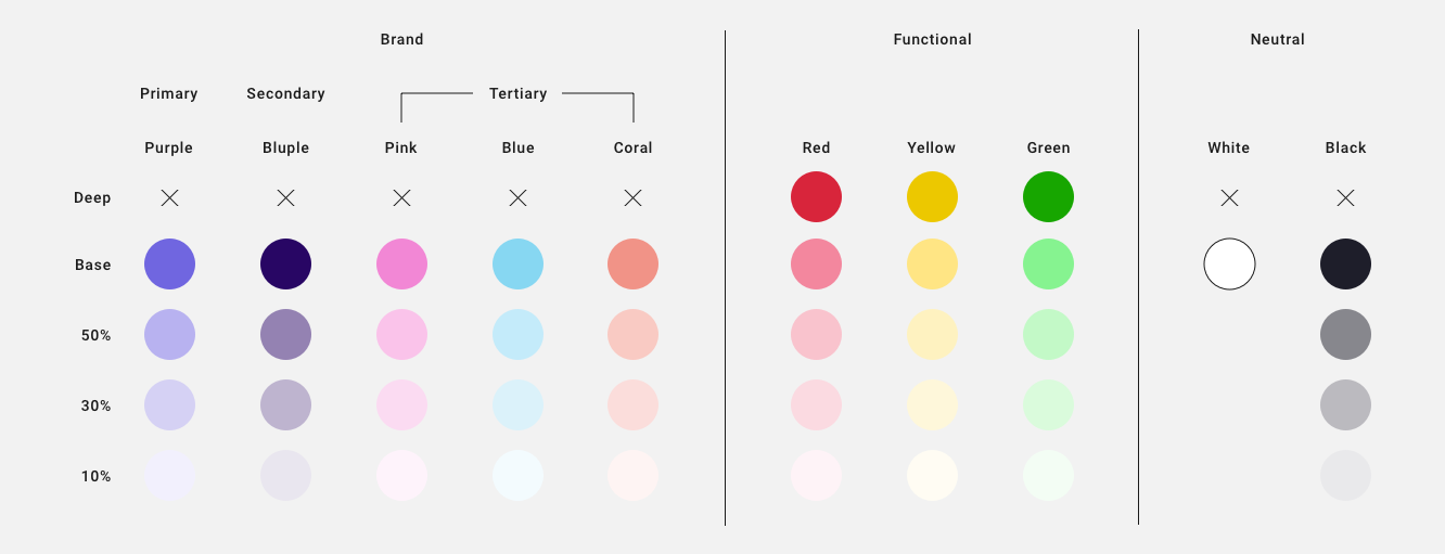
Reworked Colour System
Collaborating with the Marketing Team, my aim was to pull the colours into some kind of workable structure, closer to what we had initially - we rested on 3 pillars again, Brand, Functional and Neutral. The colours were tweaked to allow for a AA pass on as many pairings as possible and created a suite of shades for the Marketing Team to play with for a multitude of seasonal campaigns.
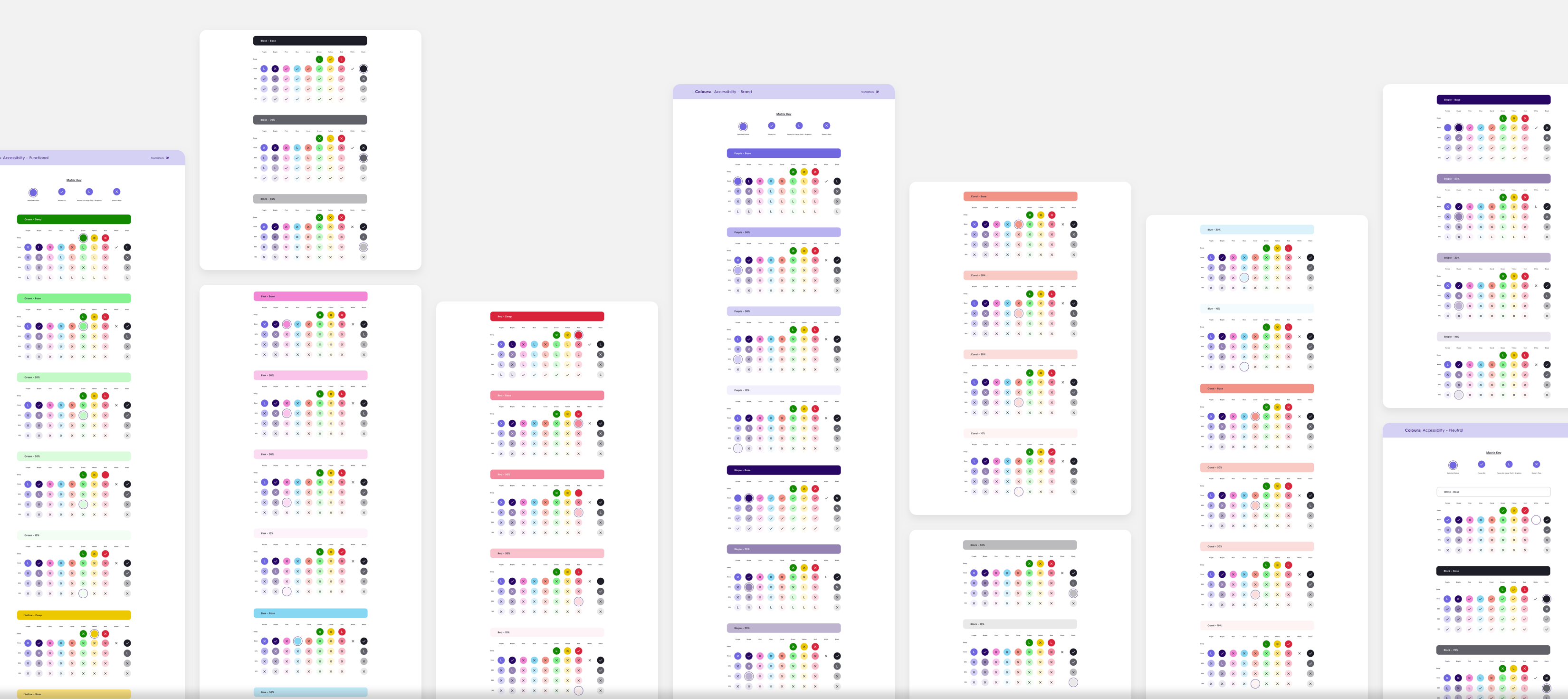
Colour Matrix
One of the challenges we faced as a team, was bringing a level of understanding that whatever we created had to adhere to Accessibility Standards. In a bid to take some of the strain of that learning process away, I created a Colour Matrix. This Matrix mapped out every colour and every perceivable combination, highlighting pairings that pass for text, graphics or fail.


Photography
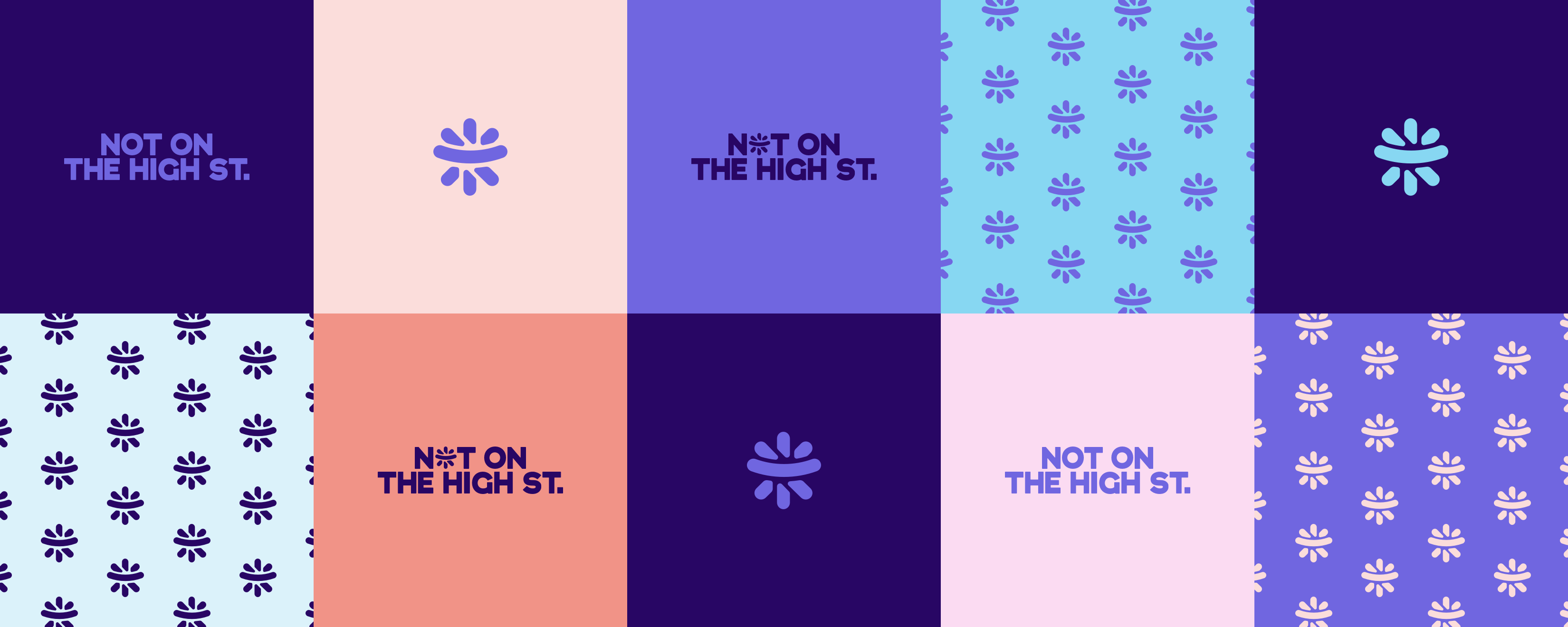
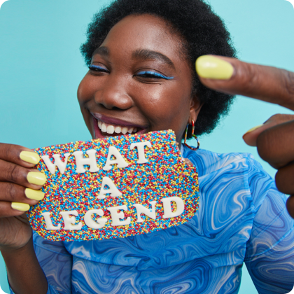
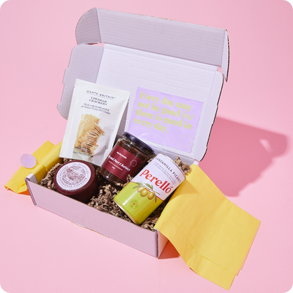
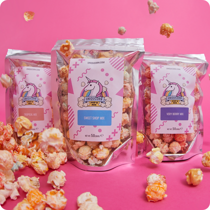
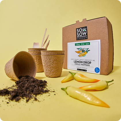
I didn't have any involvement in the photography but I've included it here to give a general feel for the brand and how the use of colour is reflected in imagery.
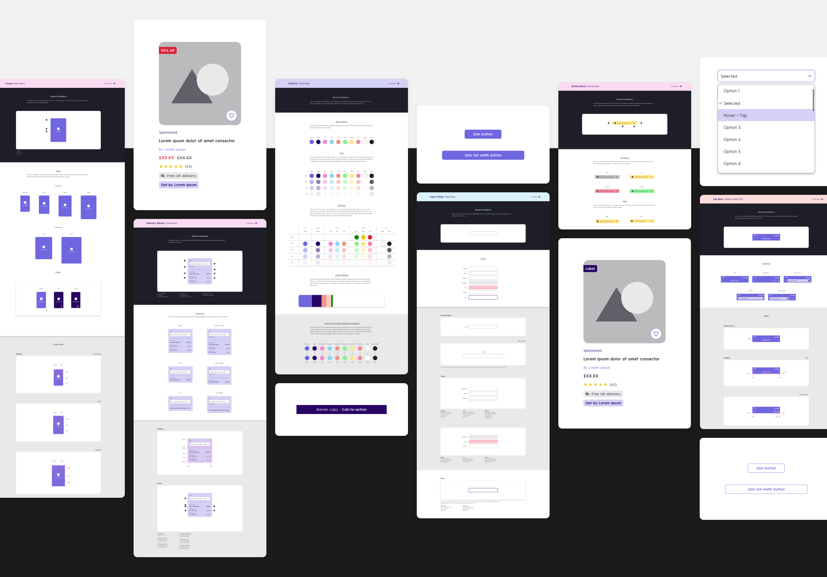
Updating the Design Library & Guides
With all the basic assets refined, we were ready to update every asset in the Library. This was a big task, as it required restructuring the organisation of the colours and how they are linked to the assets in the Library. Collaborating closely with the Development and Product Team we achieved a total update at a good pace - a success in the face of adversity and with solid foundations set, the business can step towards developing the brand further.
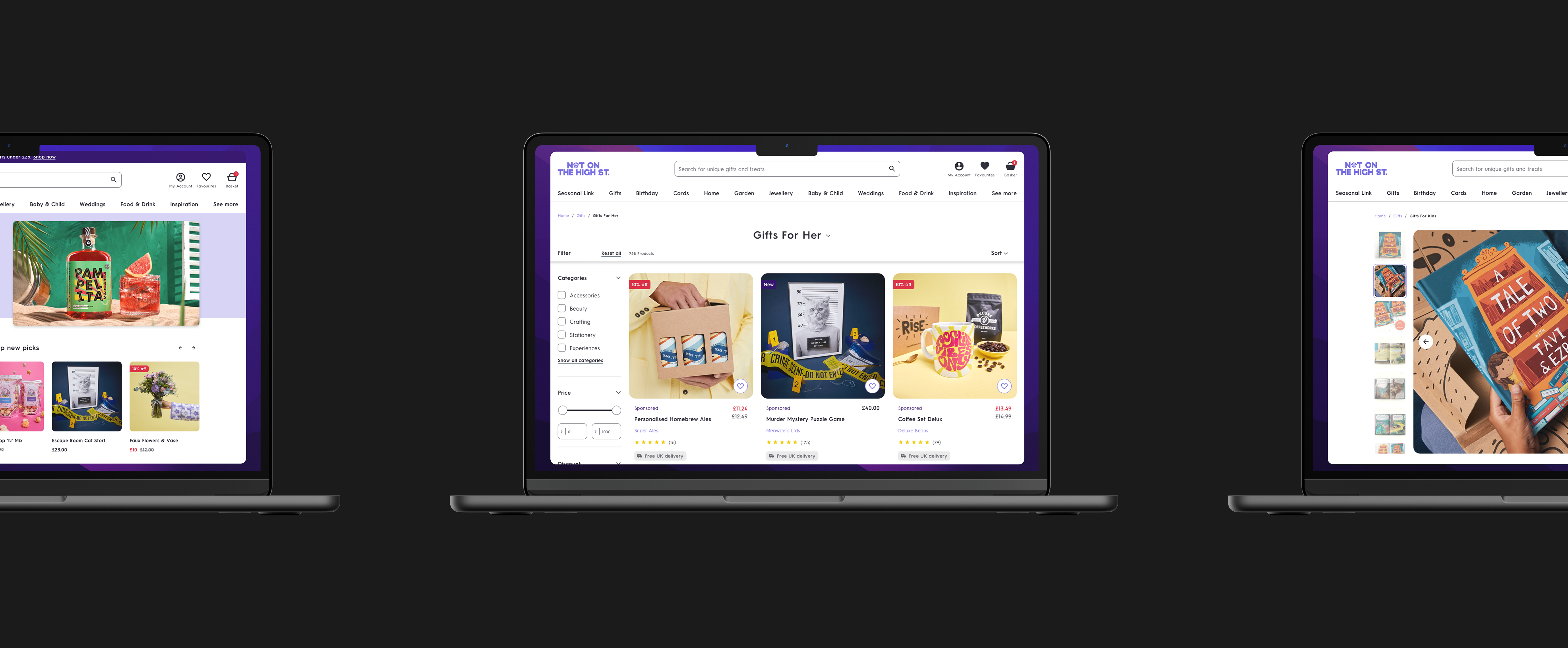
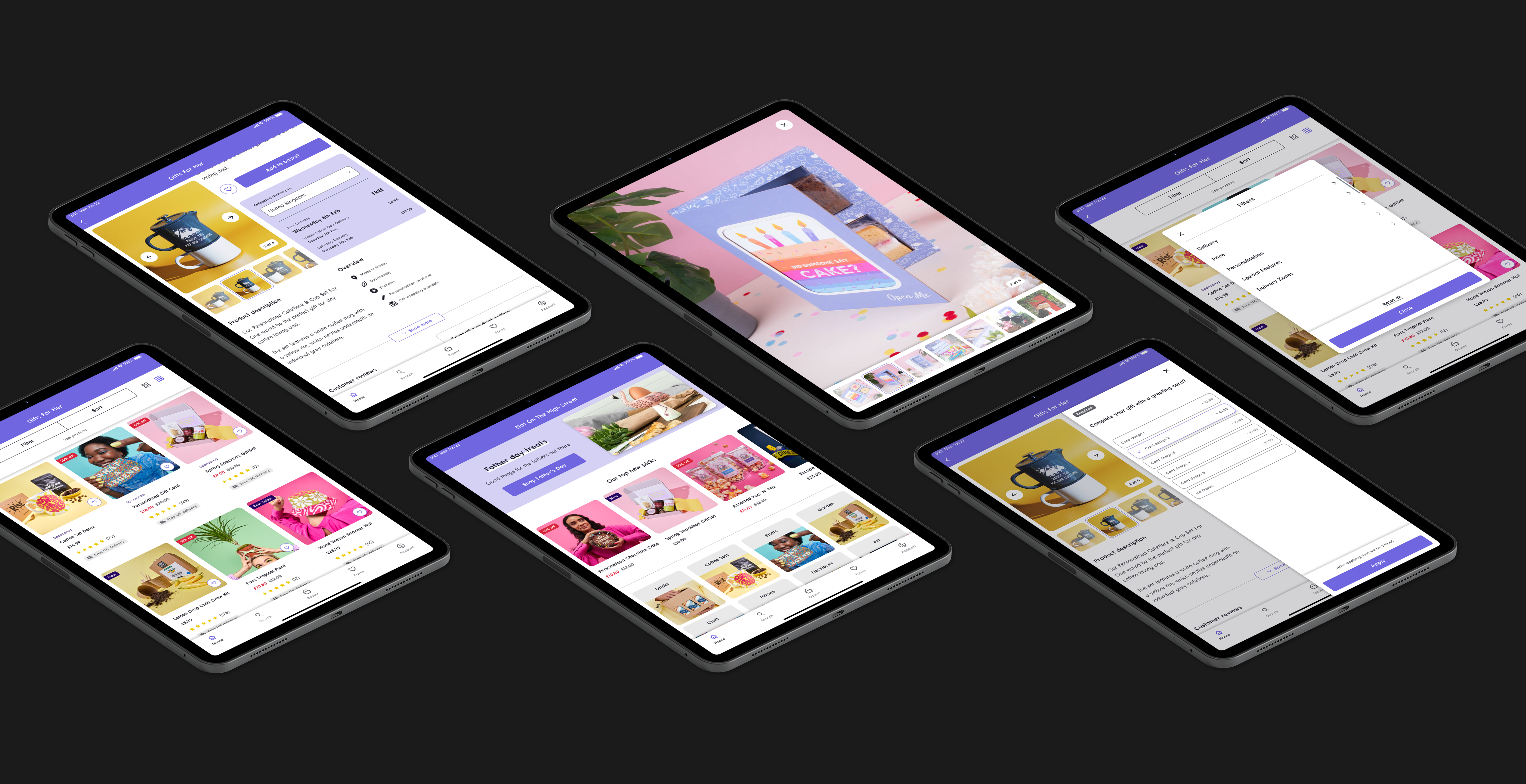
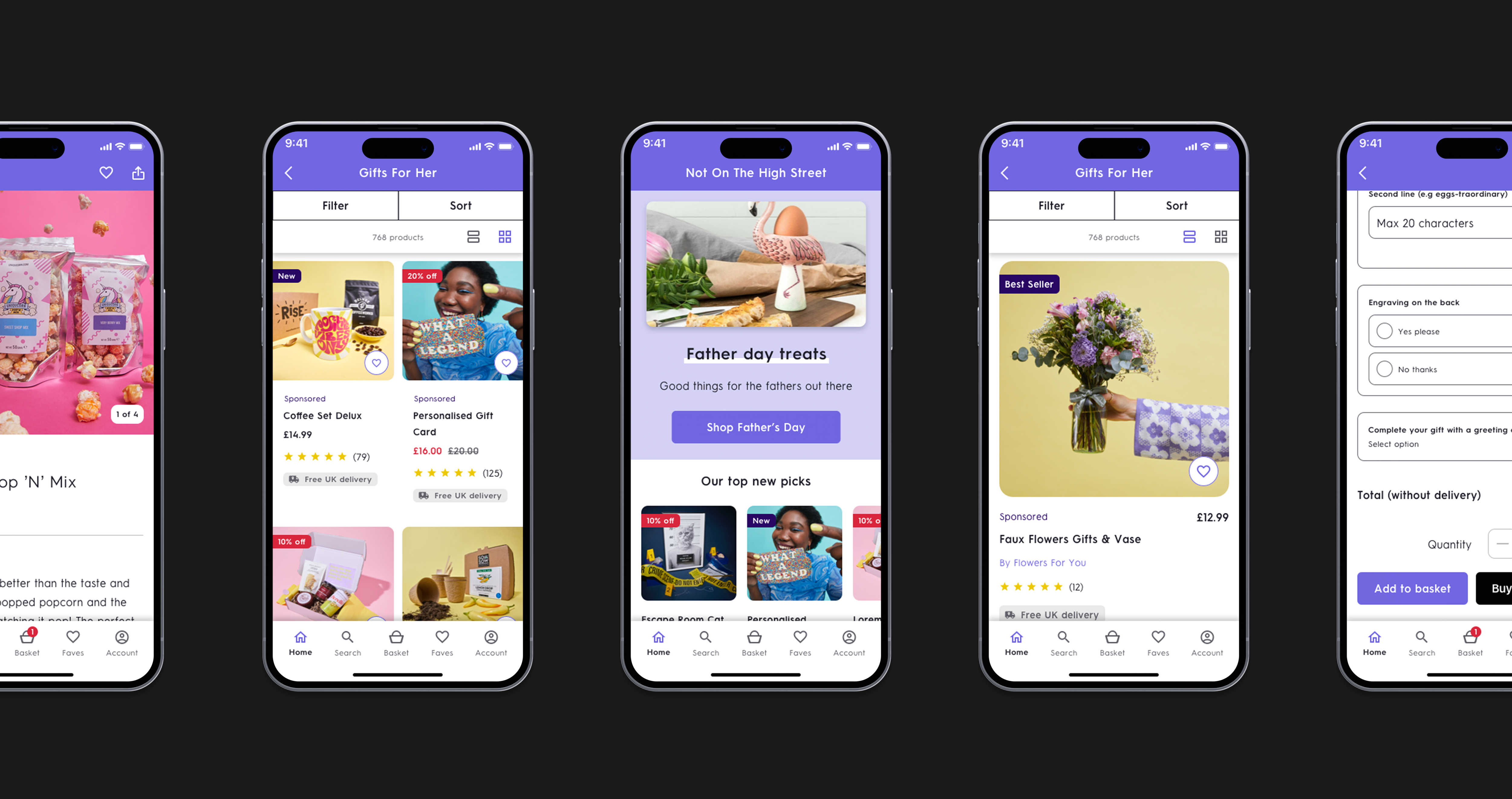
NEXT PROJECT
Get in touch and let’s make something great together
Visit my shop and check out my prints
All work © 2023 James kingman
All work © 2023 James kingman
All work © 2023 James kingman