PROJECT
Cross-brand Design System & Product Update
CLIENT
John Lewis
ROLES
Strategy, Direction, UX, UI
The John Lewis Home Improvement business was entering a new phase of its existence. Currently comprised of two separate businesses, Home Solutions and Opun, the JL Home Improvement team want their products to be developed further to meet the ever-growing demands of their customer base.
CROSS BRAND DESIGN SYSTEM
CROSS BRAND DESIGN SYSTEM
Brand research
After conducting research into who Home Solutions and Opun are as brands, who their customer base is and what the businesses meant to them. The results showed a mismatch in expectation and delivery of their online behaviour and how they visually came across to the general public in comparison to John Lewis and Partners. There was further confusion with regards to how the Home Solutions and Opun brands were connected to each other, and in some instances, disbelief that they were connected to JLP at all.
Competitor research
Competitor analysis was conducted and it became clear that other brands out there had a defined visual identity that matched the grade of their output or USP. Whilst the delivery from Opun and Home Solutions was of a high grade, how they represented themselves online did not reflect the quality of output and pricing of their service. This created missed opportunities from customers who were looking for high-level service and brought in queries from customers that were below the budget of the businesses output.
Design Roadmap
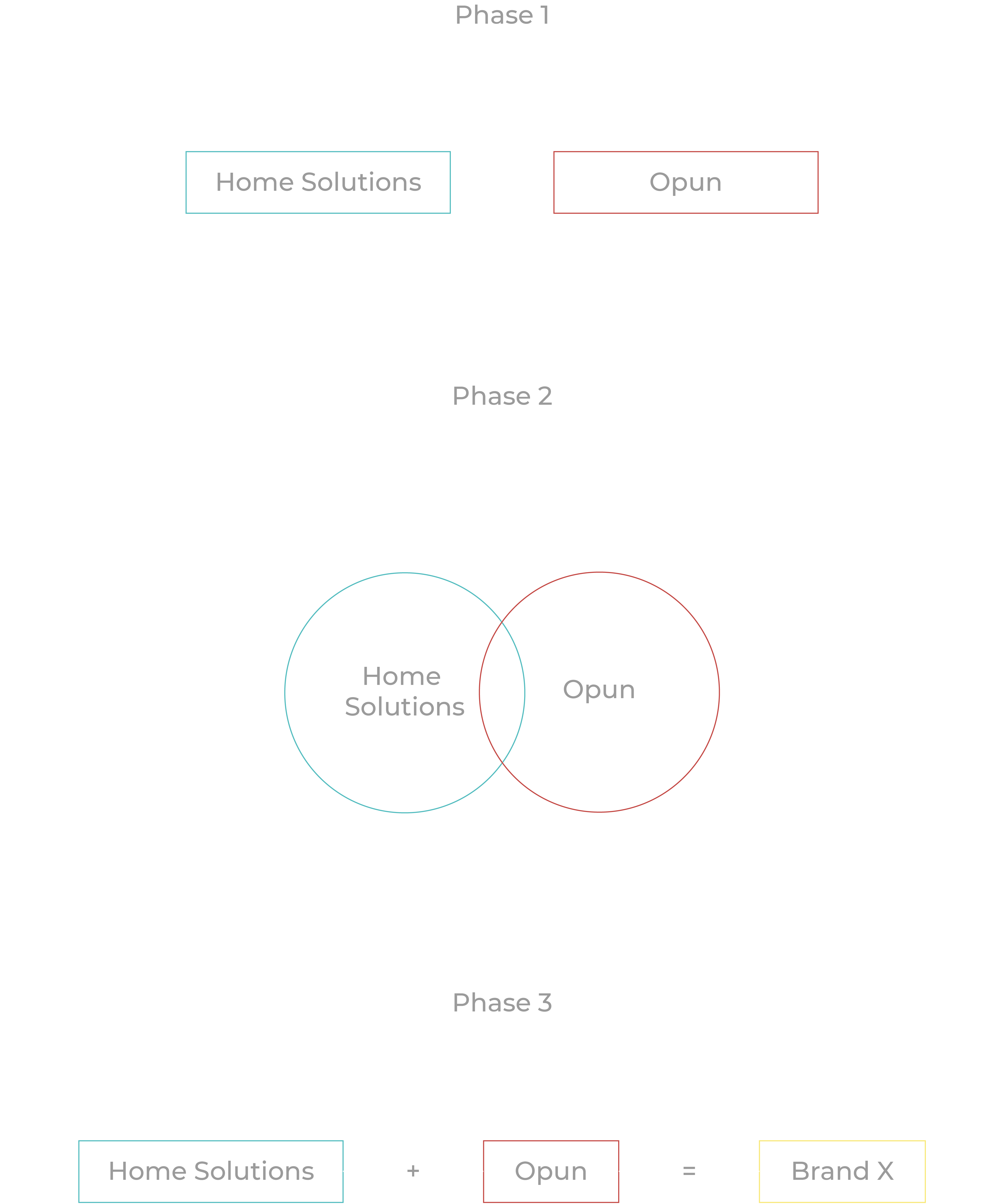
The roadmap was split into 3 clear phases. Phase 1 was already in motion in which both products were out in the wild and operating.
Phase 2 would focus on clearing the confusion of how Opun and Home Solutions were connected to each other and JLP whilst being visually improved to match the quality of the businesses output.
This alignment of brands would serve as a starting point for phase 3, where both brands would merge into one business proposition and entity.
Design system audit
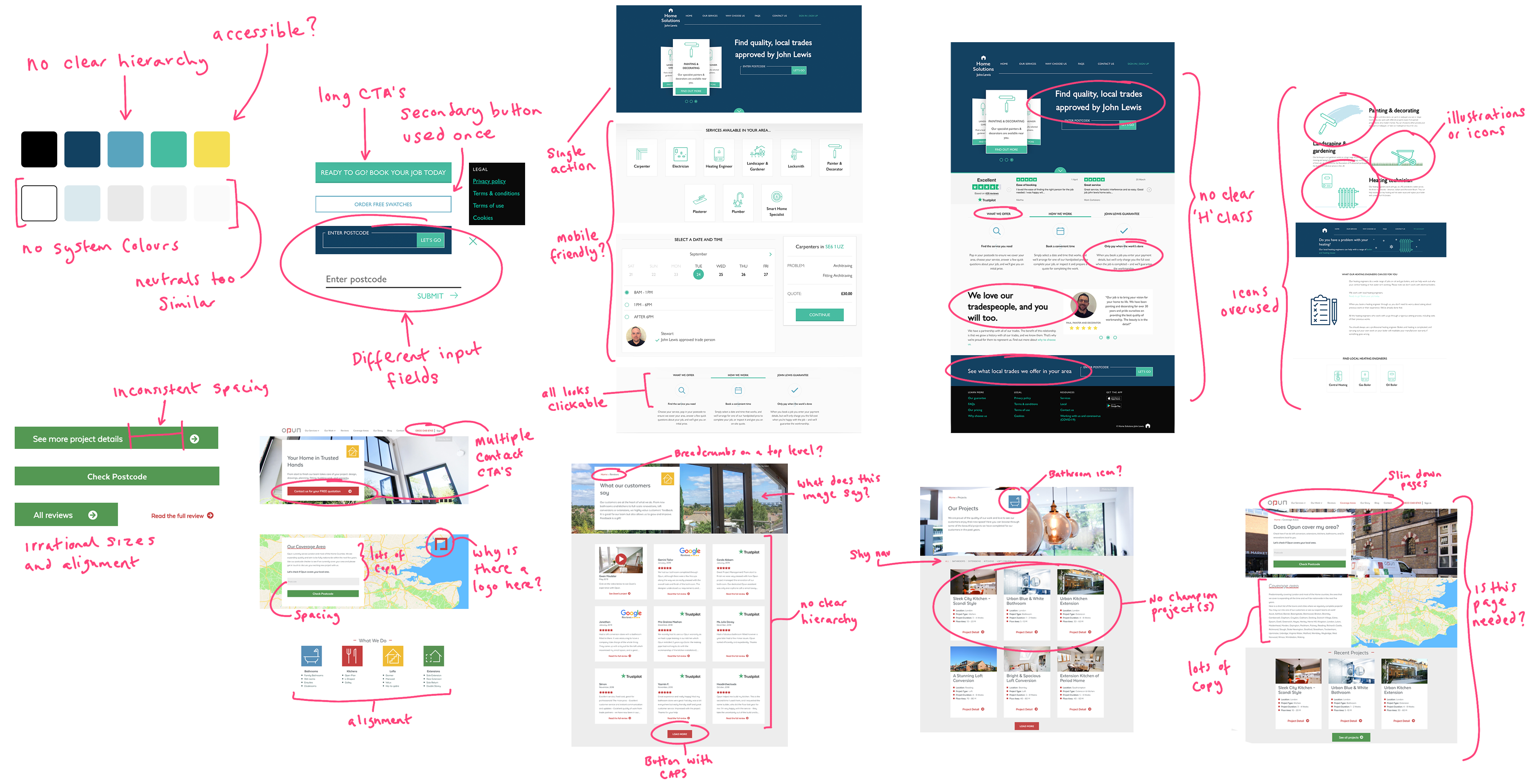
A full, frank design audit was carried out of the main digital experience and all supporting collateral. The insights shined a light on a very confused, unorganised brand that lacked clarity and consistency in all executions. This created all kinds of problems when it came to the rapid production of simple executions and briefing design teams internally or externally to carry out even the simplest of tasks efficiently.
Home Solutions
From a digital context, we needed to understand the breadth & variation of components that were currently being used across our digital estate. We took time to highlight every component in circulation and its usage. This search unearthed inconsistencies at a molecular level that required attention.
Opun
Similarly, with Opun, the audit brought several issues to the fore. Whilst the components in use were more succinct and organised, the amount available for usage was limited making the flow repetitive and easy to miss on important information. To add to this, the amount of copy in each component was too high in almost every case. It was clear that in Opuns case IA and triaging was a key issue, rather than the core components in use.
Similarly, with Opun, the audit brought several issues to the fore. Whilst the components in use were more succinct and organised, the amount available for usage was limited making the flow repetitive and easy to miss on important information. To add to this, the amount of copy in each component was too high in almost every case. It was clear that in Opuns case IA and triaging was a key issue, rather than the core components in use.
Design system strategy
The process of creating unique design systems for each brand needed consideration, especially as there were caveats around the length of time these systems would exist for and the design task of bringing the two brands somewhat together.
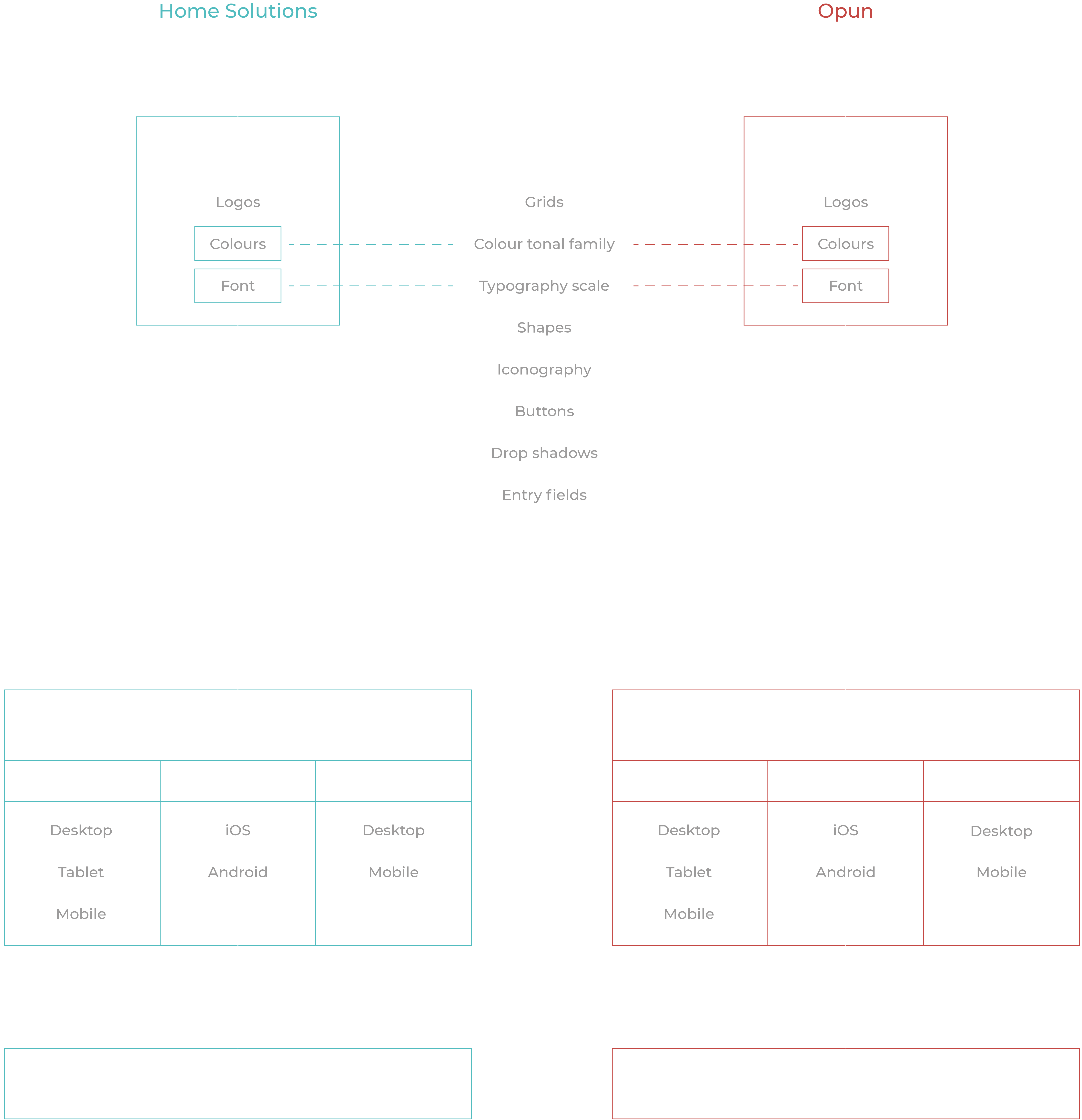
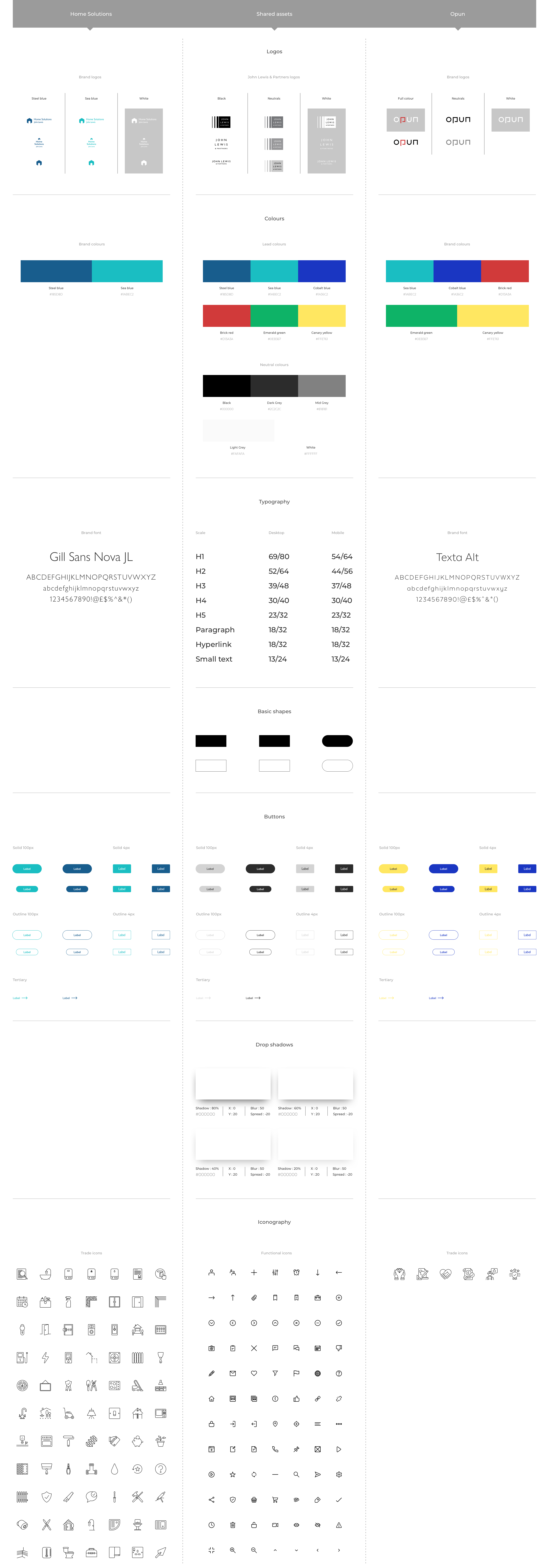
The strategy involved producing a middle ground of assets from which both brands would access. This would serve as a connection of the brands on a molecular level.
An overarching palette would be created that each brand would have its own lead brand colours, this would also serve as a tie-in. Each brand would also use its own brand font but share the same type scaling.
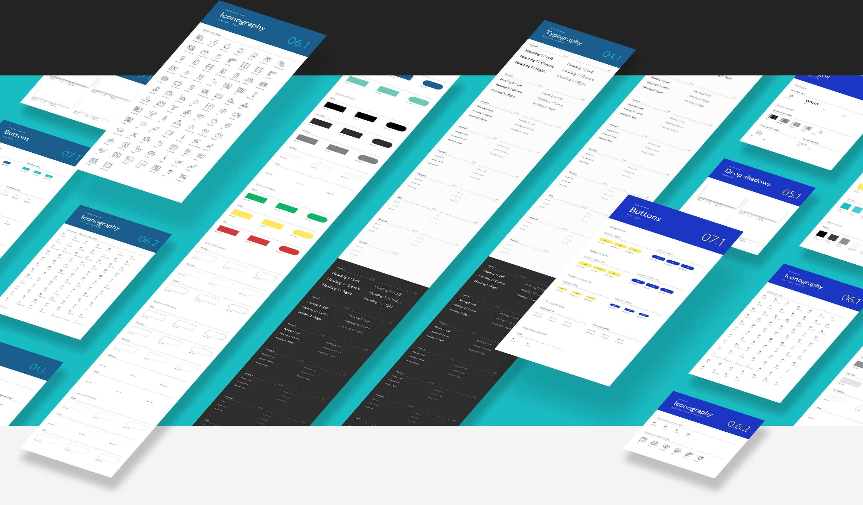
Design library
A library is not a design system but a design system is nothing without a well-constructed library. Design libraries are the engine of a design system and are the one thing a designer will have the most contact in their day-to-day, making it of critical importance for any design team to operate efficiently.
The JLHS library has been built with practicality, scalability and flexibility in mind. Correctly filed assets allow our designers to quickly find what they are looking for and executions for each instance allows for unique symbols to be used for any occurring situation with minimal need to breakdown symbols or rework an asset to suit minor changes within new designs.
Nested symbols are used throughout to allow flexibility of change at a root level if and when the time is needed and the file structure allows for growth in the library as new assets and components are created.
WEBSITE UX/UI UPDATES (HOME SOLUTIONS)
WEBSITE UX/UI UPDATES (HOME SOLUTIONS)
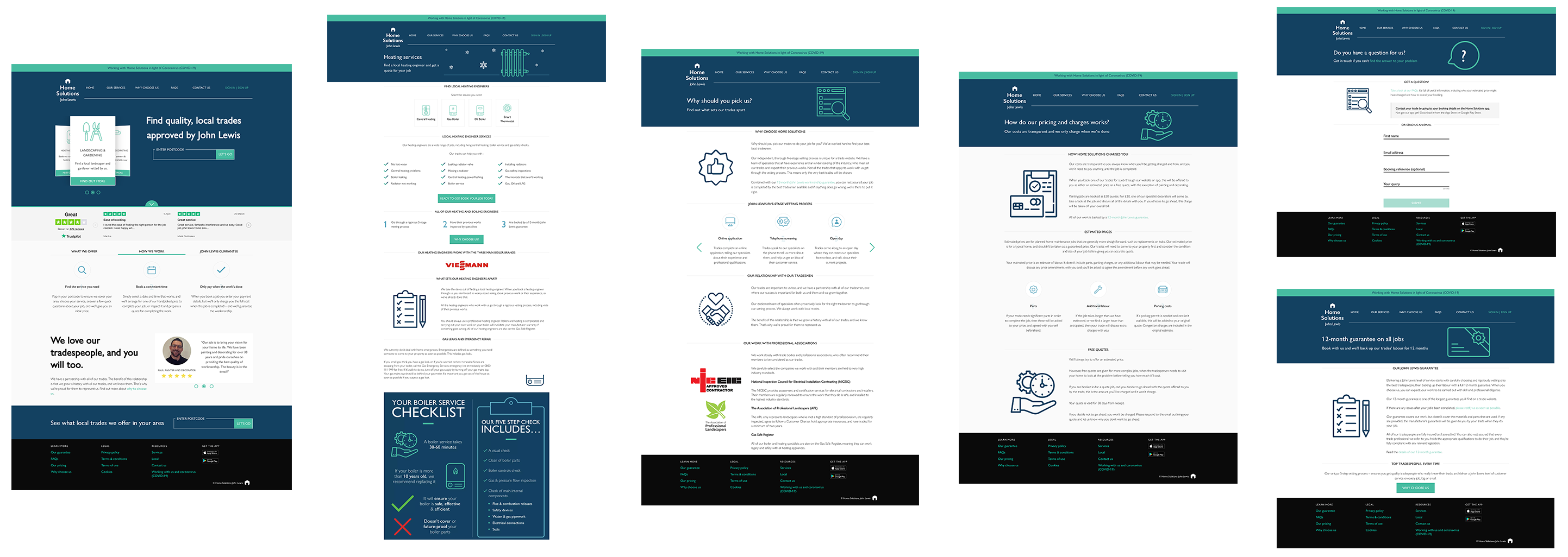
An audit of the HS website unveiled a worrying combination of unnecessary bloating of content, as well as holes where important information would be required. Generally, the booking journey functioned to a satisfactory level and whilst would need optimisations at a later date, the immediate focus would be needed on the hierarchy of information and simplicity of communications throughout the site.
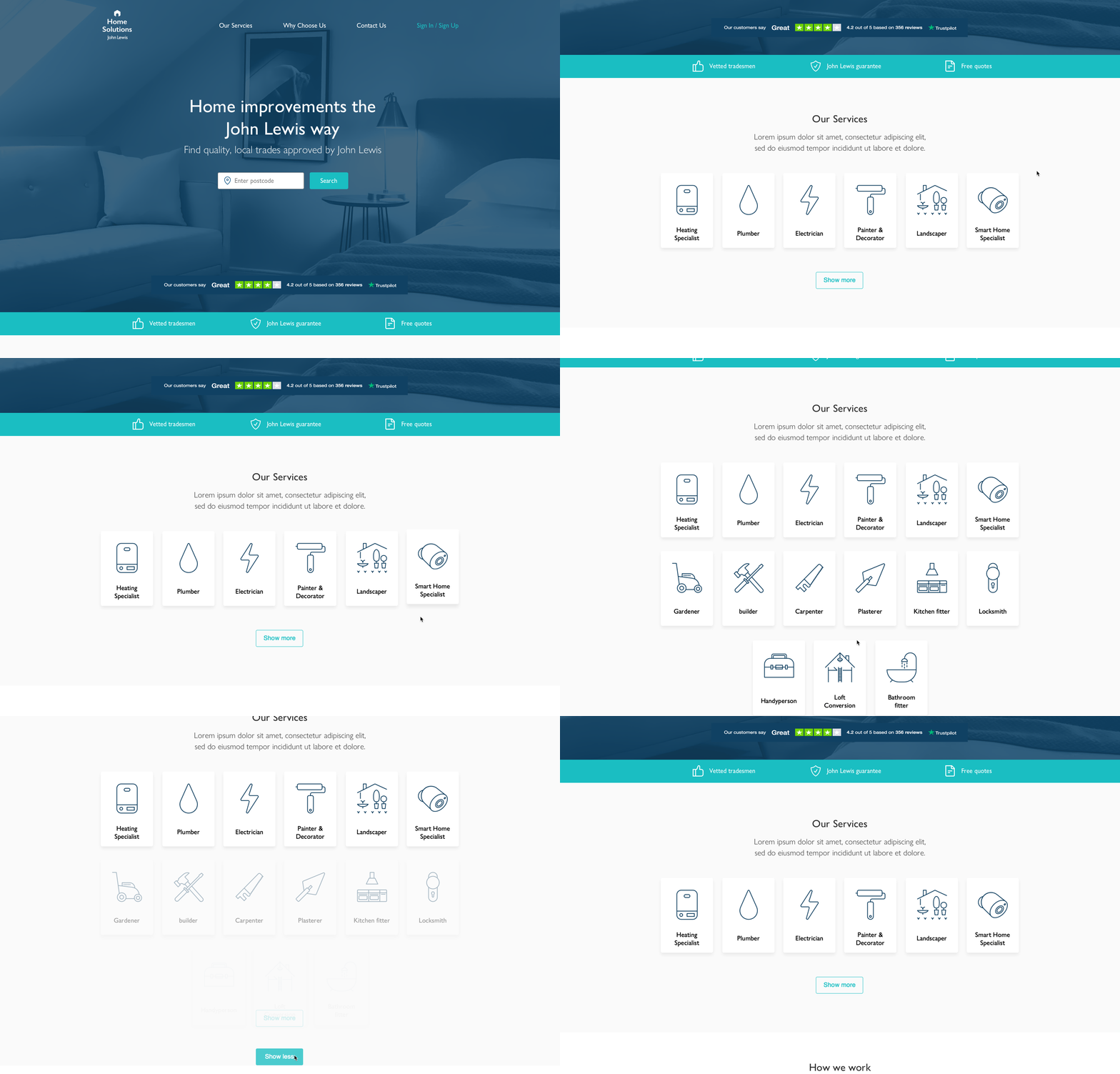
Home page re-design
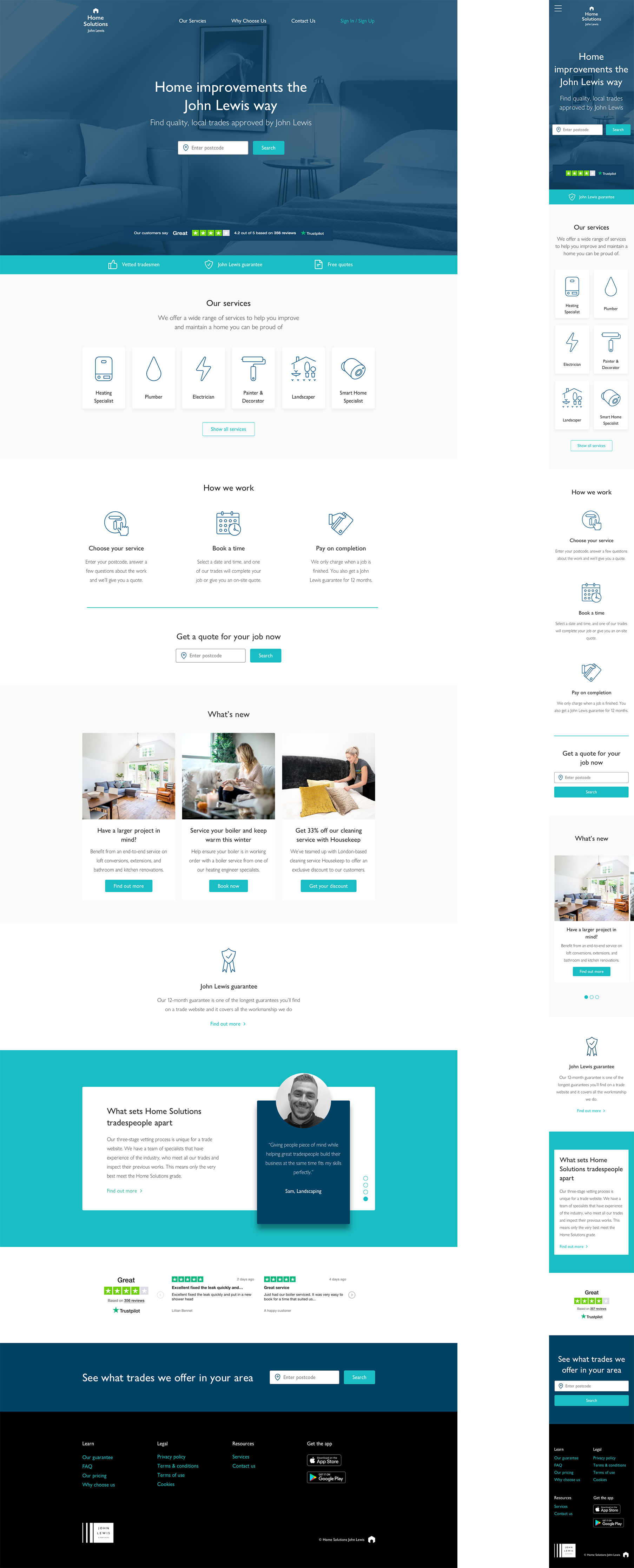
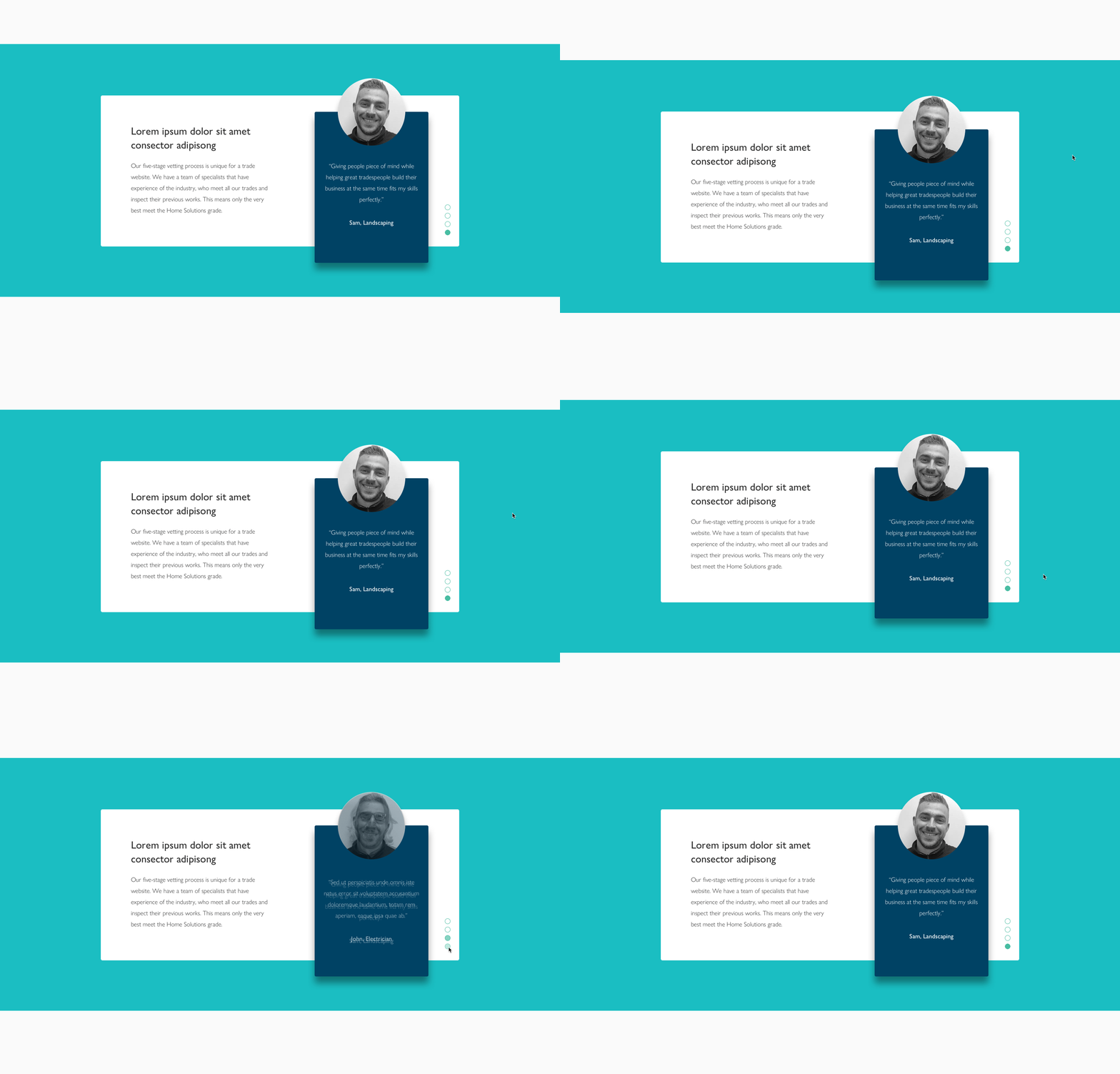
The navigation has been streamlined and the real-estate it takes up reduced. The CTA on the hero has been focused to a single proposition with the addition of reduced peer validation from Trust Pilot. A strip to highlight business validations has been added below to further support any initial interest from the user.
Home Solutions most popular services are surfaced in a new component that expands to show all services - In a future update, this will be personalised to the user's interests.
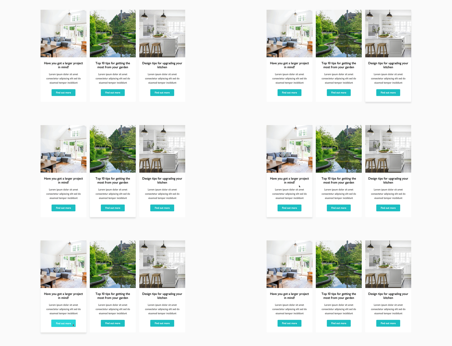
The simplicity of how the booking process operates is communicated succinctly and there is now an additional component for marketing purposes.
Why choose us re-design
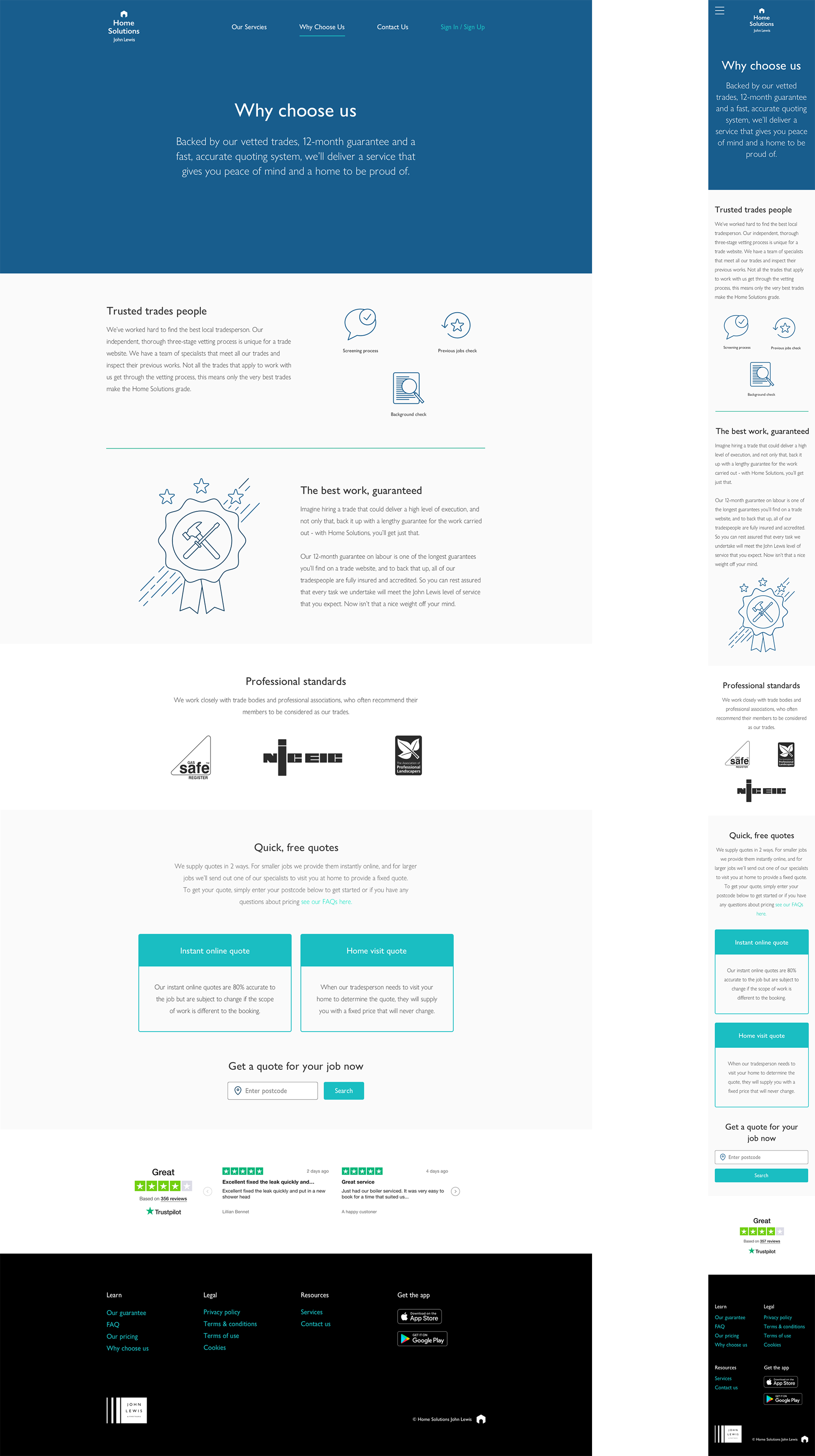
The 3 pages that this section consisted of originally has been reduced to one. The hardest part of this update was to describe in one sentence why you, the customer, should choose us. This piece of writing, as small as it is, has done most of the heavy lifting that the 3 previous pages attempted to achieve.
The rest of the content on the page is focussed on giving more detail on the core business selling points, along with a simplified communication of the pricing, which previously was convoluted to say the least.
WEBSITE UX/UI UPDATES (OPUN)
WEBSITE UX/UI UPDATES (OPUN)
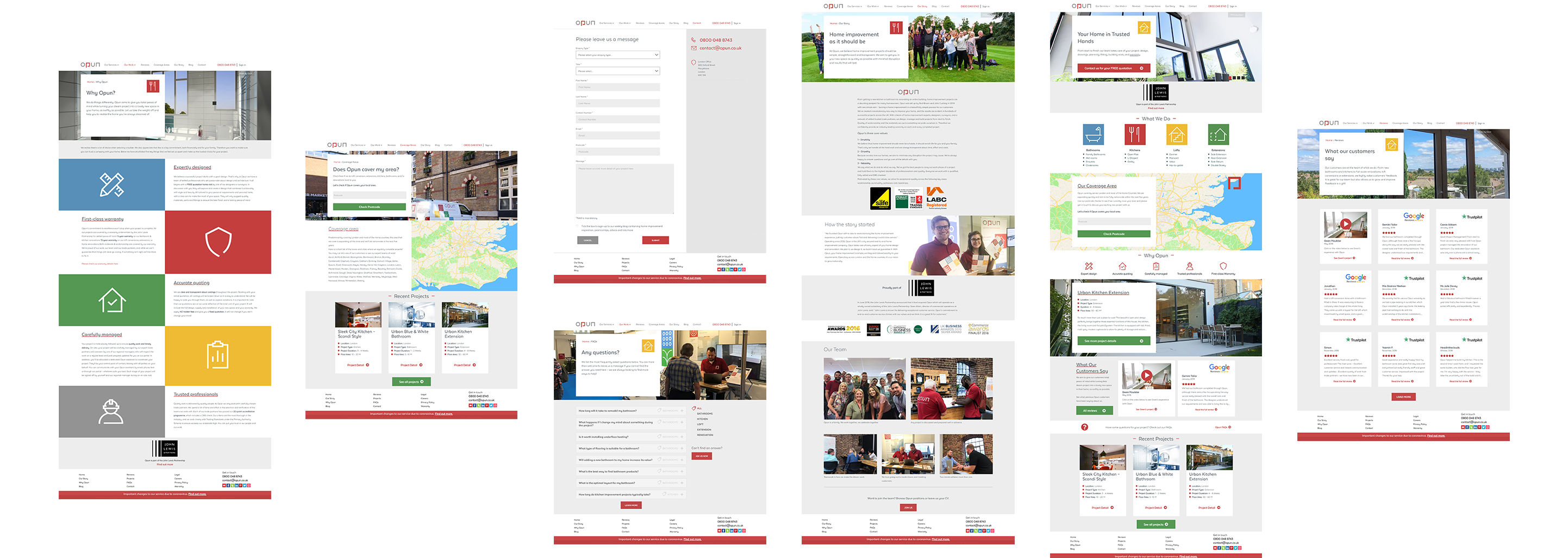
The Opun website suffered similar issues to Home Solutions. Heavy amounts of content made it hard for any user to extract what was important to them and made navigating through the site a chore. There were too many pages, often with outdated content due to a lack of internal capacity to maintain.
After conducting several workshops we gained further insights into the fact that the original booking method was yielding poor quality leads that put a strain on the sales team, hindering the ability to close on legitimate projects.
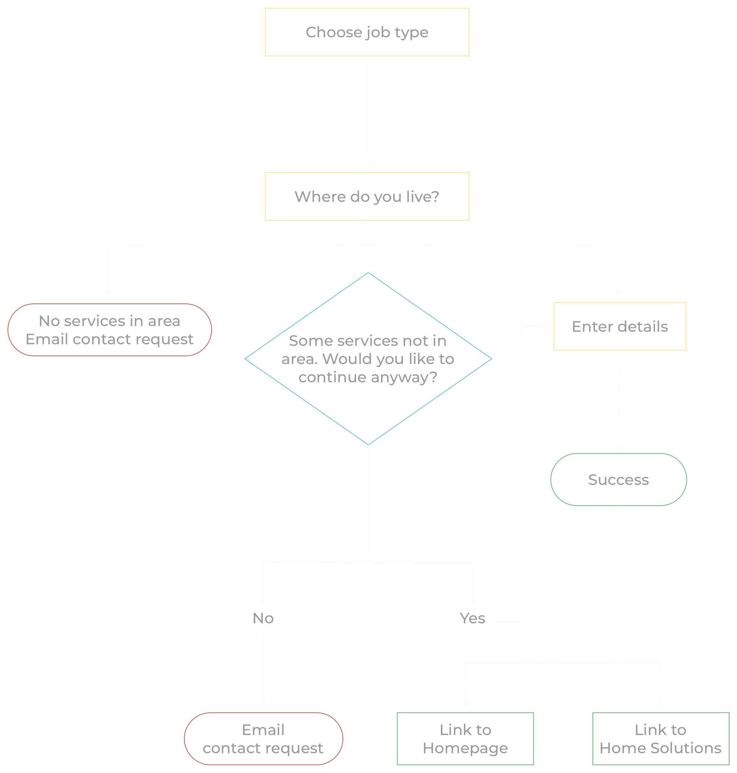
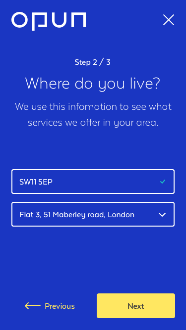
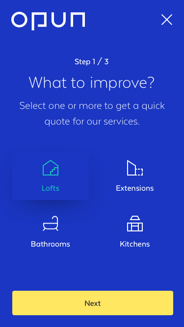
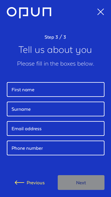
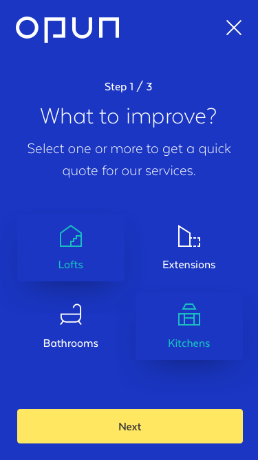
Booking system
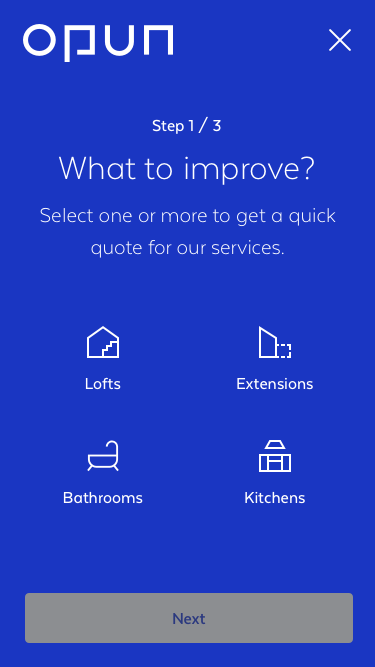
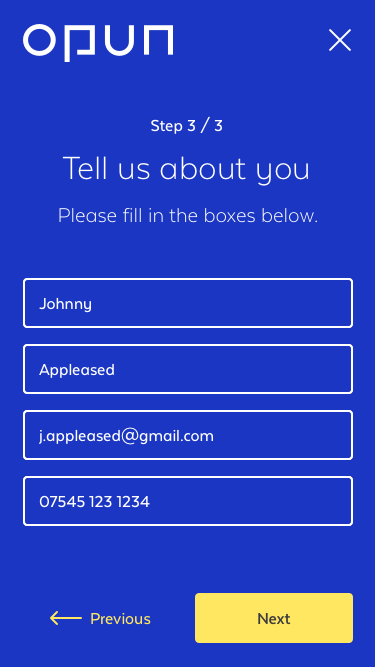
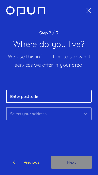
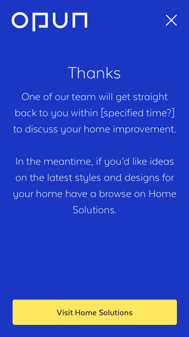
A critical part of this project was creating a simple booking system that efficiently triaged prospective customers. The previous system was a simple phone line which offered no information to the sales team about the job, or to the customer about what services we offer and in what parts of the country we cover.
We needed to create something that would quickly guide the user in as few steps as possible, and yield the most important information to our sales team so they can make informed connections.
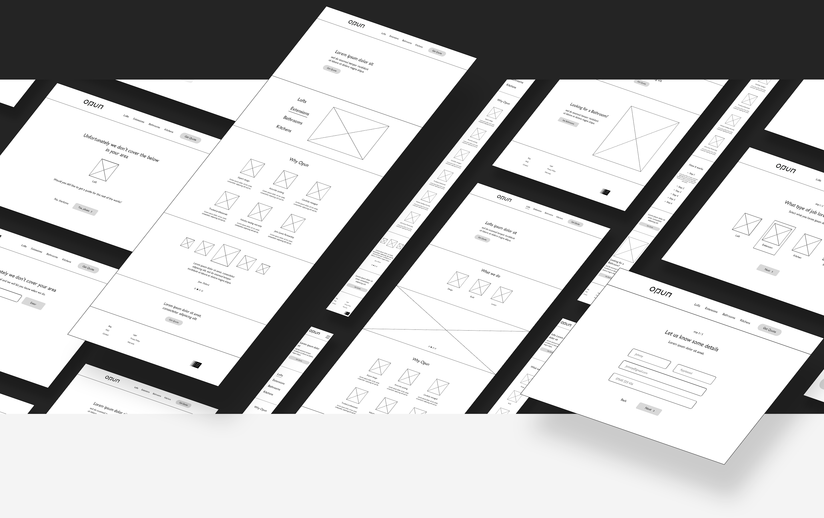
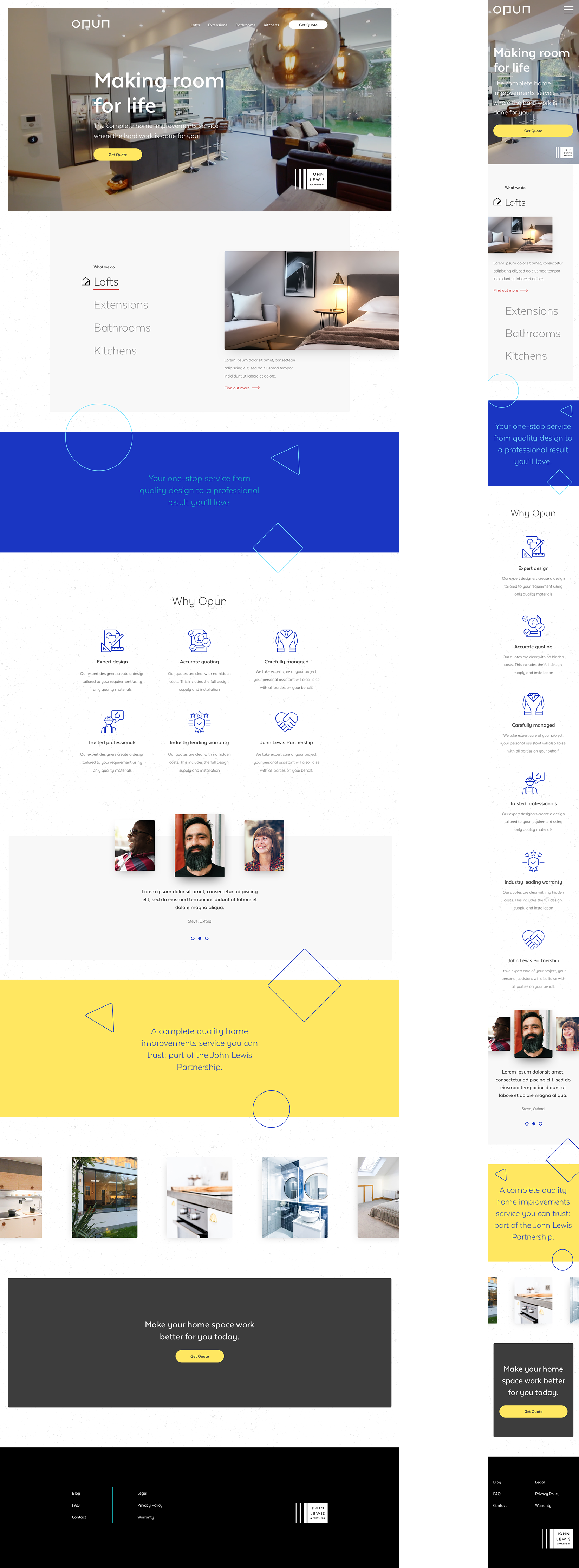
Home page re-design
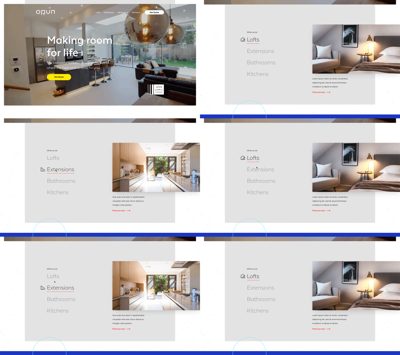
The general structure was simplified for an initial launch with a focus simply on what services Opun offers and how to get a quote.
The ambition for this simplification is to solve the ongoing issue of enquiries about services that Opun do not offer, therefore relieving operational strain within the business and improving the quality of leads coming into the sales team.
The general design was been simplified with more focus on the quality than quantity.
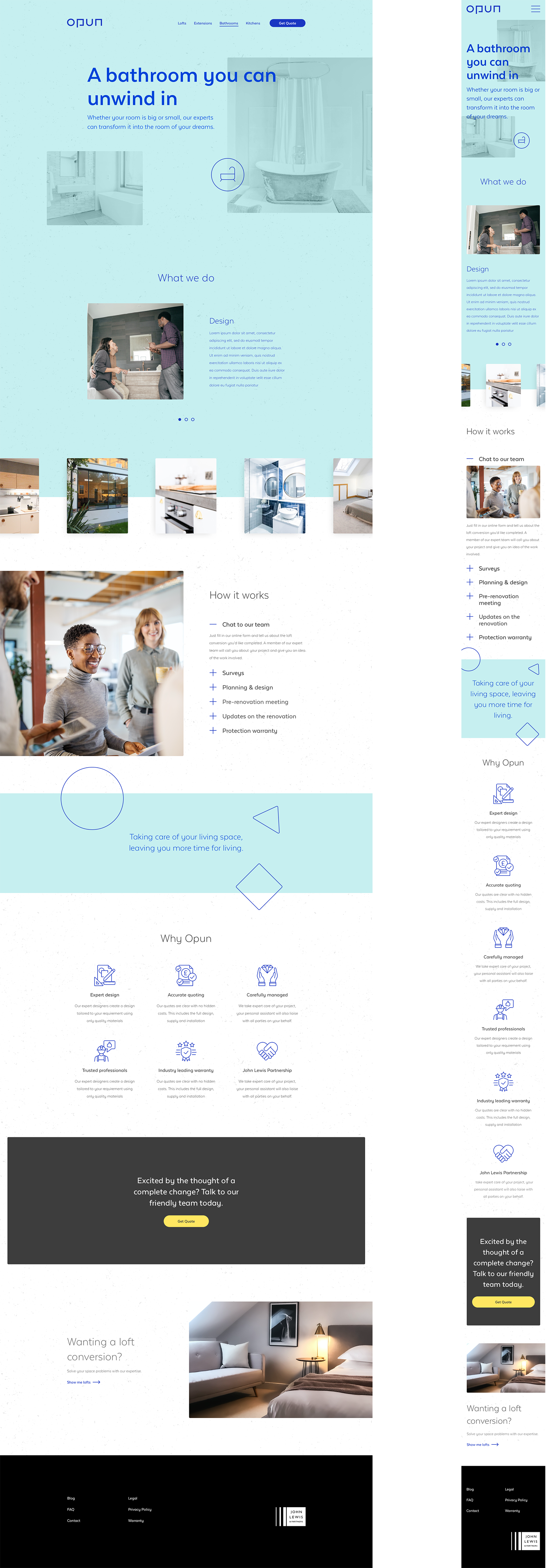
Product pages re-design
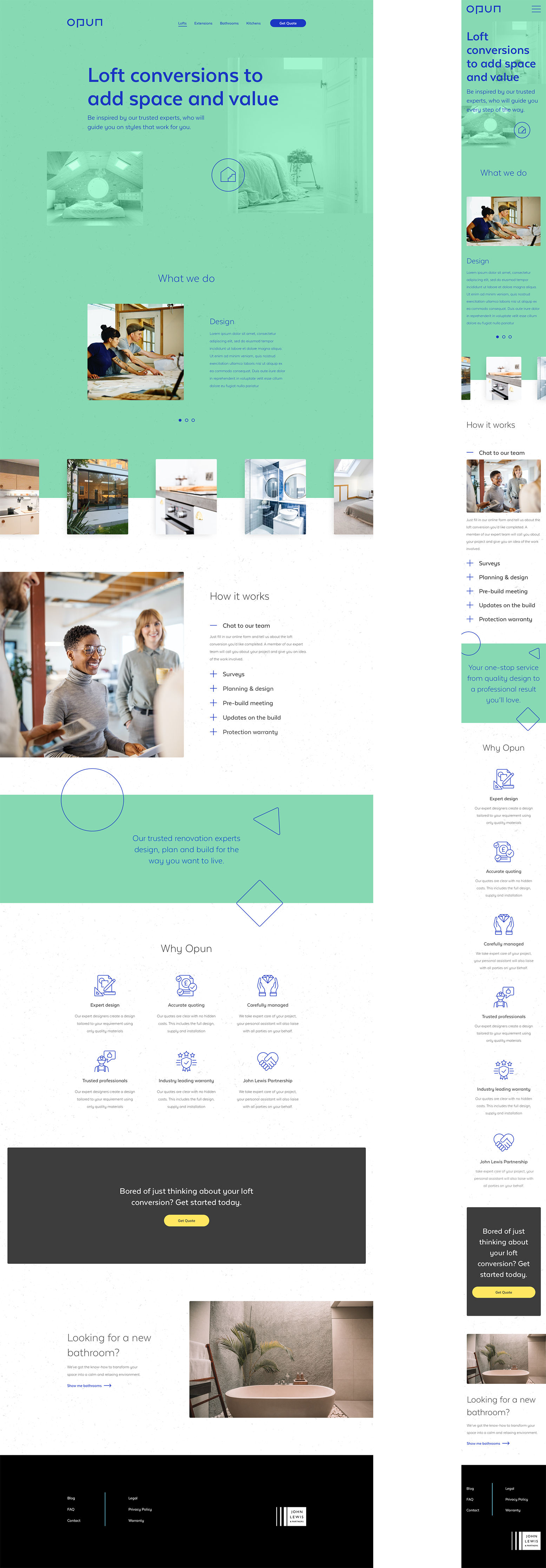
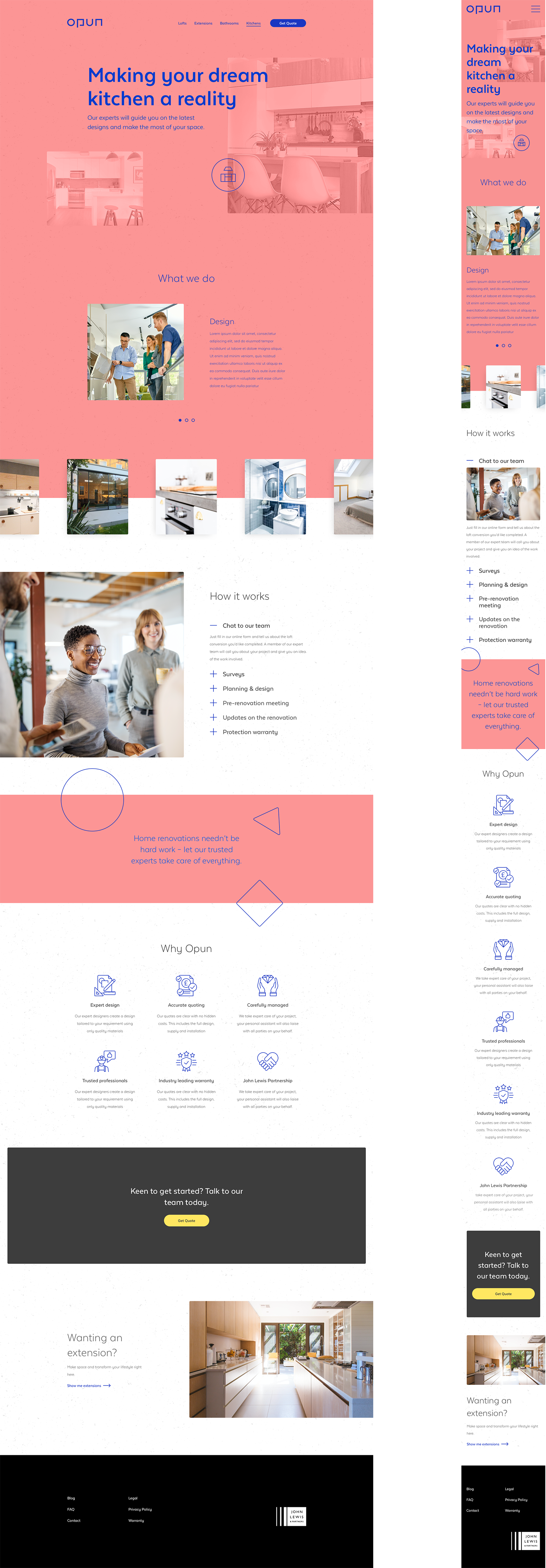
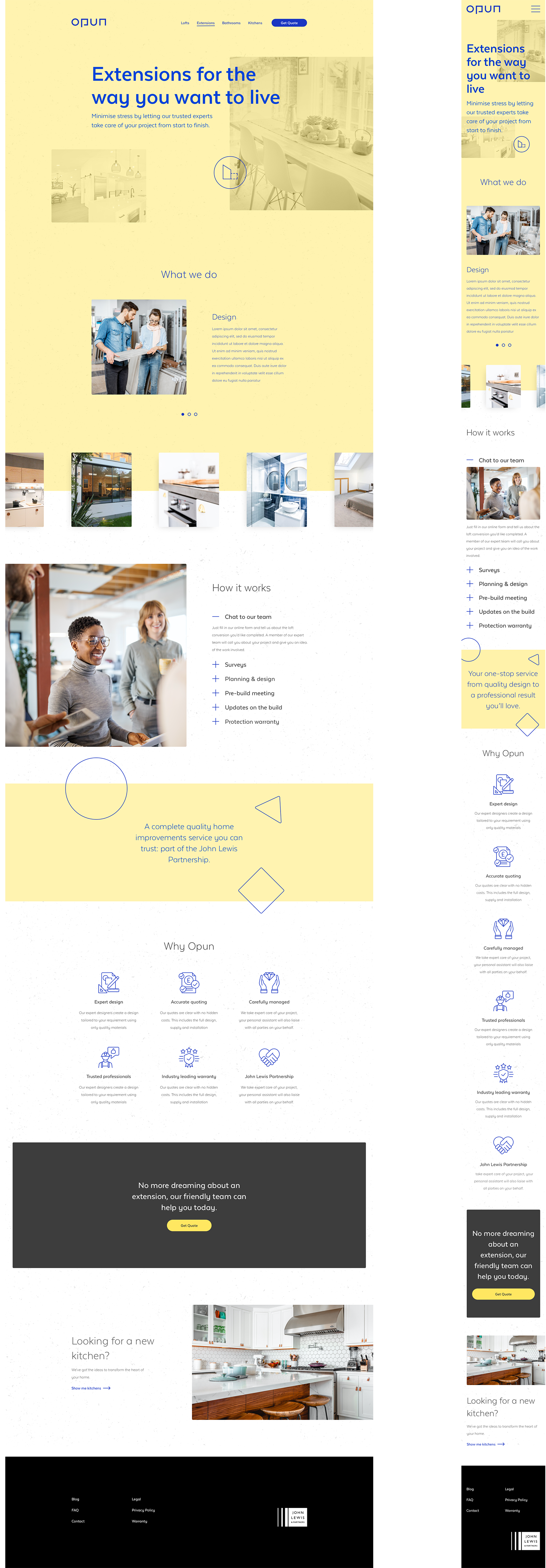
The individual product pages deliver more information on the brand and business on a more granular level. From what services we offer, to how projects are handled step-by-step, from start to finish.
The design is clean and engaging, with clear touchpoints to when the user is being fed important information and inspiration to help them in their next home renovation project.

NEXT PROJECT
Get in touch and let’s make something great together
Visit my shop and check out my prints
All work © 2023 James kingman
All work © 2023 James kingman
All work © 2023 James kingman