
PROJECT
AI-assisted product design & development system
CLIENT
CLIENT
Round Tracker
ROLES
Product Strategy, UX, UI, Design System, AI Workflow, SwiftUI, Firebase, QA, App Store Readiness
Round Tracker is a working example of system-first, AI-assisted product design. It started with a strategic position: this was not a drinking app. It was a fairness and coordination tool.
That position shaped the product mechanics, responsible design principles and communication strategy. From there, I designed the core UX journeys, built the Figma variables and token structure, created the design system, and used AI to help assimilate the rules, patterns and constraints behind the product.
AI did not define the product. It accelerated the work once the strategy, tone, UX logic and system foundations were clear.
The result was a launch-ready iOS MVP and a practical model for how product design, design systems and AI-assisted development can work together.
AI is only useful when the system around it is clear.
Round Tracker uses design systems as the control layer and AI as the acceleration layer.
AI is only useful when the system around it is clear.
Round Tracker uses design systems as the control layer and AI as the acceleration layer.
RESEARCH & STRATEGIC DIRECTION
RESEARCH & STRATEGIC DIRECTION
RESEARCH & STRATEGIC DIRECTION
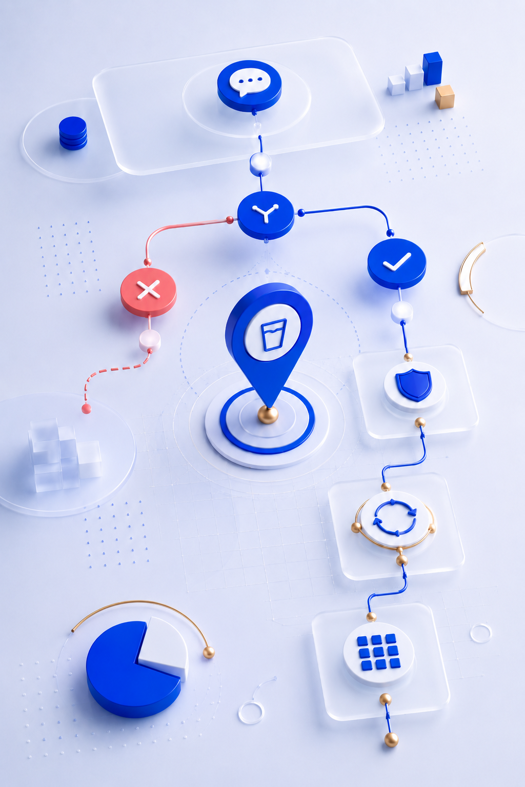
Round Tracker was not approached as a drinking app. It was approached as a fairness and coordination tool.
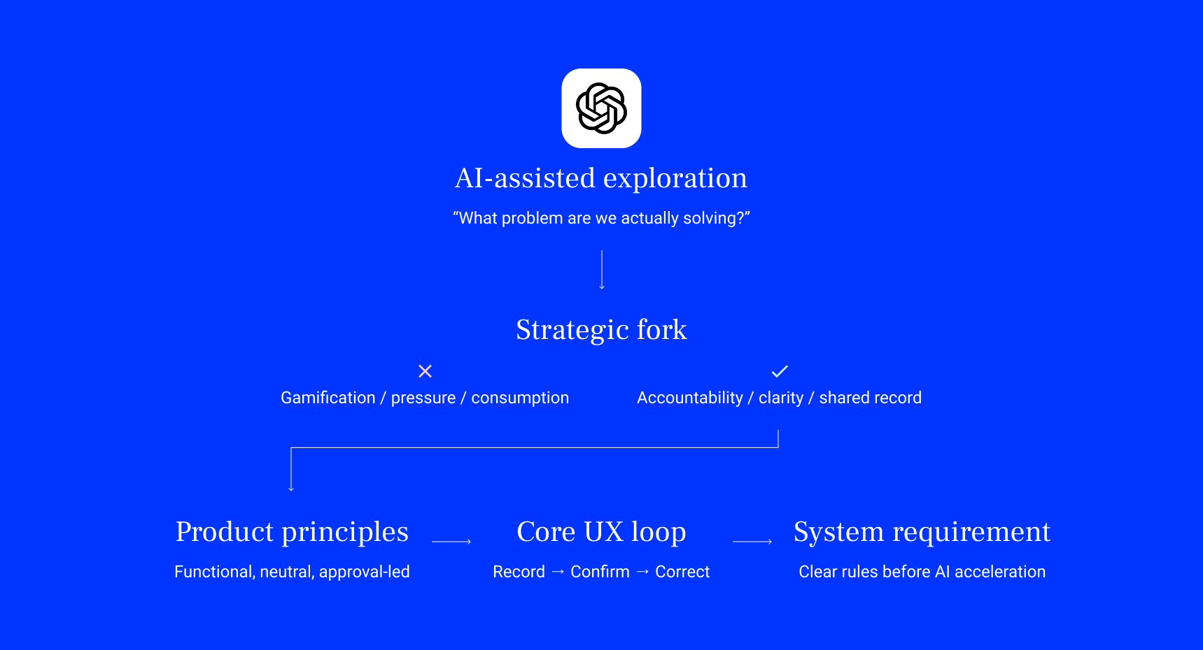
That strategic position shaped every major product decision. The app needed to help groups record, confirm and correct rounds, but it could not encourage consumption, create pressure or turn drinking into a game.
From that position, the product direction became clear: build a lightweight shared record, make approval part of the core loop, keep the experience fast enough for real-world social use, and use a design system to control both the interface and the AI-assisted workflow behind it.
Early AI conversations were used to pressure-test the product fundamentals before any interface work began. The first output was not UI. It was clarity: the product position, responsible boundaries and core loop that everything else would follow.
Early AI conversations were used to pressure-test the product fundamentals before any interface work began. The first output was not UI. It was clarity: the product position, responsible boundaries and core loop that everything else would follow.
KEY FINDINGS
KEY FINDINGS
Rounds are social, but the record is fragile
Rounds are social, but the record is fragile
The product needed a clear shared history, not just a running tally.
Fairness needs agreement, not just input
Fairness needs agreement, not just input
Recipient approval and dispute handling needed to become part of the core product loop.
Recipient approval and dispute handling needed to become part of the core product loop.
The experience had to work in the moment
Group creation, adding a round, and confirming entries had to be fast, clear and low-friction.
The alcohol context changed the design responsibility
The product needed neutral language, functional notifications and no gamified drinking mechanics.
AI only works when the system is clear
AI only works when the system is clear
The design system had to act as the control layer, giving AI enough logic, naming and structure to accelerate delivery without weakening quality.
RESPONSIBLE DESIGN & TONE OF VOICE
RESPONSIBLE DESIGN & TONE OF VOICE
RESPONSIBLE DESIGN
& TONE OF VOICE
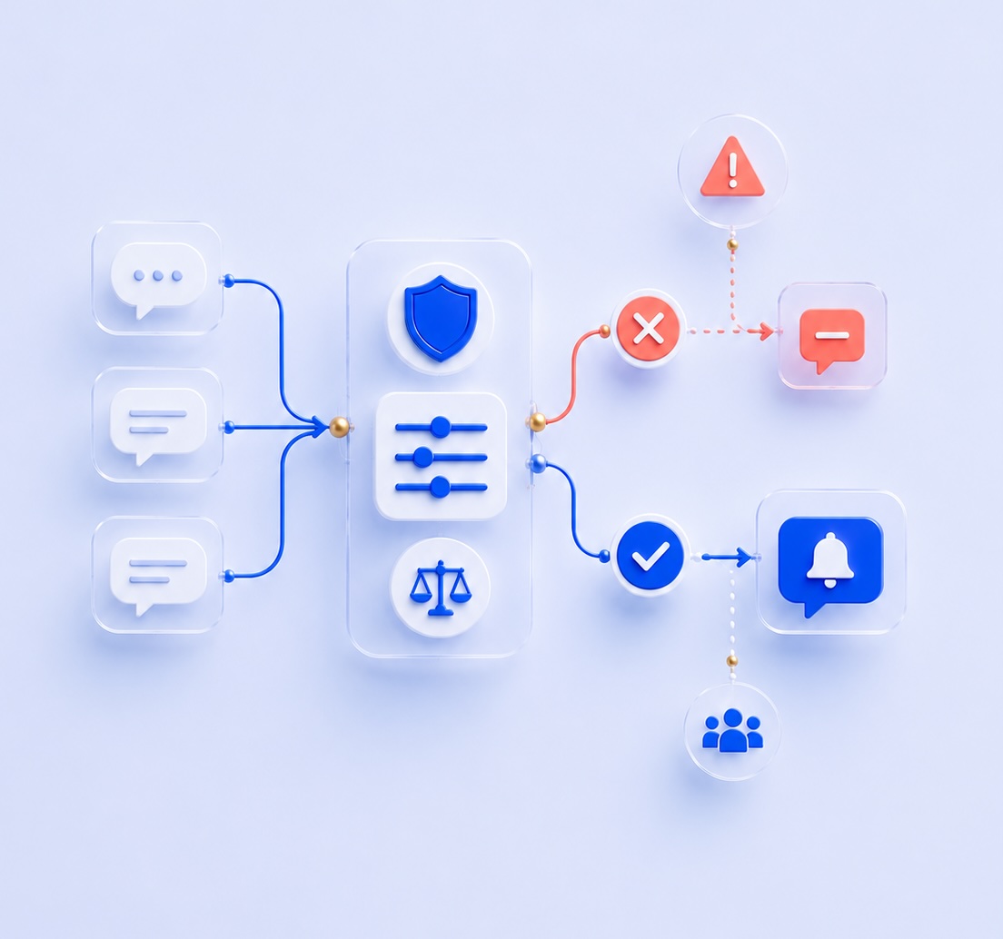
Round Tracker sits close to alcohol, so the tone of the product mattered as much as the mechanics.
The product could not sound playful in a way that encouraged drinking, competitive in a way that created pressure, or persuasive in a way that pushed users back into the app for the wrong reasons. That judgement shaped the communication strategy.
The language had to be functional, calm and clear. It needed to help users understand what had happened, what needed attention and what action they could take, without adding emotional pressure or celebratory framing.
AI helped execute that strategy, but it did not define it. The responsible product position came first. Once the tone principles were clear, AI was useful for drafting, refining and stress-testing copy across onboarding, empty states, approval requests, disputes, notifications, settings, legal flows and App Store content.
The result was a communication style that supported the product’s purpose: fairness, transparency and accountability without encouragement.
COMMUNICATION PRINCIPLES
COMMUNICATION PRINCIPLES
Functional over persuasive
Copy should explain what happened and what action is available, not push users toward engagement for its own sake.
Neutral over celebratory
Neutral over celebratory
The product avoids language that celebrates drinking volume, frequency or participation.
Clear over clever
The interface needs to be understood quickly in social settings, so clarity is more important than personality.
Accountable over judgemental
Disputes, approvals and restricted states are framed as normal product states, not blame or failure.
Helpful over urgent
Helpful over urgent
Notifications and prompts should inform users without creating unnecessary pressure.
Responsible by default
Responsible by default
Tone, mechanics and product logic all work together to avoid alcohol-led gamification.
The responsible tone was not generated by AI.
It was designed, then scaled with AI.
The responsible tone was not generated by AI.
It was designed, then scaled with AI.
PRODUCT DESIGN & CORE UX
PRODUCT DESIGN & CORE UX
PRODUCT DESIGN & CORE UX
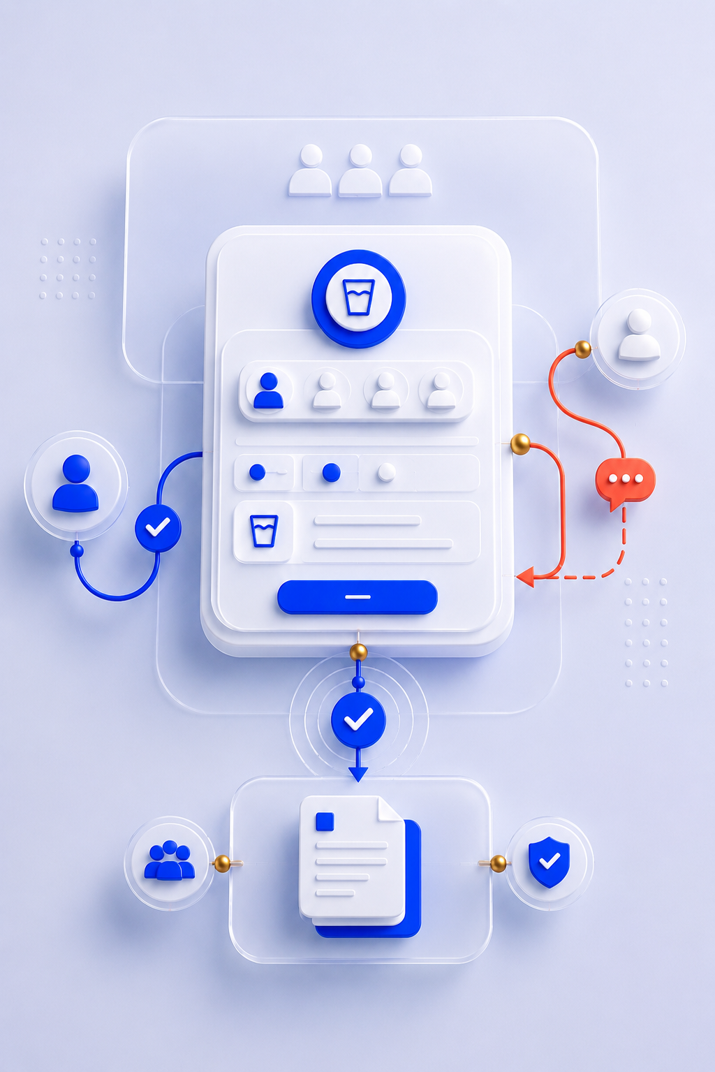
Round Tracker needed more than a clear strategic position. It needed a product experience that could work in a real social setting.
The app had to feel quick, clear and lightweight on the surface, but structured enough underneath to create a reliable shared record. That meant the UX had to balance speed with accountability.
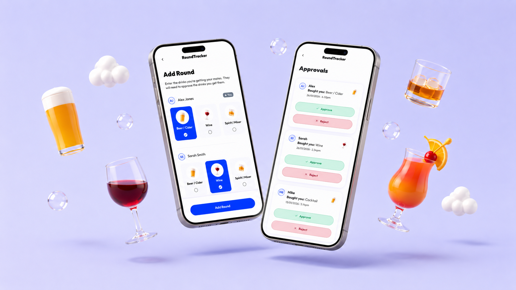
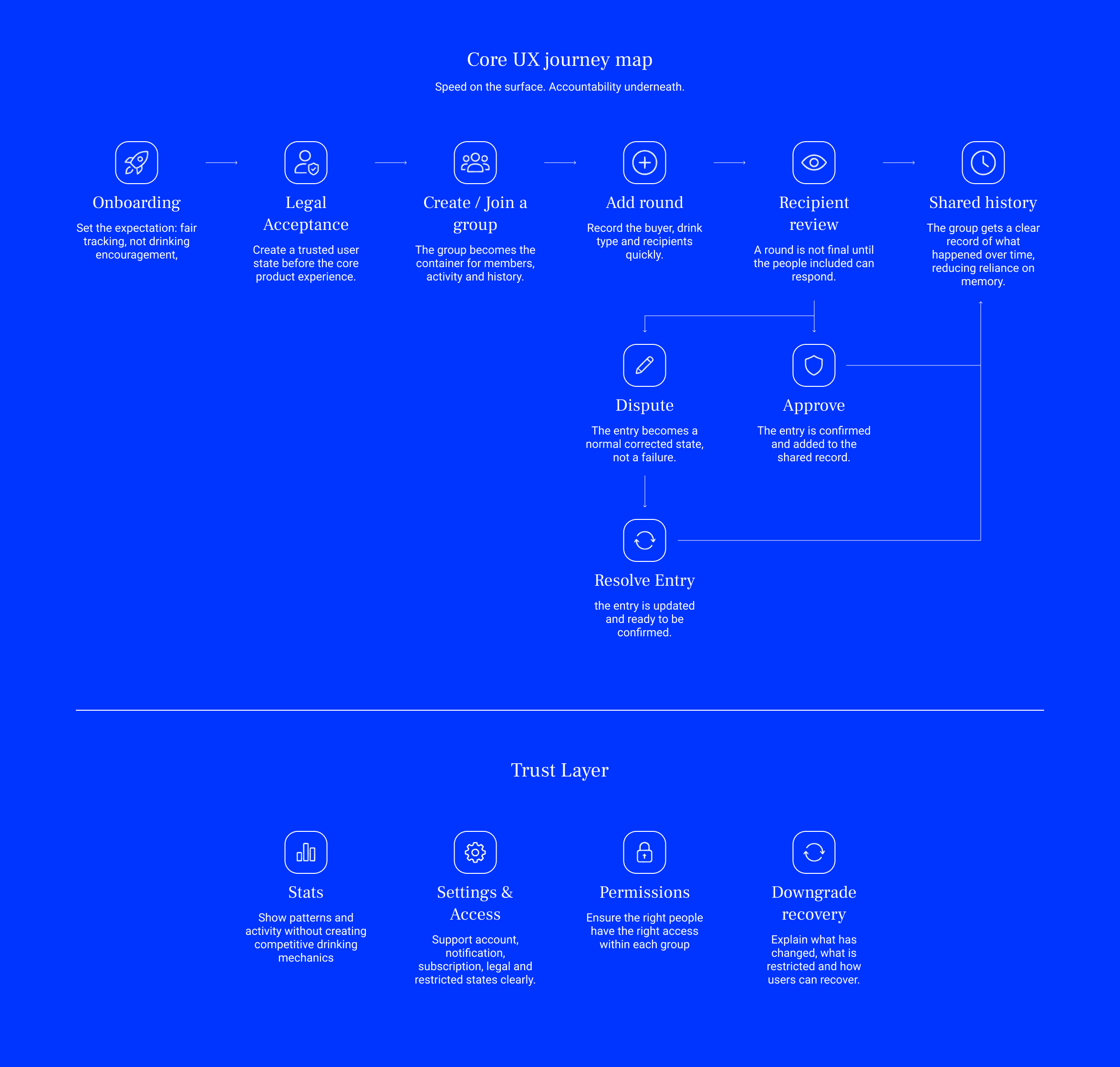
The core product design decision was to make approval part of the main loop. A round could not simply become true because one person added it. The people included in the round needed a way to confirm or challenge the entry.
That decision shaped the rest of the experience. Groups became the container for shared activity, rounds became structured entries, recipients became active participants, and disputes became a normal correction mechanism rather than an edge case.
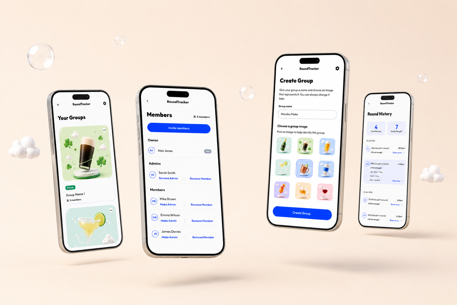
The UI had to support that logic without becoming heavy. The main flows were designed to be direct and low-friction, with clear actions, focused screens and predictable states. Settings, legal acceptance, subscriptions and notifications were also treated as part of the product experience, not as admin screens added at the end.
The result was a product model where every core interaction supported the same goal: helping a group create a fair, shared record.
CORE PRODUCT DESIGN DECISIONS
CORE PRODUCT DESIGN DECISIONS
Make the group the centre of the experience
Rounds only make sense in a social context, so the group became the primary container for activity, membership and history.
Make approval part of the core loop
Make approval part of the core loop
Recipient approval turned the app from a personal tracker into a shared record that the group could confirm.
Treat disputes as a normal product state
Treat disputes as a normal product state
Disputes were designed as a correction mechanism, not as an error, failure or confrontational moment.
Keep actions fast and focused
Adding a round, choosing recipients and confirming entries had to be simple enough for real-world social use.
Design for trust, not just task completion
Design for trust, not just task completion
Legal acceptance, account states, subscription logic and restricted states were part of the trust model behind the product.
Keep the interface calm and functional
Keep the interface calm and functional
The UI avoided persuasive patterns, unnecessary urgency and gamified drinking mechanics.
FIGMA VARIABLES & TOKEN FOUNDATION
FIGMA VARIABLES & TOKEN FOUNDATION
FIGMA VARIABLES & TOKEN FOUNDATION
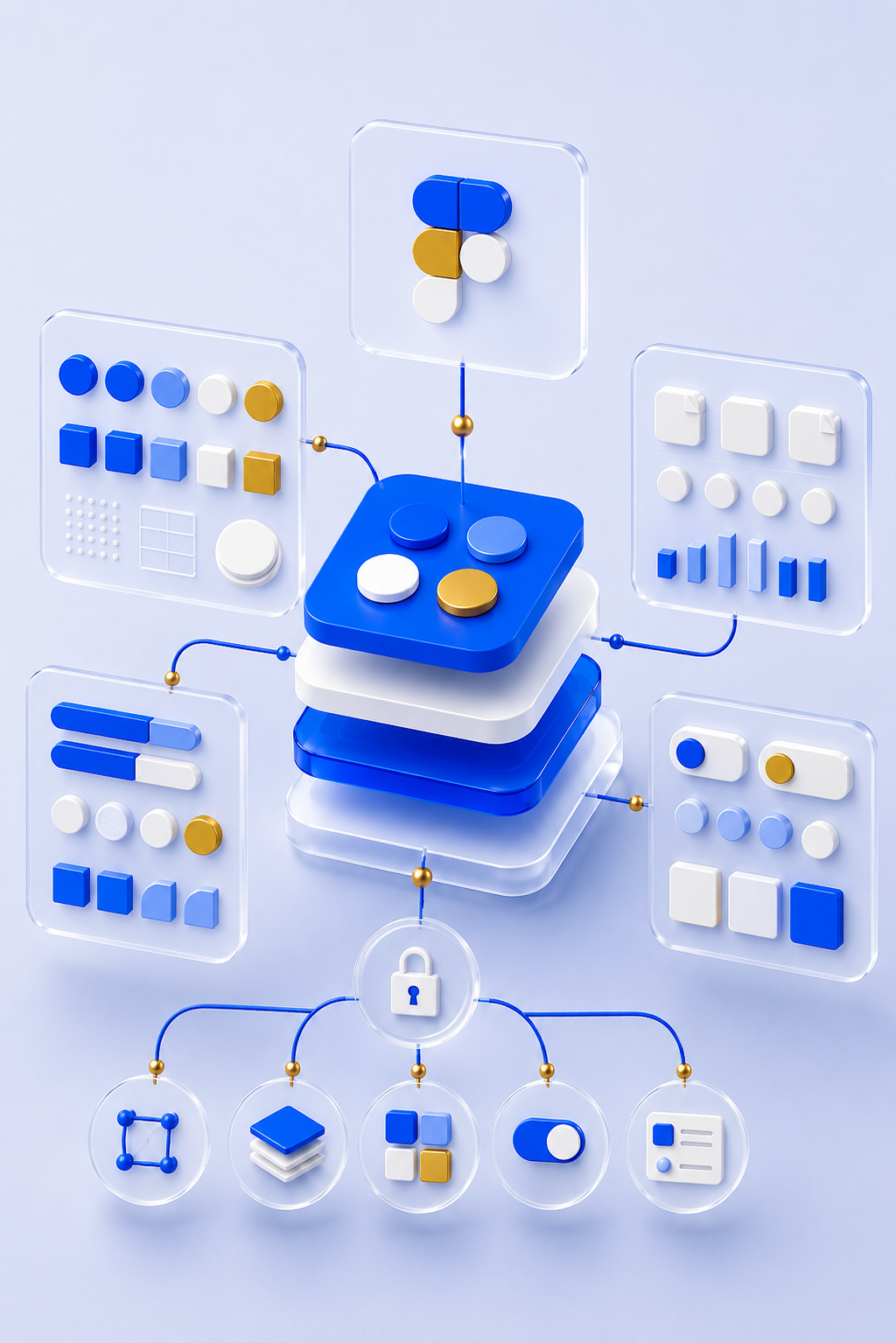
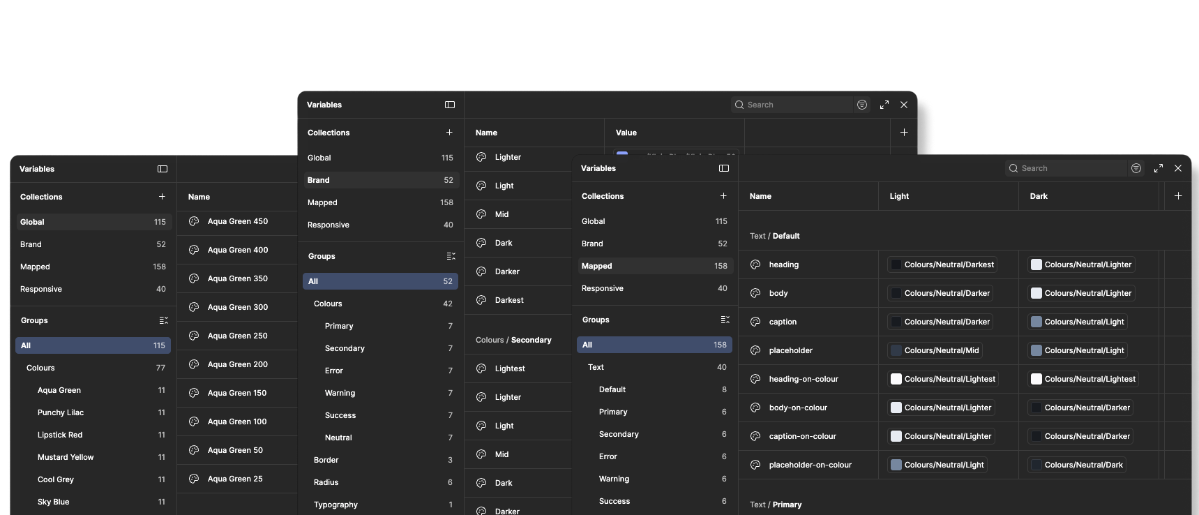
Before moving into components or screen layouts, I built the product’s foundation layer in Figma. Round Tracker needed a structured design language that could support product design, implementation and AI-assisted development. To do that, I created a three-tier variable and token architecture: Global, Brand and Mapped.
The aim was to separate raw values from brand-level decisions and usage-specific tokens. This meant the system could stay flexible underneath, while giving the interface clear, purposeful values to use in product contexts.
The foundation was created before the component layer. That mattered because the product system was not retrofitted after screens had already been designed. The tokens gave the app its underlying structure before the UI patterns were scaled across journeys. This also made the AI workflow more effective. Once the token hierarchy was defined, AI had a clearer system to work within. It could understand the difference between raw values, curated brand decisions and tokens used for specific interface roles.
VARIABLES & STRUCTURE
VARIABLES & STRUCTURE
TIER 1
Global
The raw value layer. This housed the foundational values for the system, including base colour values, sizing values and other low-level primitives. Global variables were not intended to carry product meaning on their own. They existed as the source material for the layers above.
TIER 2
Brand
Uplift
The curated brand layer. This translated the raw Global values into a Round Tracker-specific brand language, including the product’s core palette, typography choices, spacing rhythm, radius decisions and interface styling direction.
TIER 3
Mapped
Uplift
The usage-specific layer. This held tokens connected to product roles and interface decisions, such as surfaces, text, borders, actions, feedback, states and other applied UI behaviours. These were the tokens most directly tied to product design and implementation.
FIGMA TO REPO: MAKING THE SYSTEM USABLE BY AI
FIGMA TO REPO: MAKING THE SYSTEM USABLE BY AI
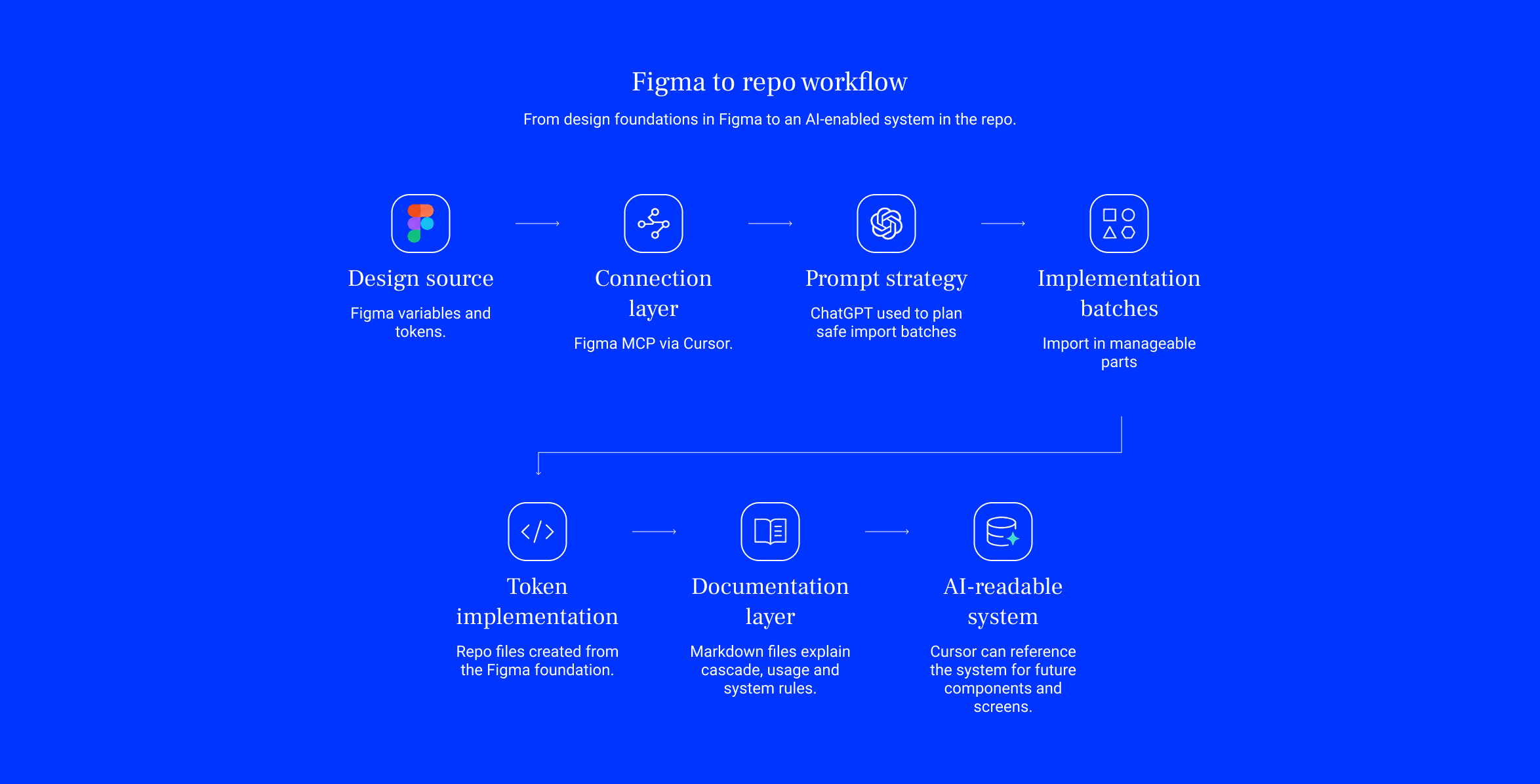
Once the variable and token structure was defined in Figma, the next step was making those foundations usable in the repo.
This was not just about exporting visual values. The aim was to move the system logic into a format that Cursor and AI could understand, reference and reuse during implementation.
I connected Cursor to Figma through Figma’s MCP, then used ChatGPT to plan a controlled import strategy. Instead of one large import, the foundations were broken into manageable parts: colour, spacing, radius, typography, mapped roles, usage rules and documentation.
Each import created both implementation files and supporting markdown. The documentation explained how the token hierarchy should cascade, how each layer should be used, and how future work should reference the system.
That markdown became a persistent memory layer inside the repo. Figma held the design structure, the repo held the implementation structure, and documentation preserved the rules behind both.
The result was a clearer design-to-code bridge where Global values, Brand decisions and Mapped tokens could support future components, screens and AI-assisted implementation without re-explaining the system from scratch.
CODED WIREFRAMES & COMPONENT REQUIREMENTS
CODED WIREFRAMES & COMPONENT REQUIREMENTS
CODED WIREFRAMES & COMPONENT REQUIREMENTS
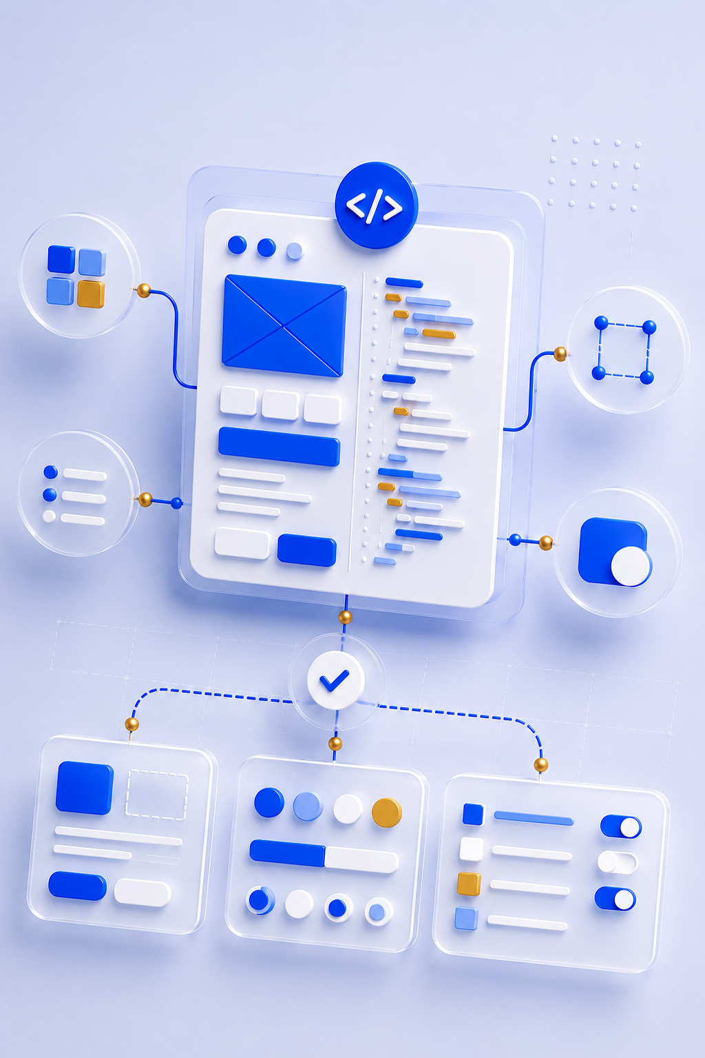
After the product strategy, core UX journeys and Figma token foundation were defined, I used AI to generate the first version of the wireframes as simple coded layouts.
These were not finished designs. They were functional, low-fidelity product structures built from the rules already in place: the strategic position, core journeys, responsible tone of voice, and Figma variables and token foundation.
This created a different kind of wireframing process. Instead of producing static grey boxes in Figma, I used AI to turn the product logic into a lightweight coded prototype. The prototype gave the app an early working shape, with placeholder interface patterns that could be tested, challenged and replaced.
The value was speed and visibility. Seeing the journeys in code made the product structure easier to interrogate. It exposed where the flows worked, where they were too thin, where states were missing, and which patterns needed to become proper design system components.
Those coded wireframes became the shopping list for the first wave of component design.
Once the requirements were clear, I moved back into Figma and designed the real components needed to replace the AI-generated holding patterns: page headers, cards, forms, buttons, modals, toggles, settings rows, status states, legal gates and subscription patterns.
This created a practical loop between AI, product design and design systems. AI helped bring the loose journeys to life quickly. The working prototype exposed what the system actually needed. The design system then replaced the temporary structures with intentional, reusable components.
WHAT MADE THIS WORKFLOW SHINE
WHAT MADE THIS WORKFLOW SHINE
The wireframes were generated from strategy, not guesswork
AI worked from the defined product position, UX journeys, tone principles and token structure.
The prototype made gaps visible early
The prototype made gaps visible early
Working flows exposed missing states and logic faster than static screens would have.
Components came from real product needs
The first wave of components was based on what the journeys required, not a generic UI kit inventory.
AI created the holding patterns, not the final system
The AI-generated layouts helped explore structure, but the final components were designed intentionally.
The process tightened the bridge between design and build
The process tightened the bridge between design and build
The coded prototype made implementation constraints visible earlier, while the Figma system gave the final product its quality and consistency.
DESIGN SYSTEM COMPONENTS & INTERACTION PATTERNS
DESIGN SYSTEM COMPONENTS & INTERACTION PATTERNS
DESIGN SYSTEM COMPONENTS & INTERACTION PATTERNS
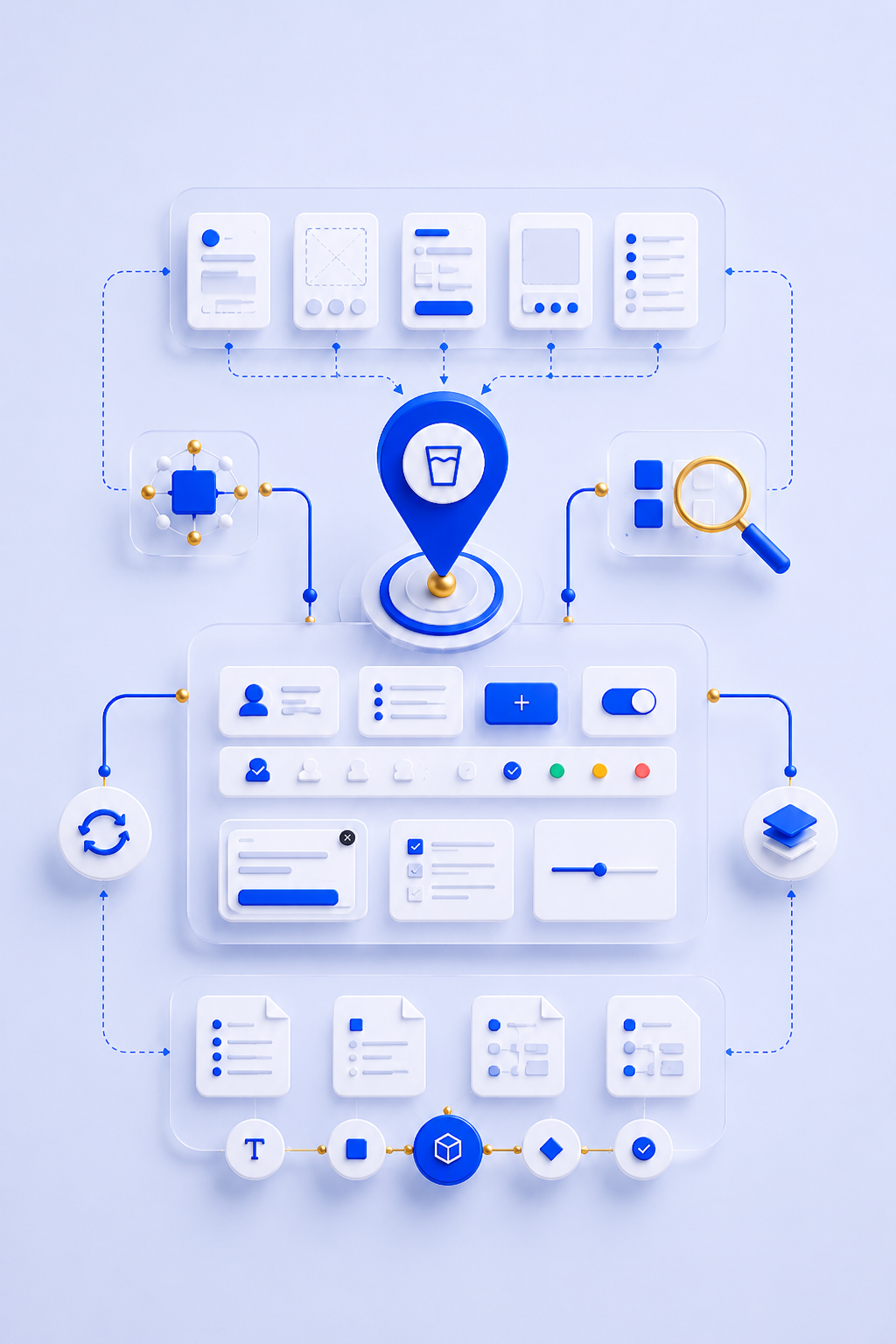
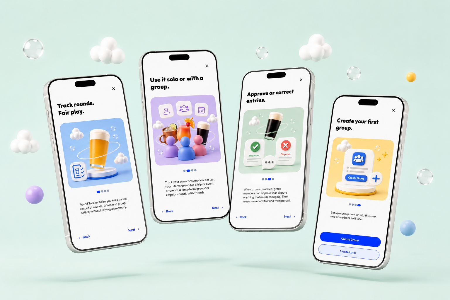
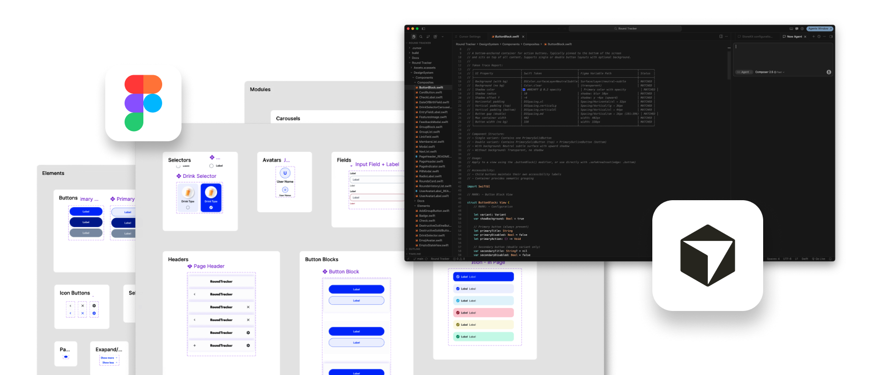
Once the coded wireframe prototype had exposed the product requirements, I moved back into Figma to turn the temporary AI-generated interface patterns into a proper high-fidelity design system.
The coded prototype had done its job. It gave the product an early working shape, helped test the main journeys, and revealed where reusable components were needed. But those early patterns were placeholders. They were useful for structure, not suitable as the final product language.
This stage was about replacing those placeholders with intentional, reusable components that reflected the product strategy, token structure, UX principles and responsible tone of voice.
The workflow became a loop: review the coded prototype, identify repeated patterns, design the high-fidelity component in Figma, define its behaviour, document its usage, then replace the temporary coded pattern with the proper system version.
This was where much of the product’s interaction logic was tightened. Component behaviour, state handling, hierarchy, layout rhythm, modal behaviour, approval states, settings patterns, restricted states and subscription interactions were refined into reusable rules rather than one-off screen decisions.
Documentation was an important part of the process. Supporting markdown files were created alongside the design and build work to capture decisions, behaviours, implementation notes and reusable guidance. These files acted as a memory layer for the product, making important system knowledge easier to reuse across future screens, AI prompts and implementation work.
AI gave the product its first working shape.
Figma turned that shape into designed components.
Documentation made the system reusable.
AI gave the product its first working shape.
Figma turned that shape into designed components.
Documentation made the system reusable.
STEP 1
Use the prototype as evidence
Use the prototype as evidence
The prototype revealed repeated patterns, missing states, unclear behaviours and places where the product logic needed more precision.
STEP 2
Identify what needed to become systemised
Identify what needed to become systemised
Temporary layouts and placeholder interactions were reviewed to decide what should become reusable components, interaction patterns or documented product rules.
STEP 3
Design the high-fidelity version in Figma
The real components were then designed using the Global, Brand and Mapped token structure, with proper hierarchy, spacing, states and visual treatment.
STEP 4
Define behaviour, not just appearance
Define behaviour, not just appearance
This stage nailed down how components behaved across states, actions, restrictions, modals, approvals, disputes, settings, subscriptions and downgrade scenarios.
STEP 5
Replace the placeholders
Replace the placeholders
The AI-generated holding patterns were removed and replaced with intentional system components and aligned implementation patterns.
STEP 6
Document the decisions
Document the decisions
Supporting markdown files captured behaviours, usage rules, edge cases and implementation notes so the system could be reused consistently by both me and AI later in the workflow.
FROM LOOSE STRUCTURE TO WORKING PRODUCT
FROM LOOSE STRUCTURE TO WORKING PRODUCT
FROM LOOSE STRUCTURE TO WORKING PRODUCT

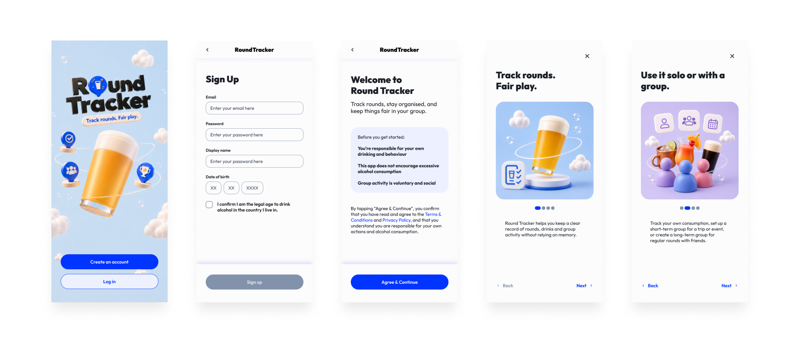
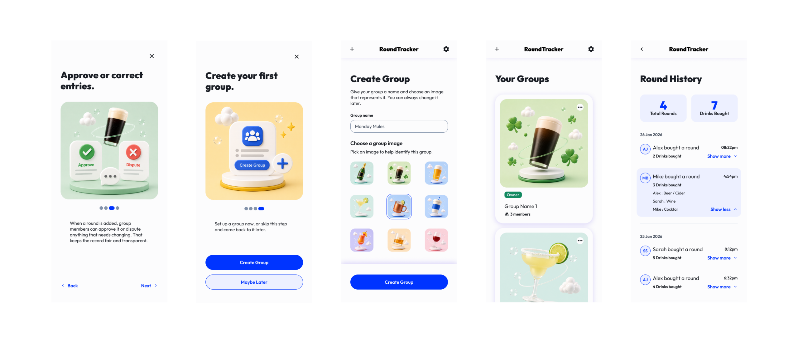
This stage became an iterative loop between product thinking, UX design, system refinement, AI-assisted implementation and QA.
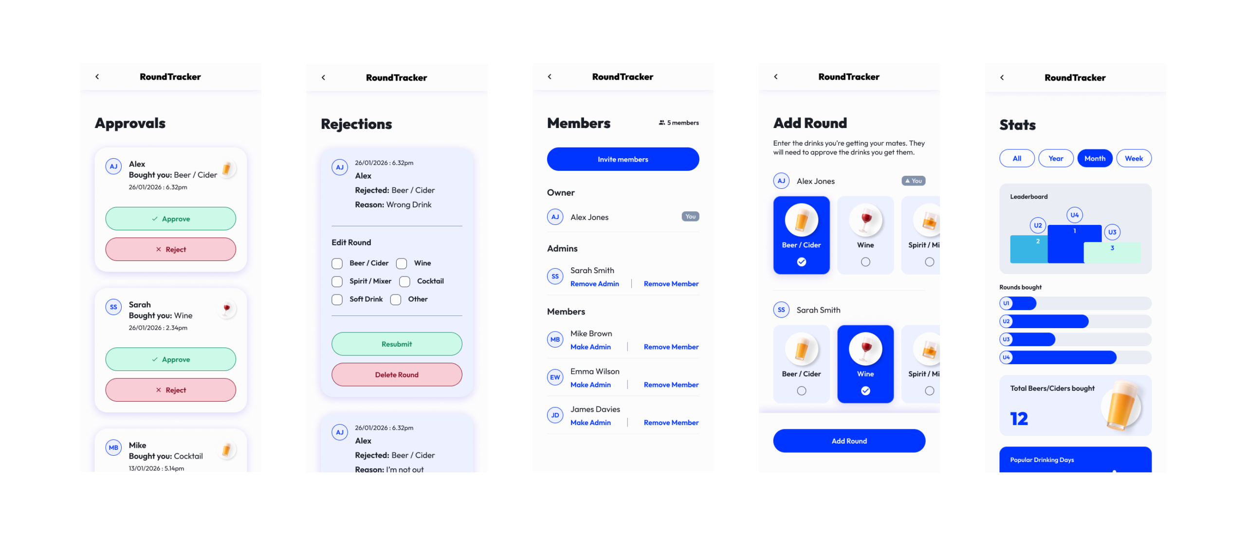
The coded prototype gave the app its first working shape. The high-fidelity components gave it a product language. The next challenge was connecting everything into real journeys that could handle real states.
As screens became working features, gaps appeared. Navigation needed tightening. Approval logic needed more precision. Legal acceptance, subscription behaviour, group permissions, restricted states, downgrade journeys and empty states all needed to become part of the system.
The downgrade journey became a key trust moment. Moving from Pro to Free could not simply lock users out or leave groups unclear. The experience needed to explain what had changed, what access was restricted, and how users could recover or manage their account without feeling punished.
This was where AI became most operationally useful. It helped test product logic, identify edge cases, reason through SwiftUI structure, shape Firebase-backed behaviours and create QA scenarios. But AI did not tighten the product by itself. Every output had to be checked against the strategy, responsible tone, UX principles, token structure, component behaviour and system documentation.
This was the stage where Round Tracker stopped being a promising MVP structure and started behaving like a real app.
THE BUILD LOOP
THE BUILD LOOP
STEP 1
Connect the core journeys
Onboarding, account creation, groups, round creation, approvals, disputes, stats, settings, subscriptions and downgrade journeys were connected into a working product flow.
STEP 2
Expose the real states
Expose the real states
Once journeys worked together, the product revealed missing states around empty groups, pending approvals, disputes, restricted access, downgrades, legal acceptance and subscription limits.
STEP 3
Refine the system
Refine the system
New requirements were fed back into the design system, tightening components, state patterns, copy rules, interaction behaviour and layout structure.
STEP 4
Replace assumptions with rules
Loose logic around permissions, approvals, legal acceptance, subscriptions and restricted access was turned into clearer product behaviour.
STEP 5
Use AI to accelerate implementation and QA
Use AI to accelerate implementation and QA
AI supported SwiftUI structure, Firebase logic, routing, state handling, test planning, release notes and App Store preparation.
STEP 6
Keep human judgement in control
Keep human judgement in control
Every decision was checked against the product position, responsible tone, UX logic and system rules.
OUTCOME & REFLECTION
OUTCOME & REFLECTION
OUTCOME & REFLECTION
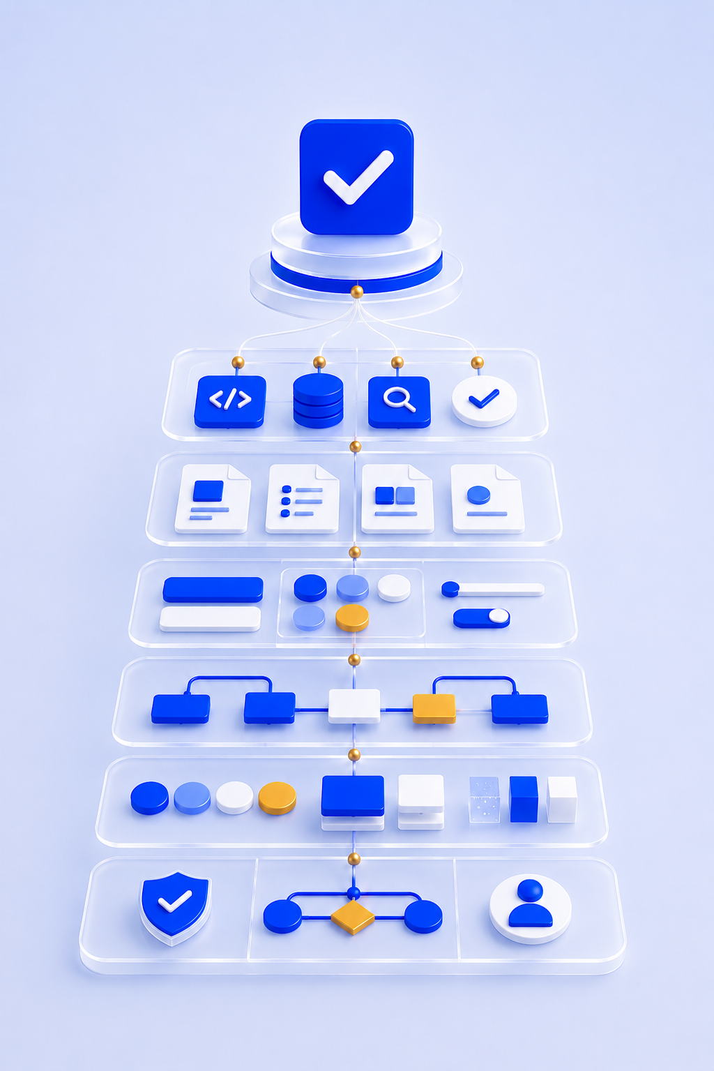
The outcome was a launch-ready iOS MVP with a complete core product experience and a system-first AI workflow behind it.
The project produced a structured Figma foundation, a three-tier token architecture, AI-generated coded wireframes, high-fidelity design system components, documented interaction patterns, SwiftUI implementation structures, Firebase-backed product logic, responsible communication principles and App Store readiness support.
The most valuable outcome was not only the app itself. It was the workflow behind it.
This proved the central thesis of the project: AI is most useful when it is not asked to invent everything from scratch. It becomes more valuable when human judgement has already defined the product, the rules, the system and the quality bar. Round Tracker became a working example of system-first, AI-assisted product design and development.
AI did not replace the product design process.
It made the process faster once the strategy, system and judgement were already in place.
AI did not replace the product design process.
It made the process faster once tahe strategy, system and judgement were already in place.
NEXT PROJECT
Get in touch and let’s make something great together
Visit my shop and check out my prints
All work © 2026 James Kingman
All work © 2026 James Kingman
All work © 2026 James Kingman