PROJECT
Hive Various
CLIENT
Hive Centrica
ROLES
UX, UI
My time as a UX/UI Designer at smart home specialists, Hive Centrica saw me spread across various projects, ranging from the creation of pages for new products to optimising existing experiences to streamlining user journeys.
EASTER SALE
EASTER SALE
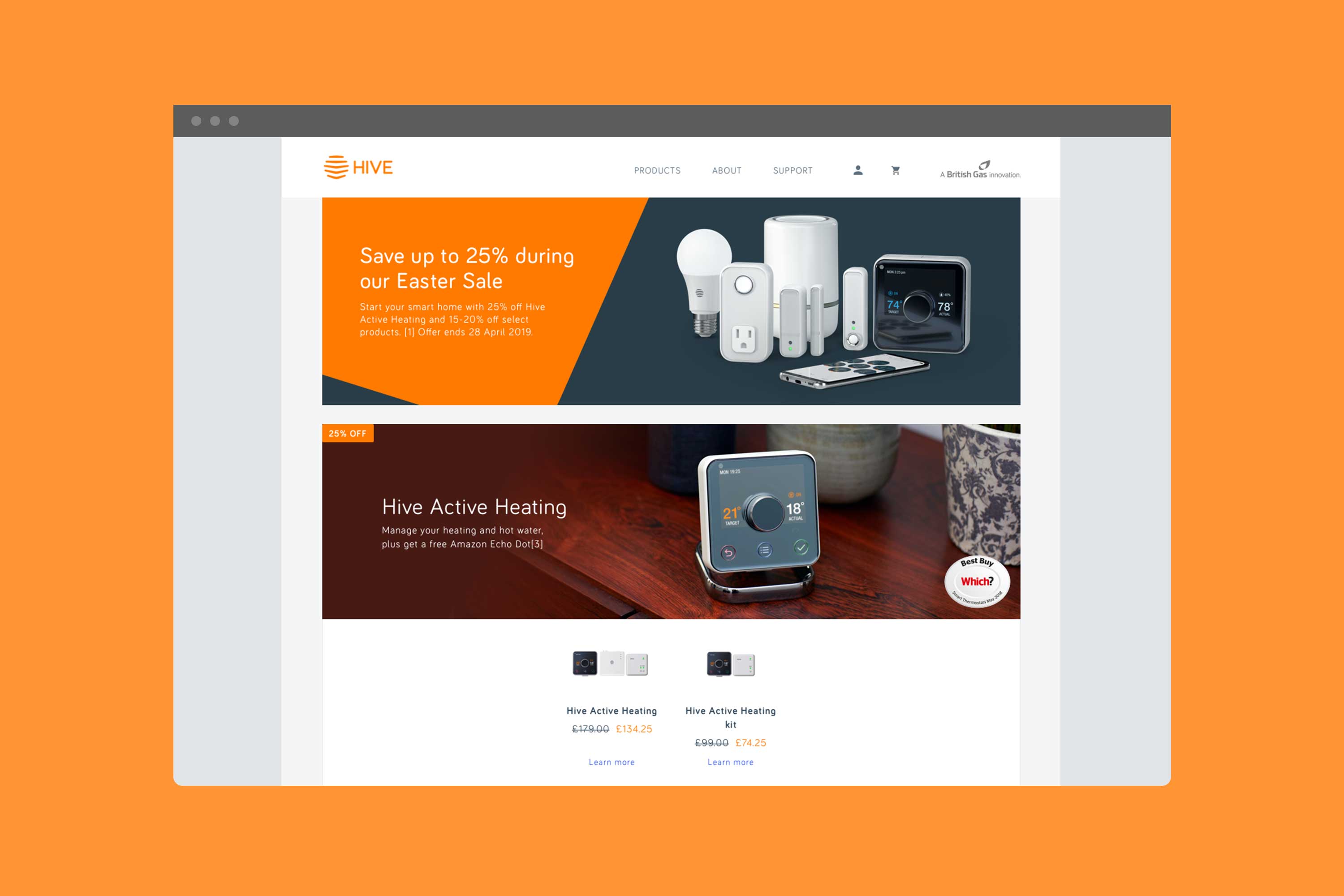
The challenge
The challenge
Sales come thick and fast these days, with every brand vying for the attention (and wallets) of the general public. At Hive Centrica, sale pages have taken on many forms without settling for one design solution. The balance between how branded content and product should appear on a sales page has been an open debate, and whilst there were multiple theories, there wasn't any research around to support any hypothesis.
The solution
Create two sales templates, one with a direct focus on the product, and the other leading with brand content. With the help of our analytical and research team, we put both designs through tests to see how our users engaged with the different page designs with the hope of finding a resolution to our hypothesis.
Control

Variant

Results and actions
The results from the tests validated our hypothesis, that by promoting product above brand would increase traffic towards our Product Overview pages and our Buy pages. Visits from the Easter sale page to Product Overview was 7% greater for the variation and 5% greater to PDP, with an overall conversion rate increase of 3%.
Interestingly though, the variation converted 9% better for existing customers
but for new customers, the control version converted 16% better.
This information has led to a change not only in the designs of sale pages but how they are served to users, with new customers being served a page that leans towards branded/educational content first and existing customers being served a product-led sales page.
COMPATIBILITY CHECKER
COMPATIBILITY CHECKER
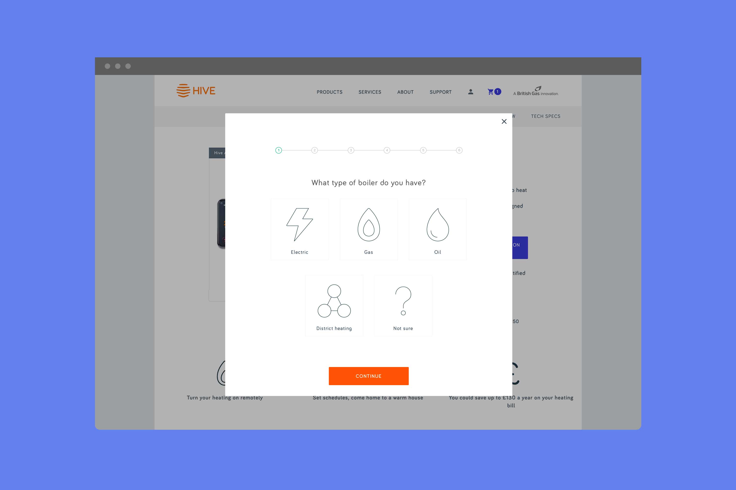
The challenge
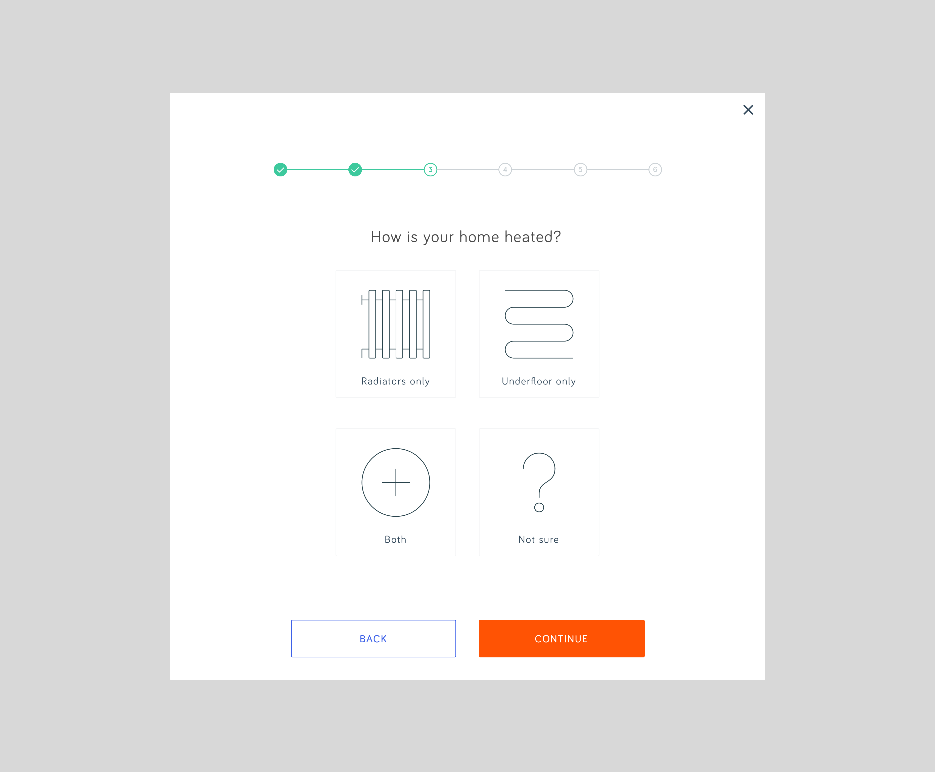
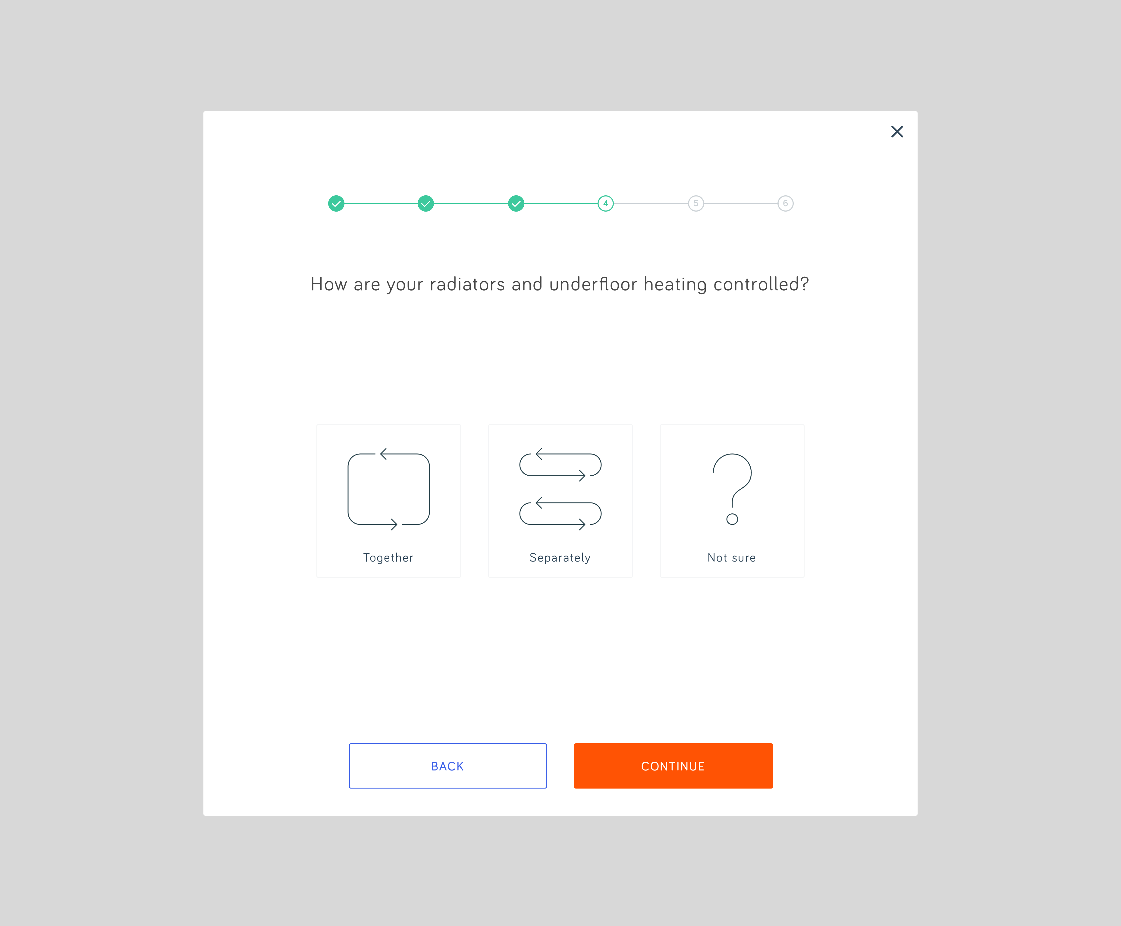
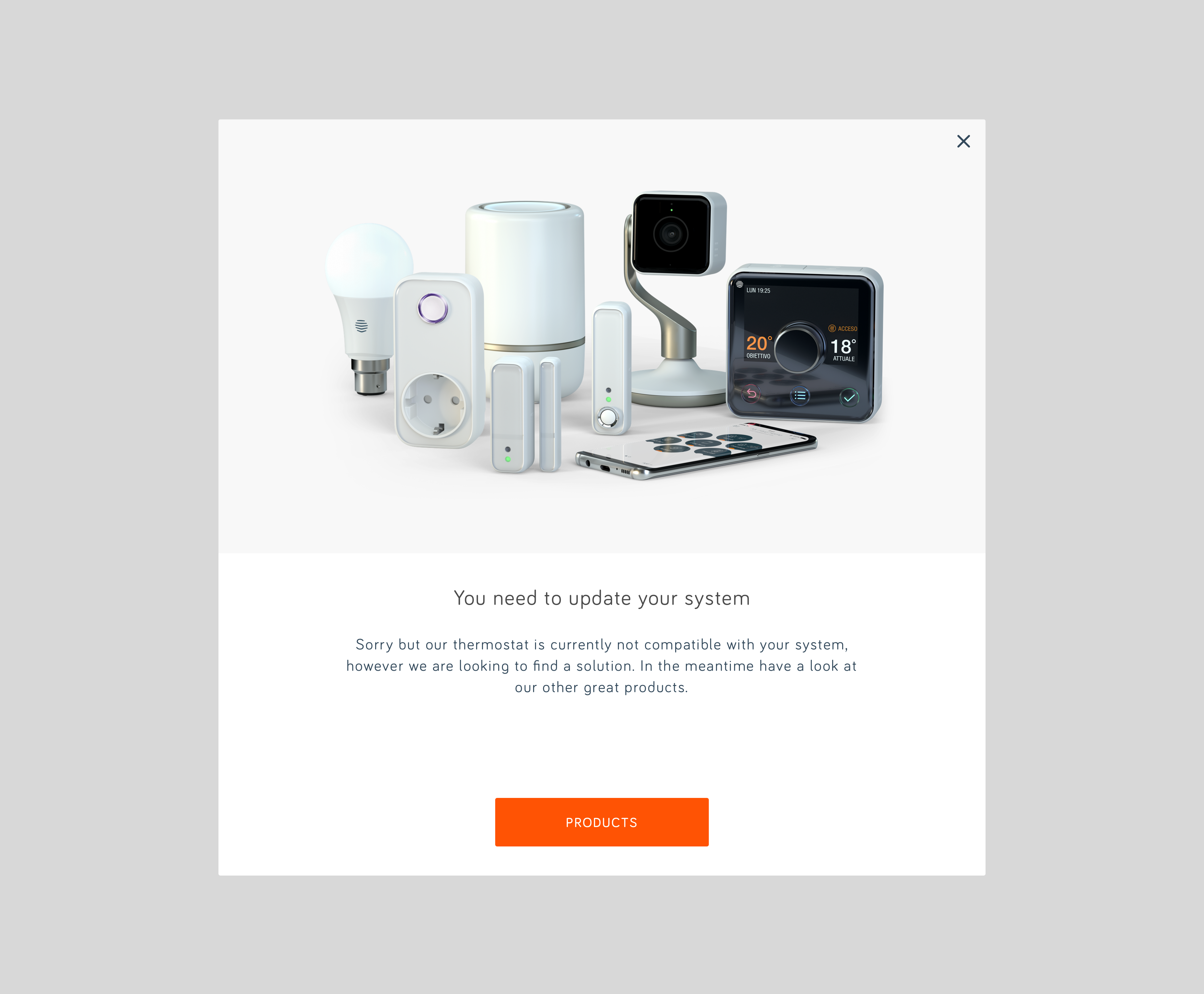
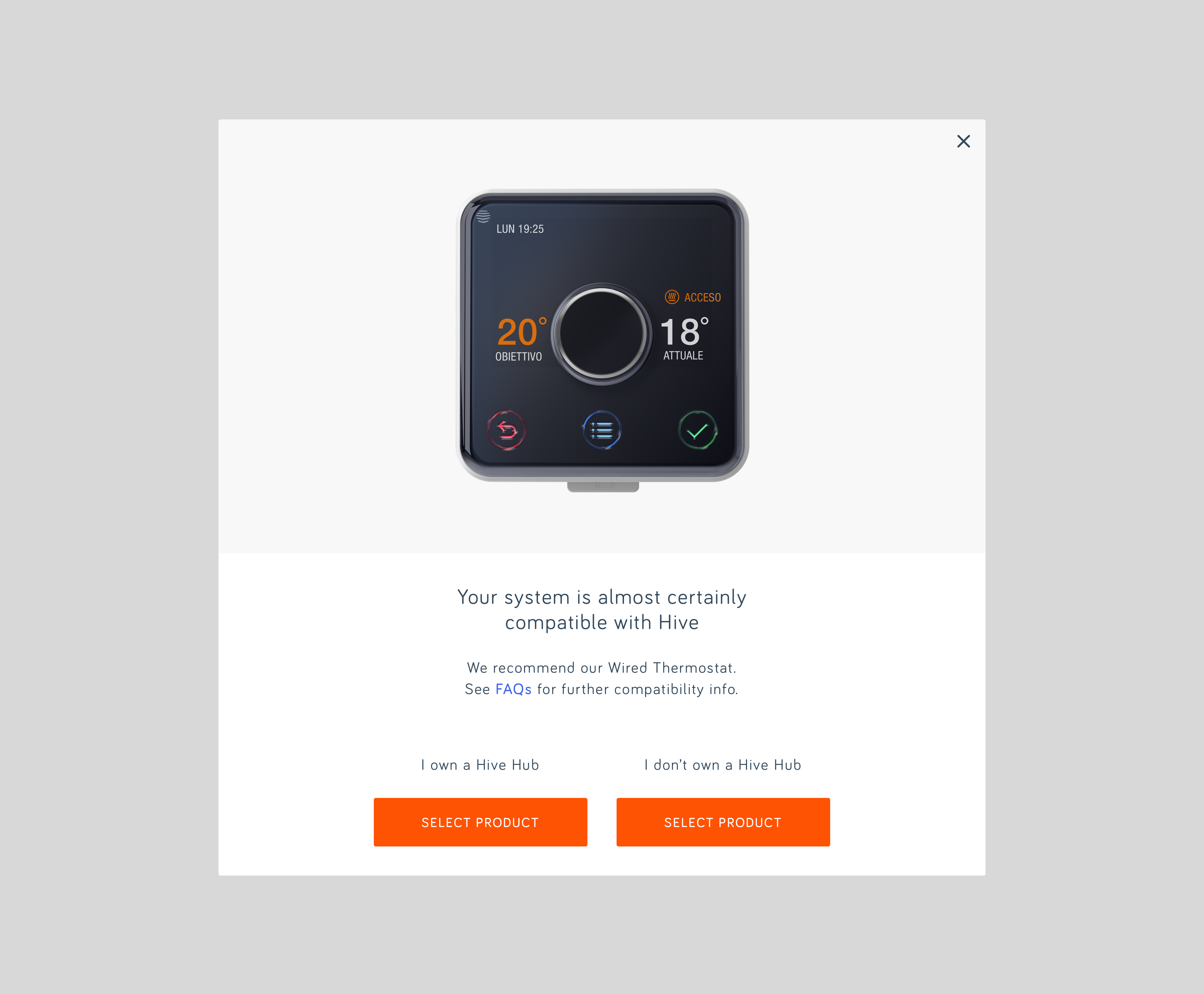
Hive had a problem with their Italian customer base. Research showed a large number of returns of their wireless thermostats from Italy, due to a lack of technical infrastructure to support a wireless network in rural areas. Hive, in response, has created a hard-wired version of their smart thermostat so those customers can have smart heating in their homes. By creating multiple versions of the same product surfaced a problem on the website. Users became confused by which thermostat was right for them.
The solution
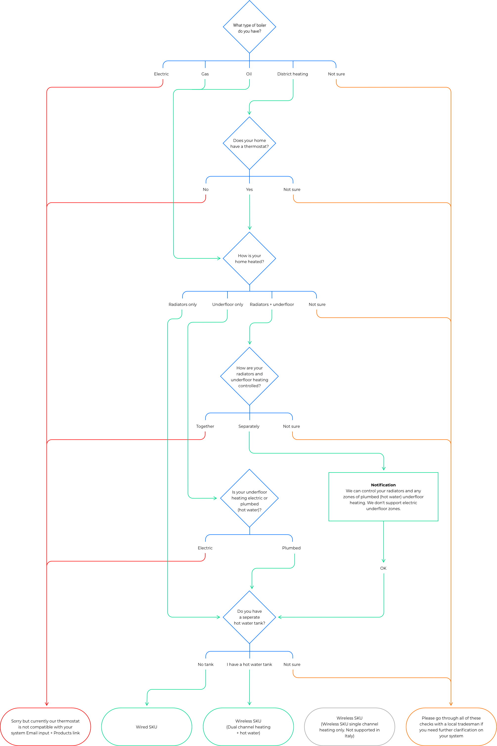
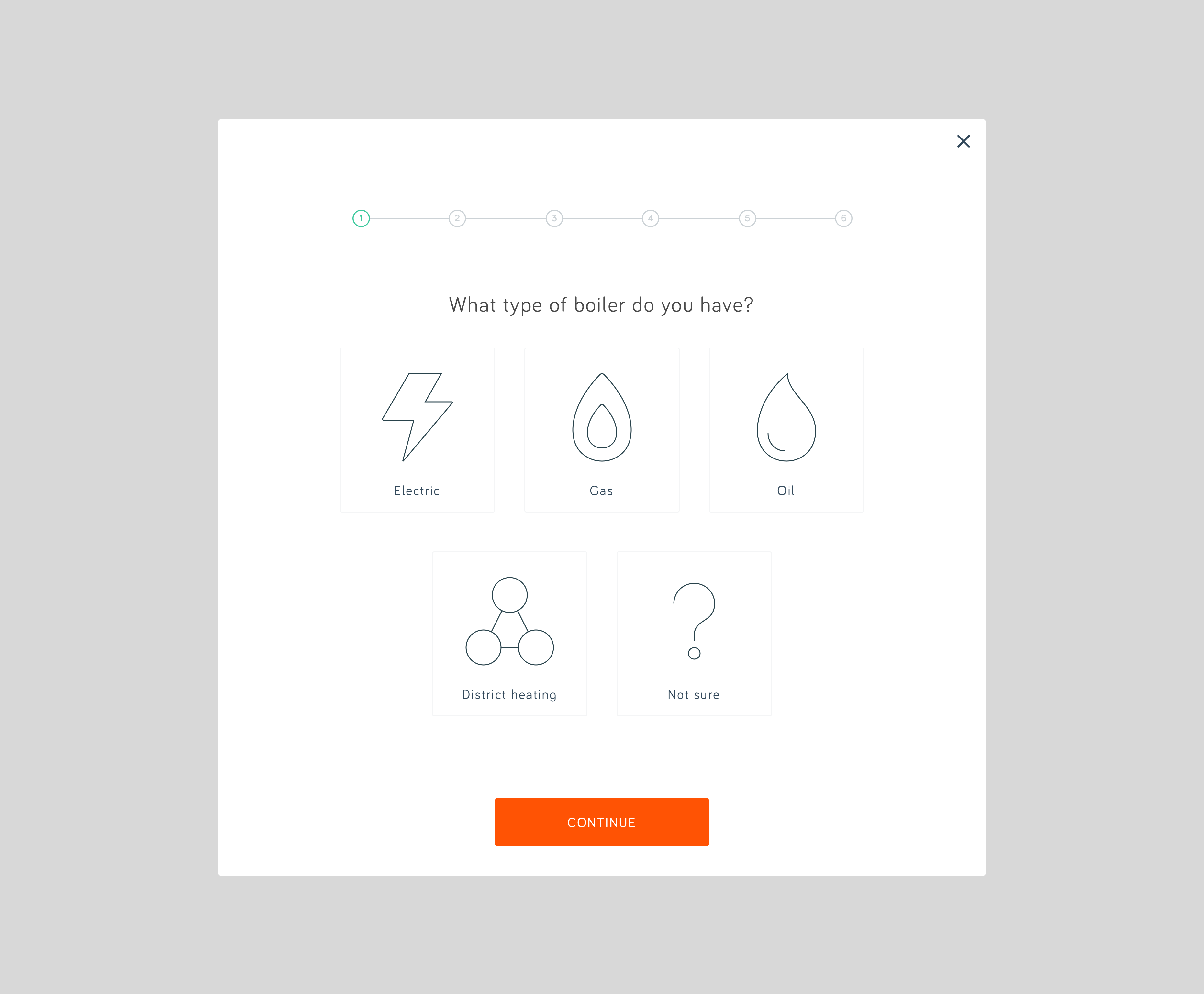
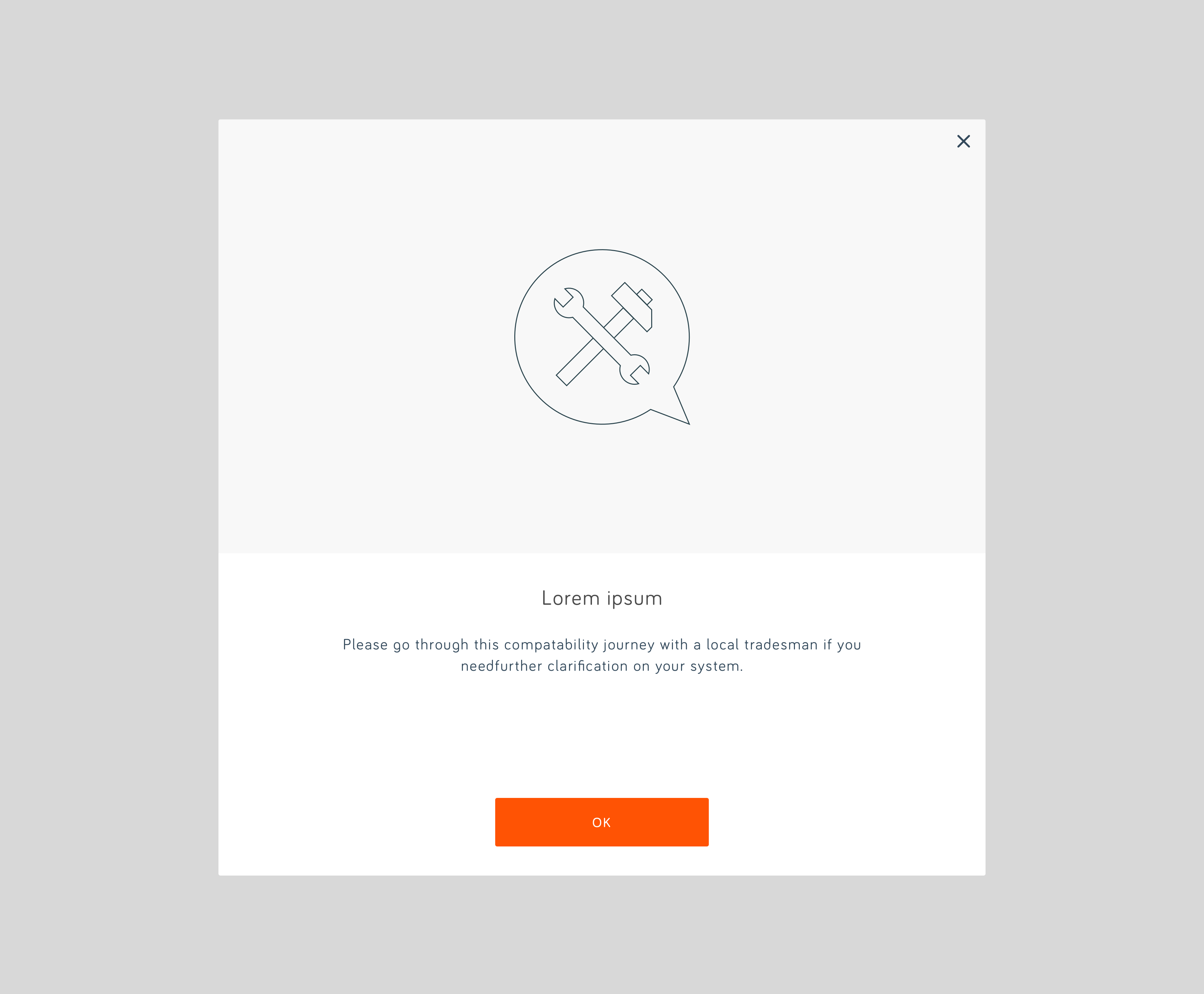
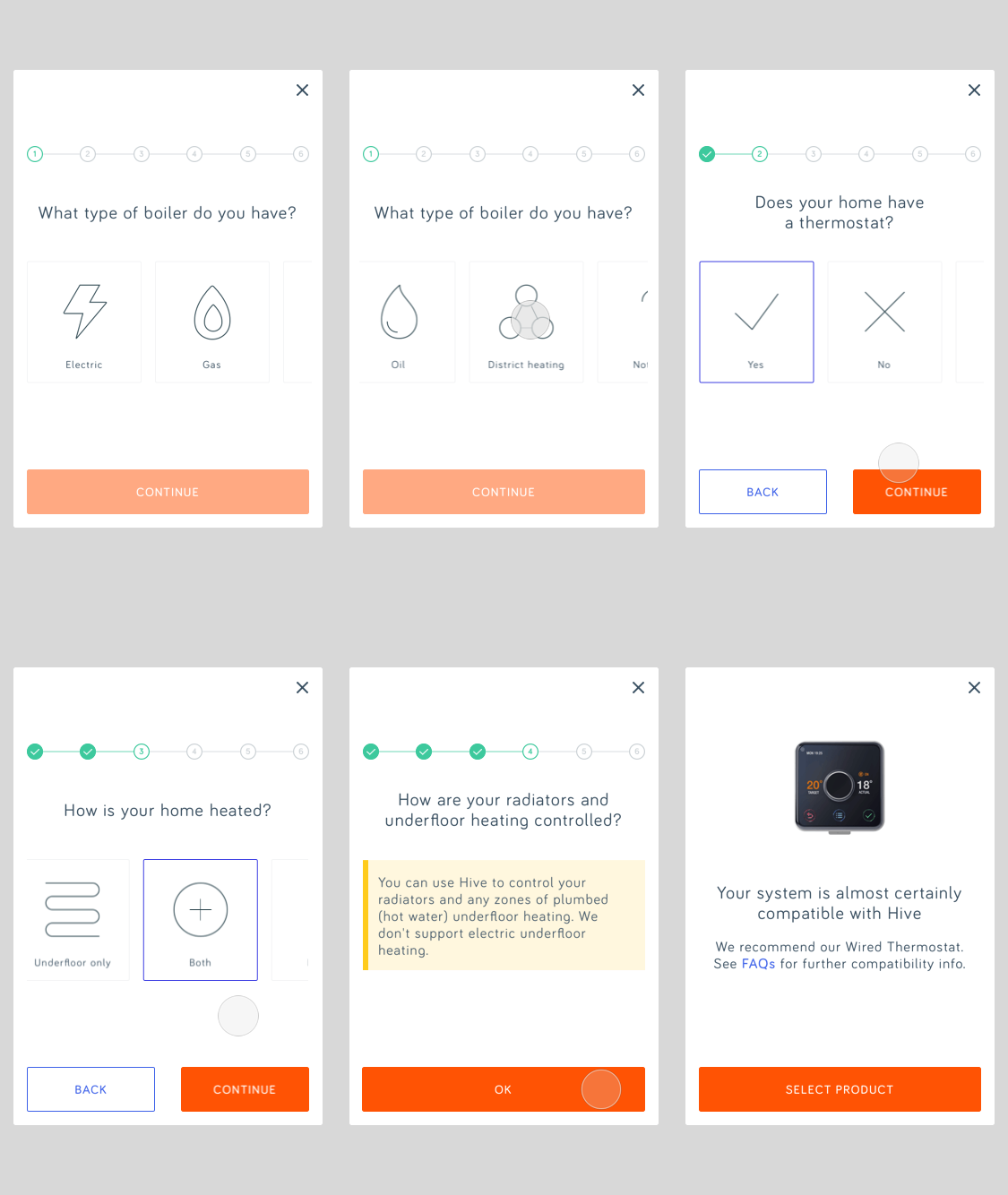
A simple Compatibility Checker was created and placed on the buy page, underneath the thermostat type selection module. to help the user find out which thermostat was right for them. I worked alongside the product engineering team to surface the necessary questions that the user would need to answer to funnel them to the correct product that would be compatible with their home system.



HIVE VIDEO PLAYBACK TRIAL
HIVE VIDEO PLAYBACK TRIAL
The challenge
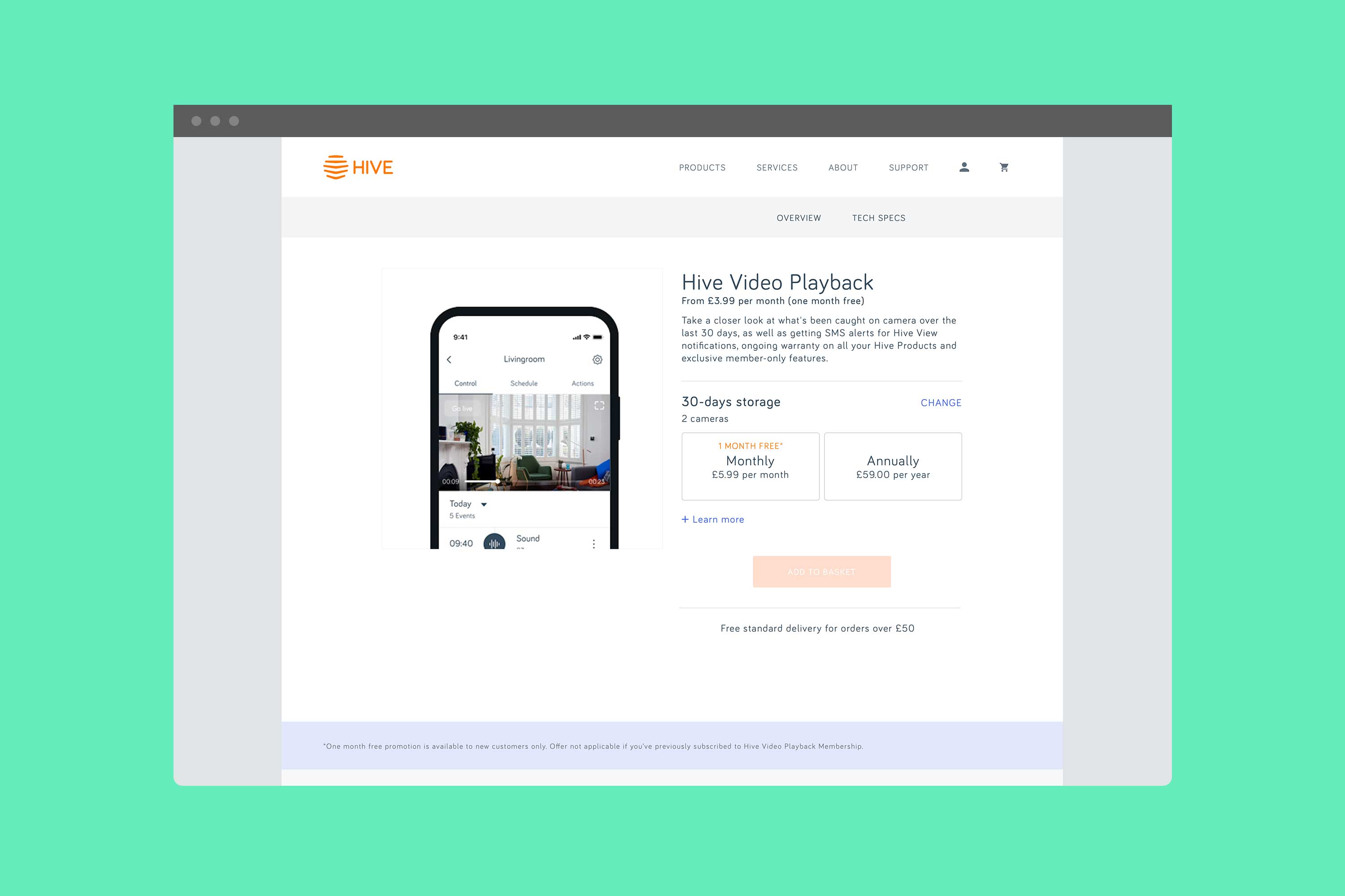
Hive Video Playback (HVP) is a service that allows customers with Hive cameras to extend their recording storage time, amongst other benefits. Hive is offering a free trial to existing customers in a bid to increase the subscription numbers. the challenge is what would be the most successful trial method in terms of uptake of trials and conversion.
The solution
Two proposals were put forward to test. Variation 1 would automatically upgrade the trialists for 3 months with the option of keeping the service at the end of the trial. This route would have a high trial uptake but a probability of low-conversion. Variation 2's trialists were offered a free 3-month trial that requires sign-up and entering of payment details upfront with the option to cancel at any time or to keep the service at the end. This route has a low trial uptake probability but the potential for higher conversions.
Variation 1
Variation 1

Email communication from Hive would be sent to the first group telling them that they have been upgraded to HVP. The email would contain details of the promotion and a link to the HVP Overview page, where the user could find more in-depth information about the service.
The second phase of the trial is initiated towards the end of the 3 months. The trialists would receive an email stating that the HVP membership is about to end, along with a range of benefits that come with it. From there, they have the option to follow a link to purchase the service, or not.
Variation 2
Variation 2

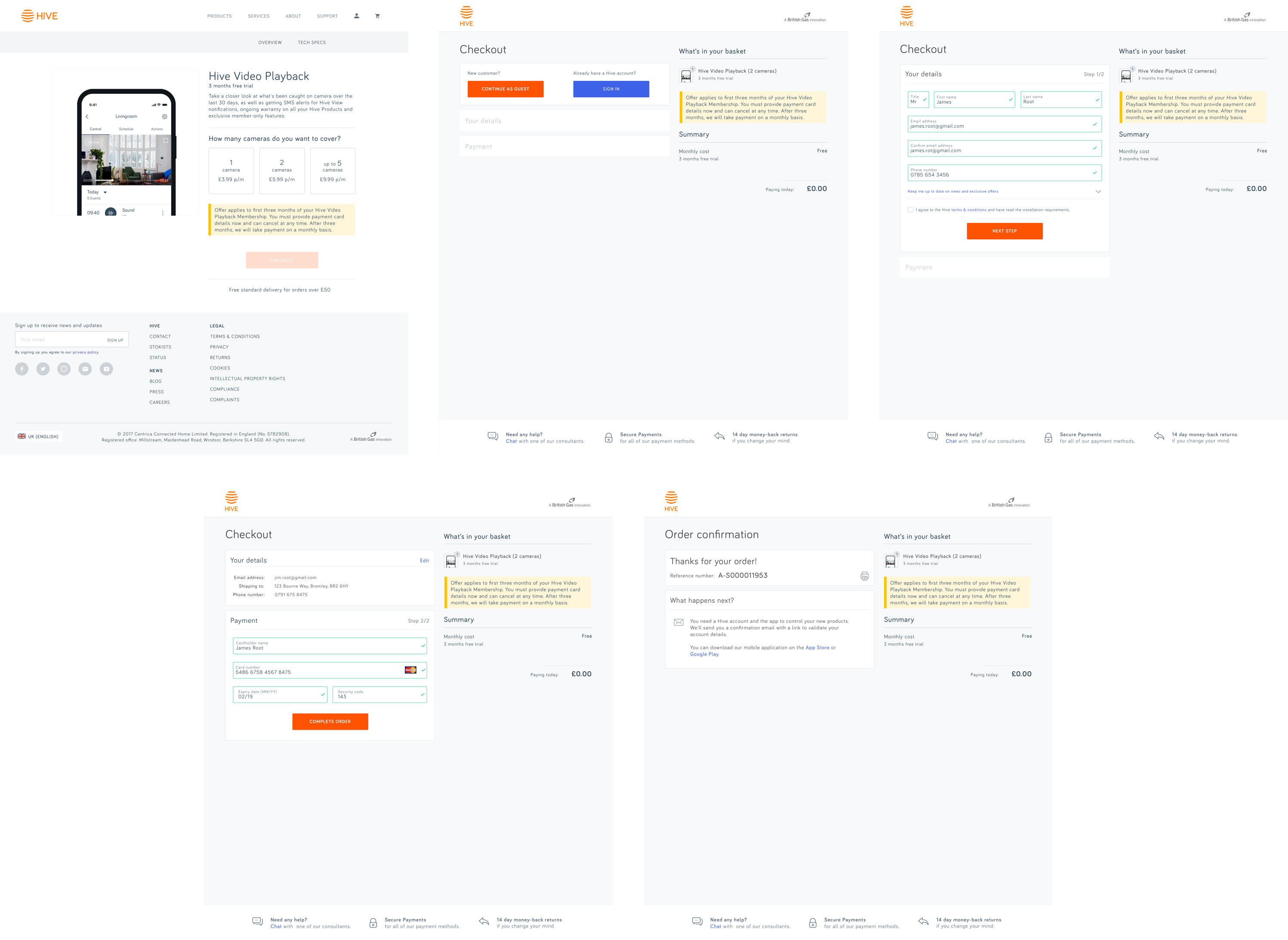
Again, email communication from Hive would be sent to the second group making them aware of the promotion. A CTA would take them to the beginning of the Buy page, where they would select how many cameras they want to be covered as part of the trial. Following that, they would be taken through the Buy journey and enter their payment details - in an attempt to minimise drop-off applying an abandoned basket procedure was recommended.
At the end of the 3 months, the trialist would have to manually cancel the deal to avoid further payments or do nothing if they are happy with the service and want it to continue.
If the trialist ignores the initial email, after a set time they would be funnelled into variation 1 to increase trial uptakes.
Streamlining path to purchase
Streamlining path to purchase
Both variations rely on the path to purchase is clear and swift. Variation 1, who if decided to complete the purchase at the end of the trial, would be incentivised by having experienced HVP and convinced it's a service they want to keep. Therefore the reliance on a quick purchase would not be as vital as with Variation 2, who would need to go through the path to purchase before starting the trial and could drop-off if frustrated by a long journey to purchase.
The original path to purchase has 9 steps, which is too long even for an incentivised trialist. After carefully looking at the existing journey, I saw that I could remove certain steps without any negative impact to the user. In doing so I managed to reduce the Buy journey steps by 57%.
Original path to purchase
Original path to purchase

Streamlined path to purchase
Streamlined path to purchase

NEXT PROJECT
Get in touch and let’s make something great together
Visit my shop and check out my prints
All work © 2023 James kingman
All work © 2023 James kingman
All work © 2023 James kingman